Relationships of Textiles and Text
Virtual Lecture for Fiber Liber
Curated by Lyuba Basin, 2023
Digital exhibition produced by Lyuba Basin, 2023

Fiber // Liber : RELATIONSHIP OF TEXTILES & TEXT
There is a clear etymological root between the words text and textile. We can trace it back to the Latin verb, texere — meaning to weave. The language of textiles provides us with certain figures of speech that bring a sense of materiality to writing. We weave a tale, spin a yarn, and piece together. There are stories that intertwine and threads that interlace. There are characters that get ensnared in a web of lies, there are ties that bind and relationships that fray. Material and immaterial. Textile and text.
Both have served as transmitters of cultural ideas. They have been linked to the sacred — to origin stories, prayers, songs, life cycles, mythmaking, and storytelling. Both are made from stems, roots, fibers, whether beaten or spun. In some cases, textile evolves into text, as the fabric that was once created by workers in a textile mill eventually becomes rags in a paper mill. Textile to text.
If we look closely, the book itself is nothing more than a form of fiber art. From paper to sewn binding to cloth covers, the book is the perfect example of the interwoven industry of textiles and text. Fiber Liber is a commentary that seeks to explore that relationship.

CLAY STAMP WITH JAGUAR DESIGN
Eighth century (realia)
NK9504 C53
Ceramic stamps were made in Central Mexico from the Early Formative period (ca. 1800-1200 B.C.) and continued into the early sixteenth century. It is assumed that the earliest examples of such objects functioned as ornamental devices used to decorate clothing, ceramic vessels, and even the body. They typically feature abstract geometric designs or stylized animal imagery, often in repeating patterns. Commonly found interred with human remains, these stamps were apparently valued as highly in death as they were in life.
The representation of jaguars in Mesoamerican cultures has a long history, with iconographic examples dating back to at least three thousand years. All major Mesoamerican civilizations prominently featured a jaguar god, and for many the jaguar was an important part of religious practice. For those who resided in or near the tropical jungle, the jaguar was well known and became incorporated into the lives of the inhabitants. The jaguar's formidable size, reputation as a predator, and its evolved capacities to survive in the jungle made it an animal to be revered. The Olmec and the Maya witnessed this animal's habits, adopting the jaguar as an authoritative and martial symbol, and incorporated the animal into their mythology, particularly that of the underworld.
This Mayan artifact was used for decorative stamping of fabrics and ceramics, and for printing on huun, or fig bark, paper. The ceramic stamp features a jaguar design, with spiraling lines defining its spots.


WOOD BLOCK FOR PRINTING CLOTH OR WALLPAPER
Nineteenth century (realia)
NK9504 W66
Woodblock printing on textiles is the process of printing patterns on various fabrics, usually of linen, cotton or silk, by means of carved wooden blocks. It is the earliest and slowest of all methods of textile printing. Despite being a slow process, woodblock printing is capable of yielding highly artistic results, some of which are unobtainable by any other method.
The origins of woodblock printing date back several thousand years, with early examples attributed to ancient Egyptians, Greeks, and Romans. Museum specimens, however, establish the fact that pattern printing on textiles had become a developed industry in parts of Europe by the end of the twelfth and the beginning of the thirteenth century. The first written reference to printed textiles in Europe can be found in Florentine trade regulations from the fifteenth century. In 1437, Italian painter Cennino Cennini published a treatise titled Il libro dell'arte, in which he describes the technique.
Wood used for textile printing may be made of box, lime, holly, sycamore, plane, or pear wood. Although they may vary in size considerably, they must always be at least two to three inches thick, otherwise they are liable to warping. The block, being planed smooth and perfectly flat, has the design drawn upon or transferred to it before it is readied to be carved out.
This nineteenth-century woodblock was received by the rare books collection with bindery equipment purchased from Colton and Nancy Storm in November 1977.


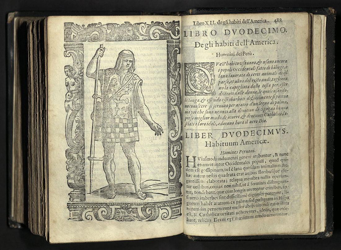
HABITI ANTICHI ET MODERNI DI TUTTO IL MUNDO
Cesare Vecellio (1521-1601)
Venice: Appresso Gio. Bernardo Sessa, 1598 Second edition
GT509 V43 1598
The sixteenth century saw the rise in popularity of the “costume” book. Between 1520 and 1610, more than two hundred collections of engravings, etchings, or woodcuts concerned with clothing or personal adornment had been published. These books reflected not only the great wealth of the mercantile classes, but also the enormous wave of travel and exploration in search of markets and raw materials. Pehaps the best known of all, and in many respects the apex of the century’s achievements, was that of Cesare Vecellio. The first edition of Vecellio’s costume book was printed by Damian Zenaro in Venice in 1590, with the title De gli Habiti Antichi et Moderni di Diverse Parti del Mundo. It was an immediate publishing sensation. For the first time, a book had brought together vivid descriptions and accurate depictions of world costume throughout history. Aimed, in part, at artists who might use it as a pattern book, its appeal soon proved to be more widespread. The book recognized that clothing was as much an identifier of rank as it was “fashion” — constantly changing, crossing borders, and transforming the way people lived.

In early-modern Europe, ethnographic curiosity was channeled into books on clothing. Clothing wasn’t merely an expression of personal style or an imitation of fast-changing fashion. Clothing marked gender, age, marital status, economic rank, and regional identity. Unlike today, individuals were not free to dress as they pleased. In Venice and other European cities, sumptuary laws controlled the fabrics, colors, and the cut of clothing in attempts to limit inequality among citizens. To dress was to be invested with a public identity, according to a system of fixed codes. In a largely pre-literate society, people learned to read the value of textiles and the meaning of their cut as signs of profession, wealth, social status, and geographical provenance.

The second edition of Vecellio’s costume book, Habiti antichi et moderni di tutto il mondo, was printed in Venice by Giovanni Bernardo Sessa in 1598. In this edition, Vecellio omitted the majority of his introductory historical text and shortened his captions considerably, so that the illustrations now appeared on every verso page, with each facing recto occupied by a brief Italian text at the top, and a newly prepared Latin translation at the bottom. More importantly, the number of illustrations was increased to five hundred. The carefully drawn woodcuts show the costumes of the world known in Vecellio’s day: Italy, France, the Lowlands, Burgundy, Spain, Portugal, Scandinavia, the German lands, the Slavic lands, Hungary, the Balkans, the Aegean, North Africa, Arabia, Syria, Armenia, Persia, India, China, and the recently discovered New World, including indigenous tribes of Roanoke, Florida, Mexico, and Peru. The twenty images of American costume were derived from various travel accounts.
Derived from the Latin habitus, or aspect, the word "habiti" signified the ways in which apparel invested bodies with meaning through the quality of the fabric and the tradition and conventions attached to dress.

A COLLECTION OF THE DRESSES OF DIFFERENT NATIONS
London: Thomas Jeffreys, 1757-1772
GT513 C6
The costume book tradition continued well into the eighteenth and nineteenth centuries. In addition to being visually enticing, they were also educational. In a sense, costume books are a form of ethnographic studies — used to understand cultures all across the world. It should not surprise us, then, that cartographers would excel at compiling the latest fashion trends.

Thomas Jefferys was a prolific map publisher, engraver, cartographer, and geographer to King Georges III. Based in London, Jefferys was apprenticed to Emanuel Bowen, a prominent mapmaker and engraver. Throughout his career, Jeffreys worked with several collaborations. His first atlas, The Small English Atlas, was published with Thomas Kitchen in 1748-1749. The following decade, he went on to publish several maps of North America.

Jeffrey’s costume book, A Collection of the Dresses of Different Nations, offers a comparative study of costumes from the Renaissance up to 1750, and features the designs of Hans Holbein, Anthony van Dyck, and Wenceslaus Hollar. The work also draws on several earlier publications. Among the books cited as sources are those by Charles de Ferriol, Johann Christoph Weigel, Athanius Kircher, Jean-Baptiste Du Halde, Jean-Baptiste Le Prince, Jean-Baptiste Chappe d'Auteroche, Filippo Bonanni, and Cesare Ripa.

Four volumes were issued between 1757-1772. Each volume introduces the plates with “A Description of the Habits” with text and plate captions printed in English and French. University of Utah rare books copy is volume 3.


MINUTES OF EVIDENCE... FOR THE PRESERVATION OF THE HEALTH AND MORALS…
Great Britain Parliament, House of Lords
London: 1819
HD8039 T42 G75 1819
During the late eighteenth and early nineteenth centuries, Great Britain became the first country to industrialize. Because of this, it was also the first country where the nature of children’s work changed so dramatically that child labor was soon considered a social problem and a political issue. Children of poor and working-class families had worked for centuries prior to industrialization. The practice of putting children to work was first documented in the Medieval era where they performed a variety of tasks that were auxiliary to their parents, but critical to the family economy. While hours varied from trade to trade and family to family, children usually worked twelve hours per day, with time out for meals and tea. These hours, moreover, were not regular over the year or consistent from day-to-day. This form of child labor was not viewed by society as cruel or abusive but was accepted as necessary for the survival of the family and development of the child.

Once the first rural textile mills were built in 1769 and child apprentices were hired as primary workers, the connotation of “child labor” began to change. These child apprentices were paupers taken from orphanages and workhouses and were housed, clothed and fed but received no wages for their long day of work in the mill. Reformers called for child labor laws and, after considerable debate, Parliament took action and set up a Royal Commission of Inquiry into children’s employment. The three laws which most impacted the employment of children in the textile industry were the Cotton Factories Regulation Act of 1819, which set the minimum working age at nine and maximum working hours at twelve; the Regulation of Child Labor Law of 1833, which established paid inspectors to enforce the laws; and the Ten Hours Bill of 1847, which limited working hours to ten for children and women.
The British Parliamentary Report, published in 1819, concluded that children formed a substantial part of the labor force in the textile mills. They calculated that while only 4.5% of the cotton workers were under ten years old, 54.5% were under the age of nineteen — confirmation that the employment of children and youths was most pervasive in cotton textile factories.

Since the age of Louis XIV, Paris had been known as a fashionable place. By the turn of the twentieth century, however, it would become the “fashion capital” of the world. During the reign of Louis the XIV, the industry of luxury goods came increasingly under royal control. The French Royal Court, in turn, quickly became the arbiter of taste and style in Europe. While Louis XIV was hailed as a patron of fashion, he had little to do with its spread and proliferation. Rather, the rise of French fashion could be credited to the development of the “fashion press” in the early 1670s and the publications of Jean Donneau de Visé — a notable journalist, historian, playwright, publicist and founder of the literary, arts, and society gazette, Le Mercure Galant. Access to printed materials transformed the French fashion industry by marketing designs to a broad public outside the French court while also popularizing notions such as the fashion "seasons" and changing styles.

PROMENADE DE LONGCHAMP, OPTIQUE NO. 4
Paris: ca. 1810-1827
Z1033 T68 O68 1827
The Promenade de Longchamp was an annual social event which took place on the Wednesday, Thursday, and Friday of Holy Week every spring along the Champs-Élysées and through the Bois-de-Boulogne. The tour ended at the abbey of Longchamp, where the nuns sang the office of Tenebrae, a village four miles from Paris. A convent there, established in 1256, had long been a destination for religious pilgrims.

In the late seventeenth century, the pilgrimage became an unauthorized secular spectacle. The nun's choir was fortified with singers from the Paris Opera. The theater in Paris was closed during Lent, which made the Promenade one of the few ways in which high society could flaunt their new spring fashions. A procession of people in festive costume traveled on horseback, in carriages, and on foot. Wealthy citizens of Paris vied to have the most elaborate carriages and clothing, while the lower classes, including laborers, soldiers, and prostitutes, lined the route to gawk. Police turned out in force, to keep the parade participants safe. The Paris Archbishop de Beaumont tried to halt the parade by ordering the convent closed during Holy Week. The parade did not stop. Participants were there to see and be seen.
In 1789, the Promenade was disrupted by an angry mob. The convent, by then wholly peripheral to the show, was closed by the Revolutionary government.

Napoleon revived the parade in the nineteenth century, in part as a way to bolster the fashion industry, but the later parades did not match the lush grandeur of those in the eighteenth century. Still, the parade contributed to later fashion phenomena. The American "Easter Parade" and the big, ostentatious hats of the Kentucky Derby can be traced back to the Promenade de Longchamp.
This early nineteenth century, concertina-style peepshow depicting the Promenade de Longchamp in Paris is etched on the front and back panes and contains four cut-out sections in-between, all hand-colored. The front panel has a circular viewing aperture. It is housed in its original marbled paper slip-case with engraved label.
The extravagant styles of the French Royal Court racked up enormous debts to keep up the pace of the changing styles. Such shopping sprees notably ruined the reputation of Marie Antoinette and were one of the many factors that led to the peasant’s revolt and the French Revolution. Despite the negative connotations, the textile industry was booming by the end of the eighteenth century and greatly influenced the gross domestic product rates in France. The spike in consumerism had been fueled by an overwhelming interest in high fashion, which often surpassed the boundaries of socio-economic class and rank. Particularly in Paris, women began purchasing knock-offs of luxury items customarily worn by the elite. These fashion accessories included watches, buttons, and belt buckles.

LES FOLIES PARISIENNES, NOUVEL ALMANACH DES MODES...
Caprice
Paris: Chez Louis Janet, 1823
GT871 F65 1823
Written by Caprice, “honorary member of all Societies, Balls, Circles, Teas, Meetings of France...” this almanac, which was “dedicated to Ladies,” connects textiles to text with a collection of poems about material goods such as gloves and hats, as well as short essays on the art of wearing a tie, the corset, and court attire. With five colored illustrations, Les Folies Parisiennes is a rare satirical collection directly from the fashion capital.

Published by Louis Janet and printed by Pierre Didot, this book reveals the intersection of the book trade with the textile industry. Pierre Didot the Elder was among the third generation of a French publishing dynasty renowned for the impeccable beauty and quality of their books. The Didot firm embraced the highest standards of bookmaking, and its patrons included King Louis XVI and his brother, the future King Charles X. Pierre Didot’s good fortune during the French Revolution was exceptional, especially at a time when many such printers lost their presses, their homeland, or worse, their lives.

During and after the French Revolution, there was a distinguishable shift in fashion styles, particularly among the common and lower classes, a great many of whom had become radical and militant partisans in response to their poor quality of life. In opposition to the word “aristocrat” they called themselves the San-culottes, referring to their clothing and thus their lower-class status. Culottes were the fashionable silk knee-breeches worn by nobility and bourgeoisie. On the other hand, the working class were sans-culottes (without breeches) and wore pantaloons, or long trousers, instead. They rejected the powdered wigs and favored natural hair and informal styles.

LA MODE FEMININE: DE 1490 A 1795
Paris: Editions Nilsson, [1920s]
GT1720 M69
An illustrated history of French fashion can be found in collection of four miniature books titled, La Mode Feminine. Each booklet features twenty hand-colored prints revealing the evolution and style of women’s clothing from 1490 to 1795. Printed by Editions Nilsson sometime in the 1920s, during the Belle époque, when Paris laid claim to its title of fashion capital.
Libraire Nilsson was a French publishing house founded in Paris in 1885 by Karl Nilsson and Per Lamm. The publishing house specialized in illustrated books, producing bound art albums, popular novels, and classics of world literature. For his illustrations, Nilsson called on artists such as René Binet, renowned for his Art Nouveau style.


WEAVING
Friedrich Froebel (1782-1852)
Circa 1880s
LB1542 F76 1880
Friedrich Froebel, a German educator, is best known as the inventor of the kindergarten system. Froebel’s kindergarten was the most successful system for teaching children about art, design, mathematics, and the natural world. In the 1840s, he devised the idea of twenty occupational “gifts” for children, some of which included sets of blocks, stick work, rings, drawing exercises and paper weaving. Gift number 14 was "Paper Weaving." Many albums such as this were compiled in the nineteenth century as teaching aids for use in kindergartens in Europe and North America. With their intricate patterns, albums of this sort are seen by some as precursors to the abstract design movement in art of the twentieth century, recognized in the work of Frank Lloyd Wright, Mondrian, Braque, Le Corbusier, Albers, and R. Buckminster Fuller.

Produced around 1880, this book contains fifteen 7x5 pages of red and pink paper woven into various geometric patterns mounted on heavy cardboard leaves in an accordion-fold structure with cloth-lined gutter and outer margins. The book is housed in an original folding case of black cloth-covered boards ruled in blind with the world “Weaving” stamped in gilt on the front board, with black ties.
[SAMPLE BOOK]
TS1124 S35 1900z
Sewing samplers taught young girls and women the tactile pedagogy of stitches. The history of the sampler is thought to date back to the early modern period, but few examples remain. Interest in collecting needlework samplers has increased greatly in the last several decades, no longer seeing the work as nostalgic folk art, but a tool for understanding the past and investigating the social and cultural history of manufacturing and design.
Samplers often included embroidered sayings, maps, family trees, multiplication tables, calendars, poetry, prayer and hymns, as well as alphabets. By the period of the Centennial Exposition in 1876, the American sampler underwent dramatic changes. Rather than exemplars of embroidered cloth, punched-paper patterns for samples became available. These had the design already marked out on heavy paper, with holes punched for embroidery wool to slide through. They were sold in a variety of patriotic and sentimental motifs and phrases.
While older samplers were probably made by adult women, eighteenth and nineteenth century, were likely made by young girls — as samplers became less about keeping a working record of stitches and more about proof of a basic skill and part of their domestic education.
This sampler was owned by Hattie D. Squier, the great-granddaughter of Alexander Kirkpatrick, a minute-man of the American Revolutionary War, in the Somerset County, New Jersey Troops. The sampler was then passed down to her daughter, Edith, whose signature can also be found on the first page of the book. Edith Squier Mudgett was born on February 7, 1888 in Nebraska. She married Harry David Hines on April 21, 1920 in Salt Lake City, Utah.
Since the sampler was a direct personal link with past generations, often signed by grandmothers and great-grandmothers, it was much more likely to be kept than other material objects like cookware or furniture. Samplers were almost certain to be passed down in the family, and in the instances that they were given away, they were much more likely to be donated to museums, or libraries such as ours, to be kept as a historical record.
Looking at such training samples, one gets a sense of a sort of bilingualism — a fluency in the visual and the verbal, something sewn and something printed. A dual language that often only women could speak.

ILLUSTRATED SEWING PRIMER: WITH SONGS AND MUSIC
Louise J. Kirkwood
New York: Wynkoop & Hallenbeck Printers, 1881
TT710 K58 1881
The demand for textiles has gone hand-in-hand with historical technological innovations — from the spinning jenny, the cotton gin, the Jacquard machine and the factory system. In the nineteenth century, the Industrial Revolution saw the development of new weaving machines at precisely the same time that changes in printing technology made books cheaper and more widely available.
By the late nineteenth century Industrial Schools had been established to better train the working classes in the numerous trades now operating in mass factories. The textile industry was one of those trades in which women and young girls were often recruited. The publication and wide circulation of “sewing primers” were seen as a way to encourage sewing skills in young girls. They included lessons and songs set to popular tunes, as well as other rules and suggestions “which will be of use in later life.”

In the introduction to this sewing primer, Louise J. Kirkwood argues, “If girls of but one grade — say from nine to twelve years — could be afforded the opportunity of becoming familiar with the use of the needle, it would be a telling step in the right direction, putting them in possession of a most valuable art, which would prove an armour of defense against temptation to idleness, which leads to want and so often crime. That this little book may give an impulse in the direction of this industrial pursuit is the desire of a practical worker.”
University of Utah rare books copy is from the John R. Park Library Collection.

THE ROOTS OF THE MOUNTAINS
William Morris (1834-1896)
London: Reeves and Turner, 1890
PR5079 R65
Poet, designer, craftsman, and pioneer socialist William Morris led the nineteenth-century revival of the art and craft of making books. In 1891, at a time when cheap machine production dominated, Morris rented a cottage near Kelmscott House and set up three printing presses. Influenced by medieval illuminated manuscripts and the work of early printers, he designed and produced over fifty editions of works written by himself, Samuel Coleridge, John Keats, Percy Bysshe Shelley, Alfred Tennyson, and others. Morris designed his own typefaces, had his own paper especially handmade using fifteenth century standards, and printed his books by hand. He returned to the woodcut for his illustrations. The books were beautiful. They were designed to be read slowly, to be treasured just as medieval manuscripts were.
Much of the impact of Morris’ books derives from the tactile sensation of superbly crafted paper and exceptionally black ink. Morris argued that it was the architecture of the printed page — word spacing, leading, and margin proportions – that made a book visually attractive. The best of designers that followed him understood his tenets of consistency and honesty and went on to revitalize the quality of book making both in limited editions and mass productions. Today, Morris is possibly best-known for his wallpaper and woven textile designs.
Binding fabric design by William Morris for Morris and Company, London. Unbleached linen upholstery fabric with hand-printed floral pattern in tan, white, crimson, pale blue and slate blue; front and rear covers without decoration; spine with gilt-stamped titling; buff endpapers; edges untrimmed. Printed by Chiswick Press, Charles Whittingham and Co., London on Whatman paper. Edition of two hundred and fifty copies.


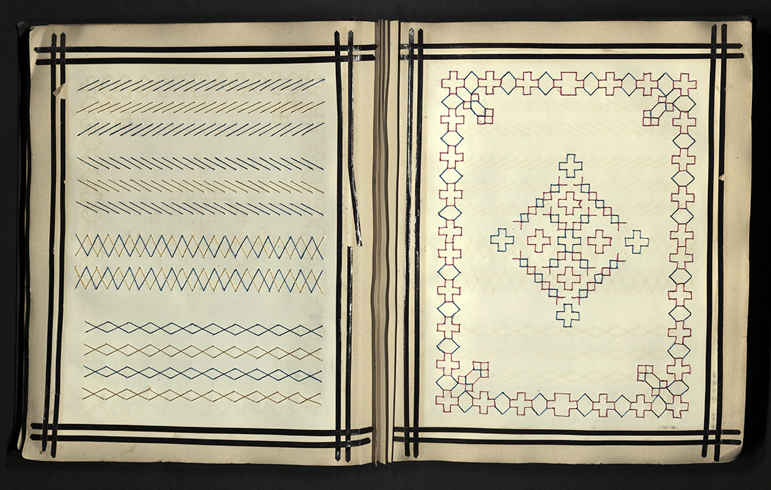
TEXTILE DESIGN BOOK
Huddersfield [U.K.]: J. Broadbent & Co., [between 1900 and 1999]
TT715 T49 1900z
This personal textile design book was produced and sold by the J. Broadbent & Company printers. It contains ninety-six leaves of design paper, and is interleaved with ruled paper that can be used for notes. This particular design book is printed in what is called a “C pattern,” meaning the configuration of 8x8 squares. With this textile design book, we might envision a book of translations — the language of text and textile displayed on opposing pages.
On the right page, the language of textile, coded in eighty-four squares, with each square containing a grid. It is the ancient language of weaving, a technology considered by some to come from the Neolithic, if not Paleolithic, period. And on the left, the English translation, hand-written in black ink.

While there are many variations of weaving, the foundational aspect involves interlacement. That is, one set of yarns crossing over and under another set of yarns. At its most basic structure, there are two sets of yarns: one that runs along the entire stretch of the fabric, called the warp, and one that crosses back and forth as it interlaces, called the weft.
The illustrative diagram we see on the right page is a notational system called a draft and it represents the fabric. Draft notations were created and consulted by the weaver in order to better plan the work on the loom. Note the inherently binary nature of the diagram.

EASY STEPS IN SEWING; OR, ADVENTURES AMONG THE THIMBLE PEOPLE
Jane Eayre Fryer
Oakland, CA: The Smithsonian Company, [1928]
TT712 F7 1928a
The language of textiles was also translated and adapted for some of the youngest readers in the form of storybooks. In 1912, 36-year-old school teacher, Jane Eayre Fryer, published the first in a series of juvenile books designed to teach young girls fundamental domestic skills, combining fact and fancy for a complete course in Home-Economics. Like the sewing primers previously presented, Fryer wanted to teach useful things in an entertaining way, but unlike the primers, Fryer did so through while weaving a narrative about a young girl named Mary Frances.

But these were not mere storybooks, they were instruction books that followed the young Mary Frances as she learned domestic skills with the guidance of her fairy helpers, along with other characters such as the Kitchen People and the Thimble People. And as Mary learned the skills, so did the young readers of Fryer’s books.
In addition to Easy Steps in Sewing, Fryer also published six other volumes including: The Mary Frances Cook Book (1912); The Mary Frances Housekeeper (1914); The Mary Frances Garden Book (1915); The Mary Frances First Aid Book (1916); and The Mary Frances Knitting and Crocheting Book (1918).

TAILLEURS LENITIS
Paris: Tailleurs Lenitis, 1939
TT555 T35 1939
Prior to the 1830s, the word “tweed” was only ever used as a proper noun, referring to the Tweed river that flows through the Scottish Borders region. In the nineteenth century, the river became well known throughout the United Kingdom, and to an extent, Europe, due to its association with the famous writer, Sir Walter Scott. But the popularity of “tweed,” as we know it, is undoubtedly attributed to its life as a textile. The family of textiles that later became known as tweeds were initially sourced by merchants from Scottish Border regions. Though it might be assumed that the name was directly inspired by the local river, the term tweed likely derived from the Scottish words tweel or tweelds — a term that was used to denote any cloth in the twill weave, but most often applied to woolen fabrics.
For many decades, tweed remained a rugged textile worn by men participating in outdoor activities. However, after the First World War, shifting developments in economy, politics and the social climate provided an opportunity for tweeds to be incorporated into the women’s fashion market. Sportswear chic became the look of the inter-war era: clothing that not only expressed comfort, but also the possibility of action. These changing conceptions of femininity greatly impacted the design, production, and sale of tweeds to women in Europe and abroad. Among the French couturiers, notable designers such as Coco Chanel, played a crucial role in popularizing the tweed suit internationally. Following fishing trips with her then lover, the Duke of Westminster, Chanel began to introduce tweeds and other knitted Fair Isle designs into her fashion collections. The simplicity of men’s sporting apparel inspired Chanel’s garconne look. She wanted women to have the same level of comfort, function, and durability and decided to open a boutique in London where she sold tweed cardigan suits. Appealing to the contemporary woman, the versatile clothes of Chanel’s early collections became hugely popular and were copied across the globe.

The popularity of the women’s tweed suit skyrocketed in the 1930s. “Sportswear” was no longer worn specifically for sporting activities, but could now be worn during luncheon parties in the country, or even shopping expeditions in the city. As in the words of one designer, “The clothes that sold best were those that were good for town and country.” The tweed suit was symbolic not only of an increased informality, but also of the social democratization of women’s fashion. As the thirties moved forward and Europe found itself on the brink of war once again, many of the couturiers shut their doors — some temporarily, and others for good. Despite all this, the tailored suit remained an ideal wartime outfit, due to its adaptability to different social contexts within the increasingly straitened times.
This sample catalog was created by Tailleurs Lénitis in Paris, 1939. The catalog includes forty-eight mounted samples of fabric, including wool, silk, and wool rayon blends. Each page features a large fashion illustration, at times accented in silver and adorned with colored borders and geometrical designs. Many of the illustrations feature the shoulder pads and tailored jackets of Elsa Schiaparelli’s distinctive designs, while the tailored skirts are reminiscent of Coco Chanel’s iconic two-piece women’s suit. Following the Second World War and its immediate aftermath, the tweed suit continued to have an ever more integral role in women’s wardrobes, primarily because of its adaptability and suitability for all day wear. Over the course of the next sixty years, the suit found its way into the wardrobes of style icons such as Jackie Kennedy, Princess Diana, and Brigitte Bardot. During the twentieth century, the tweed suit became more than a symbol of fashion, but a representation of the liberated woman.

FASHION DESIGN DRAWINGS
Richard-Gabriel Rummonds (b. 1931)
Twentieth century
TT506 R85 1950
Fashion and costume design drawings done by printer, Richard-Gabriel Rummonds. Box 1 includes his drawings from high school and box 2 his post-high school drawings.
Raised in California, Rummonds moved to New York to attend the School of Fine Arts at Syracuse University in 1949–1950. He later returned to California, with the intention of majoring in set and costume design and the University of California at Berkeley, but decided to major in English and Creative Writing instead. During this period he was on the staff of Occident, the student literary magazine, of which he became the editor for the Spring 1954 issue.
Rummonds began his own imprint, Plain Wrapper Press in 1966. His first book — a selection of his own poems — was printed in Quito, Ecuador. The following year, he printed a book of his short stories from Buenos Aires, Argentina. Between 1977 and 1996, Rummonds taught in the Graduate School of Library Service at the University of Alabama in Tuscaloosa, Alabama. He was the founding director of the MFA in the Book Arts Program. Subsequently, he offered workshops on printing on iron handpresses throughout the world as well as giving numerous lectures on fine printing.


HANDCRAFTED DOLLS IN VILLAGE DRESS
Jericho, Jordan: World Y.W.C.A Centre, Aqbat Jaber Refugee Camp
Twentieth century
This set of handcrafted dolls was made by women in the Aqabat Jaber Refugee Camp. The camp was established in 1948, three kilometers southwest of Jericho. Before the 1967 Arab-Israeli war, the number of registered refugees was 30,000, making Aqbat Jaber the largest camp in the West Bank. The original inhabitants came from nearly three hundred villages north of Haifa, as well as the Gaza and Hebron areas. Many of the refugees fled to Jordan during the 1967 Arab-Israeli war.
During the early 1970s, Tania Tamari Nasir began volunteering as an aid for refugee women in a Y.W.C.A located in the region. Nasir held a bachelor's degree in English Literature as well as a Fine Arts degree from Beirut College for Women (now called Lebanese-American University). Using her background in literature and art, Nasir was inspired to teach the refugee women craft and embroidery to help them make a living. With her guidance, they made embroidered goods, costuems of their country, and Nativity sets to sell the public. Nasir's experience was later published in a memoir titled My Silk Road. She is also the author of Spring is Here: Embroidered Flowers of the Palestinian Spring (2003); co-author of Palestinian Embroidery: Fallahi Cross-Stitch (1990); and has also translated the work of several prominent Arab writers.

The set includes the following figurines: “Bedouin Man” (black robe, white headdress); “Salt Woman” (black dress, basket); “Emaus Refugees” (woman with two children); “Jericho Woman” (blue dress, stick bundle on head); “Sheikh Darwish” (black robe, white tunic, headdress of green wool); “Bethlehem Woman” (black velvet dress with embroidered panels); “Jerusalem Woman” (purple dress with embroidery, basket); and “Hebronite Sheepherder” (pink and beige tunic, wool vest, gun).
Gift of Wilma Marcus from the estate of Mayor Louis Marcus, May 1984

PAPER SAMPLES
Simpson Lee Paper Company
San Francisco, CA: Simpson Lee Paper Co., 1970s
TS1220 S54 1970z

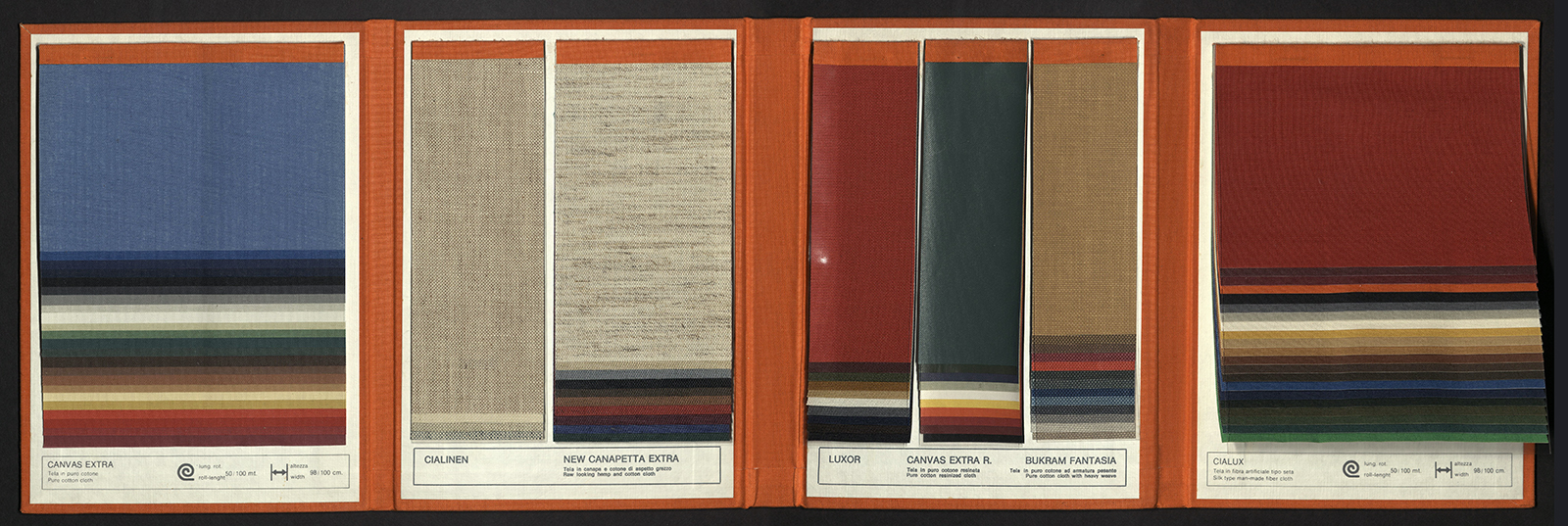
TELE LEGATORIA: TOILES POUR RELIURE (BOOKBINDING CLOTHS)
Manifattura del Seveso
Cusano, Milanino, Italy: Manifattura del Seveso, 1981
Z274 M35 1981

TIRE BRAND SILK THREAD: COLOR SAMPLES
Fujii Sen-I Co. Ltd.
Kirkland, WA: Fujii Sen-I Co. Ltd, 1990s
HD9929 T3 F8 1990z


501: THIS IS A PAIR OF LEVI’S JEANS
Lynn Downey
San Francisco, CA: Levi Strauss & Co. Publishers, 1995
HD9940 U6 L454 1995


DRESS AND KINDRED SPIRITS
Marianne Moore (1887-1972)
New York, NY: Ibex Press, 1965
PS3525 O5616 D7 1965
Women’s Wear Daily was founded as an extension of the menswear journal Daily News Record in 1910. Founded by Edmund Fairchild, the fashion-forward publication quickly acquired notoriety among the New York clothing industry and was referred to as the “Bible of Fashion.” The trade journal provided information on changing trends and breaking news in the fashion, beauty, and retail industries to a demographic of readers consisting largely of retailers, designers, manufacturers, marketers, financiers, media executives, advertising agencies, socialites and trend makers. By the mid-century, Women’s Wear Daily turned its focus on the “human side of fashion” and began reporting on the social scene, meanwhile manufacturing a cult of celebrity around fashion designers.

Demonstrating her own interest in fashion, American poet Marianne Moore contributed an essay to the February 1965 issue of Women’s Wear Daily titled “Dress and Kindred Subjects.” The essay was reprinted by the Ibex Press in an edition of 100 copies. Cover drawing done by Laurence Scott. University of Utah copy is numbered ‘R’.

THE WARDROBE
Teresa Pankartz
Chicago, IL: Artists Book Works, 1988
N7433.4 P26 W27 1988
While we may no longer perpetuate the stereotypes of domestic work being solely women’s work, there is still an undeniable connection between textiles, female writing, and the shared experience of women. During the women’s liberation movement of the 1960s and 1970s, second-wave feminists gained new interest in family textiles, collecting quilts and samplers, and trying to learn traditional textile arts. In searching for missing records and hidden histories, they saw in textiles a unique form of female writing that implicitly chronicled the lives and labors of their mothers and grandmothers before them.
Teresa Pankratz dedicates her book, The Wardrobe, to her mother “whose closets bulge with story.” Designed to resemble a wardrobe of clothes, interlaced with illustrations and text. Pankratz muses on the differences and similarities between her mothers wardrobe and her own, with each page highlighting an article of clothing that is intrinsically linked to a specific memory or event. Text and illustrations folded accordion style in a mahogany box designed to resemble a wardrobe. Edition of five copies. University of Utah rare books copy is no. 3.

LOOM
Carol June Barton
Bethesda, MD: Carol June Barton, 1989
N7433.4 B376 L66 1989
Carol Barton is a book artist, paper engineer, curator, and educator. She is the proprietor of Popular Kinetics Press and has published several editions of artist books. She may be best known for her series of interactive workbooks, The Pocket Paper Engineer. Fueled by her interest in book arts, Barton embarked on a two-year study of movable and pop-up books. She traveled to libraries and collections across the United States where she discovered a wide variety of books utilizing sculptural formats and uncommon engineering techniques. As she began to better understand the materials and methods used in the construction of these books, Barton began compiling ideas for the production of her own editions of artist books.
One result of her research was that Barton is credited with reestablishing the tunnel book as a book structure. In Loom, the reader travels through a series of Persian rugs while, landscapes and space to reveal an image of the world. An anonymous quote, translated from Persian greets the reader at the end, “No one yet hath unravelled a knot from the skein of the universe. And each who came and essayed the same but made the tangle worse.”
Loom was assisted by Katherine Barrow, Linda Couvillion, Gayle Garrett, Ann Kalmbach, Judy McCarthy, Douglas Olds, Michael Sediman, Esther K Smith, and Brad Freeman of Pyramid Atlantic. With Funds from Maryland State Arts Council. Edition of six hundred copies. University of Utah rare books copy is number 562.

SOME REALLY UGLY CLOTHES
[New Haven, CT]: Skeptical Press, [1996]
HD2337 S64 1996
Clothing is not only a testament of our past, it is also the outwardly expression of who we are. It is a reflection of our personalities, a connection to unique cultures and communities, and sometimes even a declaration of our political beliefs. We wear our heart on our sleeves, as they say, and sometimes we wear some really ugly clothes.
From the American textile workers’ strikes of the early twentienth centuries, to the contemporary inhumane conditions of textile workers in factories here and abroad, and the major environmental impacts resulting from synthetic waste and water use — the textile industry has been and continues to be controversial.

In 1996, the Skeptical Press of New Haven, Connecticut produced this little booklet to raise awareness about the ugly facts of fashion. Accompanied by images of clothing tags, the book digs deep into the serious issues of sweatshop labor, using excerpts from articles written in major publications like The New York Times, The Wall Street Journal, and South China Morning Post, to name a few. The twenty—one unnumbered pages include information such as the following,
"Women produce most of the clothing bought and worn world-wide. The exact percentage of women working in the garment industry varies among countries, but it is always upwards of 70 percent. Very often they are immigrants, and in some countries they are children."
"Hong Kong is the world’s third biggest supplier of clothing, but many goods marked Made in Hong Kong are made in China or Thailand. Thai industry has one of the worst safety records in Asia. There are an estimated 40 million children working in various jobs in Thailand; those who work in factories have often been purchased from rural parents by recruiters."
While the information provided is truly ugly, the book ends on a reflective note, providing a list of all the articles of clothing the author owns: 4 pairs of jeans; 6 sweaters; 4 skirts; 3 dresses; 7 blouses; 2 jackets; 2 pairs of slacks; 16 Tshirts; 1 turtleneck; plus various socks, tights and underwear. The final statement, “Okay these are my clothes, but I don’t know what to do about it."
Printed with Kabel light type on Rives Heavyweight paper. Bound in striped cloth covers, with paper spine label. Edition of thirty-five copies. University of Utah rare books copy is no. 235.

HANGING LAUNDRY
Emily Payne
San Francisco, CA: Pea Pod Press, 1996
N7433.4.P39 H35 1996
Poetry printed on torn paper suspended from string inside a box. Printing, hand painting, cover linoleum cut and book construction by Emily Payne.


ON THE LINE
Linda Johnson and Kristy Lewis
Lafayette, IN: L. Johnson, K. Lewis, 1997
N7433.4 J66 O5 1997
On the Line is a collaborative project created by Linda Johnson and Kristy Lewis for 1997 show titled Van Gogh’s Ear and Other Art Stories. Johnson and Lewis collected stories, rumors, little known facts and folktales about well-known artists. They searched for “the kind of scoop that usually doesn’t find it’s way into history books.”
Most of these stories have been related through a message-making process known as “word of mouth” giving them a certain less than tangible quality. The collection of stories became content for an artists’ book, through which these juicy tidbits of information are passed on to others. The book was designed so that the viewer has to interact with the piece in a symbolic way of hanging out the dirty laundry. To further perpetuate this process of person-to-person rumoring, the Johnson and Lewis requested that their initial contacts pass a copy of the project to another artist, art patron, art historian, or anyone else whom they considered to be “in the know” on such gossip.
This limited-edition bookwork was supported in part with public funds from the Women’s Studio Workshop and the New York State Council on the Arts. Contributors include Robert Brinkerhoff, Harvey Kaner, Jim Walker, Jacob Livshultz, Maria Rougal, and Alexsandra Sukhoy. Printed on 100% cotton muslin in an edition of one hundred and twenty-five copies. University of Utah rare books copy is number 86.
MODERN (LAUNDRY) PRODUCTION
Susan Johanknecht
London: Gefn Press & Paupers Productions, 2001
PS3560 U26 M6 2001
The text for Modern (Laundry) Production was derived from three sources. The first two, titled Modern Laundry Production (1945) and Industrial Psychology and the Laundry Trade (1947) describe the processes and machinery which structure the operators lives. The third, an article titled “A Manifesto for Cyborgs: Science, Technology and Socialist Feminism for the 1980s” was published in volume 15 of The Socialist Review. Susan Johanknecht’s artist’s book carries with it her interest in innovative writing practices which use existing “working” languages. The imagery is based on early twentieth—century time and motion studies, which divided up and recorded “cycles” of work with the view to standardization and increased production — a visual documentation of work, where the body and machine become linked as cyborgs. The concertina structure smoothly turns from front to back, guiding the reader into performing their own repetitive loop.
Text in 12pt Gill Sans and Gill Sans Italic, title in 18pt Gill Sans Bold Italic, printed offset litho in dark blue by Michael Taylor at Paupers Press, London. Sheets glued and accordion folded, housed in a brown card slipcase rubber stamped with the title in white ink. 150 copies co-published with Paupers Publications, London 2001.
Because we do not typically see the production of textiles, we often forget that they are, in most cases, made by human hands. The same could be said about books. Yes, books are now produced by mechanical robots by the thousands all over the world. But at one point in time, the entire process was done by hand.
Our familiarity with the book has made us blind to the intricate details of the paper, the binding, and architectural structure. When we look at the book we only ever see the text, not the textiles. Artist Claire Van Vliet seeks to redirect our attention to those details by experimenting with the book’s form and structure in innovative ways. She is, perhaps, best known for her weaving techniques, interlocking the binding with colorful strips of paper and thread.
Claire Van Vliet is an artist, illustrator, typographer and founder of the Janus Press, named after the Roman god of beginnings and transitions — a perfect metaphor for the kinds of books she creates. For Van Vliet,
"… To read a book is an act of opening — we open it and are open to what is inside — we expect to receive from a book... All the physical components of a book can act as facilitators for the essence of the text. They can engage the senses and widen the comprehension of the text — ideally, without interfering in any way. Reading a book is a dialogue, and the more the reader is encouraged to bring to the act of reading, the better it is for the author."

OLD QUILTS
Margaret Kaufman
Minneapolis, MN: Minnesota Center for Book Arts; West Burke, VT: Janus Press, 1989
Z232.5 J36 K378 1989
Handset in 10 and 12 pt. Optima. Printed dry in three blues on Tenjugo inclusion in “quilt” of Japanese lace papers and kozo and gampi papers handmade by Amanda Degener. Set by Michael Tarachow at Pentagram Press, Minneapolis. Designed by Claire Van Vliet and made with Amanda Degener and Barb Schubring at the Minnesota Center for Book Arts and Cave Studio. Edition of one hundred and forty copies, numbered.


PANDORA'S BOX
Margaret Kaufman
Hanover, NH: Graphic Arts Workshop, Baker Library, Dartmouth College, 1991
Z232.5 J36 K379 1991
Handset in 18 pt Palatino italic, colophon in 10 pt. Printed damp on Barcham Green India paper. Embedded quilt pattern of tumbling blocks woven of paper and cloth. Printed with assistance from Stephanie Westnedge who completed the embedded image at Janus Press.


BEAUTY IN USE
Sandra McPherson
Newark, VT: Janus Press, 1997
Z232.5 J36 M35 1997
Thirteen poems inspired by African-American Quilts. The twenty quilt square pages are two-sided patterns constructed with interlocking and woven pieces of paper collected over a period of five years. Many of the papers were made especially for this project at the press and by different papermakers. Chiyogami, paste, marbled, and printed papers are included. The binding concertina of Twinrocker abaca is a book structure invented specifically for this project by Claire Van Vliet and, in the spirit of the interlocked quilt squares, is non-adhesive. The tray case is covered with three different cottons. Accompanied by a bag of small pieces of paper left over from the construction of the book. Edition of one hundred and fifty copies, signed by the participants.

DEEP IN THE TERRITORY
Margaret Kaufman
Newark, VT: Janus Press, 1998
Z232.5 J36 K373 1998
Deep in the Territory is the third in a series of quilt books written by poet Margaret Kaufman and created by Van Vliet and the Janus Press. The thirteen quilts, accompanied by Kaufman’s poems, are built from interlocking strips and shapes of paper to form double-sided squares, with the two sides varying radically in most instances, both in hue and in format. Most amazingly, the complex book has no binding — in that there is no thread or glue holding it together. The text and quilt papers are folded, cut and woven into tight patterns that hold all on their own.
Kaufman’s poems, including the titular “Deep in the Territory,” were inspired by plainswomen’s quilts. A collector of such quilts, Kaufman closely observes the artifact and stitches together the poem, which then combines with Van Vliet’s interplay of materials — text and textile.
Included with the book is a bag of paper scraps, which Van Vliet explained, “just seemed too nice to throw away.”
Thirteen quilts, opposite thirteen poems, are built from interlocking strips and shapes of various handmade and machine-made papers to form double-sided squares. Included is a bag of paper scraps. Letterpress printed. Binding structure and design by Claire Van Vliet. Housed in a cloth-covered clamshell box. Edition of one hundred and twenty copies. University of Utah rare books copy is signed to the Marriott Library by Claire Van Vliet and initialed by the poet.

AUNT SALLIE'S LAMENT
Margaret Kaufman
Newark, VT: Janus Press, 2004
N7433.4 V37 A8 2004
Book design by Claire Van Vliet. Each page is a different combination of colors and geometric shapes resembling quilt blocks. Issued in box. Edition of one hundred and twenty copies, signed by the poet and artist.


HANDMADE DEFINITION OF OBSCURITY
Sandra McPherson
Newark, VT: Janus Press, 2005
PS3563 A326 H36 2005
Broadside poem. Titles handset in 16 pt Helvetica Medium, text in 18 pt Century Schoolbook italic by Tamar Schuman, colophon in 10 pt Helvetica. Printed dry in ochres on calendered Barcham Green Dover and McGregor—Vinzini ochre and mauve papers collaged onto Barcham Green DeWint paper in an interwove design using colored, paste, and papers patterned with a tailor's roulette, including Japanese Chiyogami. Twinrocker black abaca, and Janus dark blue, black, orange, yellow. Assembled with assistance from Audrey Holden and Andrew Miller-Brown. Edition of 100 copies from Janus Press catalogue. Wonderful poem and elaborate even by Janus Press standards broadside in a quilt design.


SILVER NEEDLES
Barry A. Lanier
[between 2000 and 2009]
PS3612 A584 S55 2000z
Scraps of paper or cloth can be sentimental. You may hold on to all of them, vowing to find a way or a reason to repurpose them later. Using repurposed cloth, many sewers create specialty needlebooks, decorated with patchwork pieces of different fabrics and sometimes embroidered with designs. These soft, small, portable books not only safely keep your sharp needles in place they can also be reminders of past projects and containers for even smaller scraps.
This needlebook does, in fact, contain needles and pins. But within its patchwork we also find a poem, titled “Silver Needles” and all at once, text and textile become self—referential. Although the poem is not about sewing, it uses the language of textile to weave the imagery of the sky on a winter’s day.
Winter's cloak embraces me walking out the door.
White diamond studded frost cutting into metal,
Silver needles pulling white threads beneath the sun.
Winter-bare trees drifting in and out of fog,
Azure carpet darted with cumulus circles tossing about.
Should serenity be as gentle, misting rain,
Basking in this moment of nature and nothingness —
I have found the cotton trails of roaring thunder.
Streaming upward toward the heavens and beyond,
On silver needles pulling white threads beneath the sun.
Little is known about the history of this little needlebook. Where it came from, when it was made. As for the Georgia poet, Barry Lanier, it is said that he once admitted, when asked about his poetry, “I have no special ambition, other than to give back hopefully a portion of what has been freely given to me, and should my written words help just one person, then my efforts have been a success.”

REDRESSING THE SIXTIES: (ART) LESSONS A LA MODE
Susan Elizabeth King
Washington, D.C.: National Museum of Women in the Arts, [2001]
N7433.4 K5 R43 2001
Like the books we read and the outfits we wear, scraps are more than capable of telling a story. Just ask artist Susan E. King. In her book, Redressing the Sixties: (Art) Lessons a la mode, King uses scraps from her collection of vintage clothing to weave the narrative of her journey as an artist — from her beginnings in 1965 as an art student in the United Kingdom to a thirty year stint in Los Angeles, and back again. Somewhere along the way, King became a founding member of the legendary non-profit community art center known as the Women’s Building in Los Angeles. In addition, she headed the Women’s Graphic Workshop and became internationally known for her artist books.
Growing up in Lexington, Kentucky, Susan King was shaped by a family of Southern storytellers, including mothers who prowled antique malls and grandmothers who sewed and tatted lace. In a whimsical recollection of the influences on her life related to clothing and fashion, Redressing the Sixties can be considered part memoir and part cultural artifact, combining original prose pieces with selected texts, plus a variety of fabric samples to adorn the pages. It begins,
“I started the sixties with the requisite wardrobe of wool pleated skirts and matching Shetland sweaters. Jackie had glamorized Mamie’s matronly outfits of the fifties, but we were still expected to wear gloves and hats to church. As the decade began, the wildest I got was a Madras shift with sandals. If worn with the right accessories, I could almost look beat. Like one of the beat girls in a Life magazine photo. It was what I most wanted to be.”

Created for and supported by the Library Fellows of the National Museum of Women in the Arts. Fabric swatches are pieces of clothing from the collection of the artists. Paper made by David Carruthers and Company at St. Armand Papeterie, Montreal. The typeface is Palatino. Covers are paste papers made at the press over boards. Sewn in signatures in a non-adhesive binding with visible sewing structure. Edition of one hundred and twenty-five copies, plus artist’s proofs. University of Utah rare books copy is no. 52, signed by the author/artist.

KIMONO / KOSODE
Carol Schwartzott
Washington, D.C.: National Museum of Women in the Arts, 2001
N7433.4 S384 K55 2001
As with Redressing the Sixties, Carol Schwartzott’s Kimono / Kosode was published in 2001 by the National Museum of Women in the Arts, and while the former uses descriptions of clothing to drive the plot, the latter imitates the garment through the form and structure of the book itself.
Bound with a piano hinge binding design and Japanese chiyogami papers, Kimono / Kosode reveals the history of the distinct Japanese garment while simultaneously alluding to the act of wrapping and unwrapping the material around the body of the book — with a cut-out of the iconic t-shaped design highlighting decorative textiles represented by the differents papers of each page.
The first real indication of the kimono’s importance in Japanese culture occurs during the Heian period between 794-1185 AD. It was during this earliest period of artistic enlightenment that a mastery of poetry, calligraphy, and music, along with elegance in dress became essential aspects of court life.
Women were the first to wear kimono style garments. The court lady’s rule of dress was called the kasane—gi, where multiple layers of unlined robes, usually twelve to twenty, were worn over the other. Since the inside of the elbow and the nape of the neck were considered erotic and sensual, each gossamer layer created a complex beauty at the collar and sleeve opening, where the colors of all were visible. A woman usually wore her court dress for several days at a time, not removing it even to sleep.
Kosode means “a thing for wearing.” It is an old name for a form of dress that is now usually called kimono. The cultural aspects of the kosode evolving as kimono also came about because of the increasing influence of women, and this, along with the changeover from a noble ruling class to the samurai and their beliefs, placed more emphasis on simple clothing. As kimono design evolved, the concept was to achieve the original beauty of many robes creating a complex surface design on one single layer of fabric.
With each period in history, the kosode evolved, adapting its design and decorative elements to current style and availability of materials. Stitched or embroidered with silk and metallic threads, patterned with paste-resist foils and stencils, shiburi dyed and ikat warped, printed, or silk-screened, the kosode has many different faces, each showing us a different time and place in the history of Japan.
Created for and supported by the Library Fellows of the National Museum of Women in the Arts. Designed and bound by the author. Printed on Blacks Corner Letterpress. Bound in archival boards, Japanese chiyogami papers with a piano hinge binding design by Hedi Kyle.

ONE WOMAN'S SEWING BEE
Linda K. Smith
[United States]: Linda K. Smith, [2002]
N7433.4 S6417 O6 2002
According to Nancy Bradfield, author of Costume in Detail, “The inside of a dress is often as interesting as the outside, and at times more complicated, and to understand a dress fully, a knowledge of the inside is essential.”
Linda K. Smith takes this notion of “the inside” and applies it to herself, creating a collection of descriptive essays about pieces of clothing that she, the “one woman” of The One Woman’s Sewing Bee would like to sew. Her essays are coupled with examples of clothing practices and beliefs, along with some secrets of clothing, all discovered in her readings on the subject. Vignettes of personal narratives make up the third strand of the text, exploring both the universal and personal in the ordinary and basic structure of clothing. Smith views the book as her version of how we weave threads of our lives into a whole.

The three strands of short and historical and personal essays which make up this textually and structurally entwined book are accompanied by hand-stitched paper, bead decorations, and pin-hole patterns made by threadless sewing machine needle perforations. The narrative includes musings on the vest, the everyday dress, the courting dress, the special dress, the fantasy dress, the buttons, the glove, the shoe, and the mended piece.
Laser printed using Quark Express in Hoefler Text with Hoefler Text Ornaments. Hand-stitched paper and bead decorations and pin-hole patterns (from threadless sewing machine needle perforations) adorn the pages. The papers are Esse white; grey, straw-embedded Ogura Chine; gold-on-grey Yuken; and Reversible Unryu/Kozo Momigami all within a Coptic binding of layered Japanese papers. Edition of twenty-five copies. University of Utah rare books copy is no. 3.

QUIPU
Catherine Mutz
San Francisco, CA: Protean Press, 2004
F3429.3 Q6 M87 2004
Designed, printed, and bound by Terry Horrigan. Text typeface is 13 pt. Poliphilus and Blado. Paper is bianco Fabriano Ingres. The etching was drawn and engraved in plexiglass by Terry Horrigan, printed, and then folded in a style known as the “Turkish map” fold. Bound in Lokta fiber paper from Nepal. Ann Miller developed calligraphic letters and elements. Edition of forty copies. University of Utah copy is no. 31.


CLEW
Robin Ami Silverberg
New York, NY: Dobbin Books, 2004
N7433.4 S548 C5 2004
The guiding thread, as it were, for this selection of books has been a focus on textiles, whether explicitly or implicitly. This next book uses this notion of a guiding thread, or clew to reflect on the deeper meaning of the marriage tree located on the grounds of a Hindu temple in South Africa, and the ritual of young women wrapping the tree with silk threads as a prayer to acquire a husband.
The prose, printed in thin red lines of red across translucent paper, evoke a thin strand of thread moving across the page. Meanwhile, the illegible bolder black commentary might suggest a tangled ball of yarn — further depicting the author’s conflicted views of the ritual. The text reads,
I remember then being struck by the image of all those shimmering threads against the dark. And — it was so hot and we were sitting on a low stone wall. I allowed my mind to drift to examples of “wrapped” art — from Christo to Windsor. I considered several evocative memories — like the wrapped tall candlesticks on the altar in a Roman church, and those balls in Yucatan that were made of layers upon layers of strings or rubber bands. Each recollection made me look longer at those threads —
I thought pityingly about those young women for whom marriage is an essential and ultimate goal. But: don’t we also say “tying the knot”? What about tying a yellow ribbon around that old oak — not to mention all the post—9/11 memorials that cropped around town. I am sure that I never understood the evocative language of material, form and presentation. I was certainly aware of the parallel symbols of bondage, but I am quite sure that I was naive to which factors encapsulated the meaning of containment.
I was unable to either comprehend how myths with their rituals can be so transcendent or of the role of the initiated in sustaining their illusions… even after the dreams have all gone away. And, I was totally unaware of the role of textiles as an essential form of women’s communication. Text. Texture. Textile. Text. Texture. Textile.
The "ball of thread" meaning of clew has been with us since before the twelth century. In Greek mythology, Ariadne gave a ball of thread to Theseus so that he could use it to find his way out of her father's labyrinth. This, and similar tales, gave rise to the use of clew for anything that could guide a person through a difficult place. This use led in turn to the meaning "a piece of evidence that leads one toward the solution of a problem." Today, the spelling variant clue (spelled c-l-u-e and appeared in the sixteenth century), is the more common spelling variant for the "evidence" sense.

FASHION STATEMENTS
Frederica Postman and Bonnie Stone
Los Altos, CA: P’Nye Press, 2005
N7433.4 P68 F37 2005
Designed in the appearance of a clutch, Fashion Statements brings together the stories of more than two dozen women. In order to provide anonymity and privacy, the book artists substituted some contributor's names for the names of famous fashion designers. The stories respond to the ways in which clothing and fashion are bound up in the relationships between mothers, daughters, sisters and friends. From bridal gowns, paper dolls and heirlooms to the little black dress, hats, and aprons, this artist’s book makes a ‘statement’ on how fashion influences and is influenced by society’s expectations.
Fashion Statements is printed letterpress. The text is set in Italian Old Style cast by Monroe H. Postman on a Monotype caster with a Macintosh Computer interface. Edition of sixty copies. University of Utah copy is number 27.


NOUS TISSONS
Kitty Maryatt
[Claremont, CA]: Scripps College Press, 2006
N7433.4 S37 N6 2006
There is no doubt that the role of textiles is an essential form of women’s communication, but would it surprise you to know that textiles, specifically woven ones, are what allow us to communicate digitally today. It’s true, the origin of modern computers dates back to an early eighteenth-century invention commonly called the Jacquard machine or the Jacquard loom.
The Jacquard machine is a device fitted to a loom, called a head, that simplifies the process of manufacturing woven textiles with complex patterns. The machine is controlled by a chain of punched cards, laced together into a continuous sequence. Multiple rows of holes were punched on each card, with one complete card corresponding to one row of the woven design. These cards were replaceable and were used to control a sequence of operations, allowing only certain hooks to move through holes in order to grab the appropriate thread and create the design.
Though based on earlier inventions by Basile Bouchon, Jean Baptiste Falcon, and Jacque Vaucanson, this mechanism was fully developed by Joseph Marie Jacquard in 1804, which is why he is often cited as the inventor. The Jacquard machine and loom revolutionized the textile industry and made possible the automatic production of unlimited varieties of pattern weavings, among so many other things.
The Jacquard head, and its replaceable punched cards, is considered to be an important step in the history of computing software. The ability to change the pattern of the loom's weave by simply changing cards was an important conceptual precursor to the development of computer programming and data entry.
Nous Tissons, translated from the French as “we weave” is a collaborative project produced by The Scripps College Press and Clair Van Vliet, which includes various texts on the subject of weaving, and incorporates Van Vliet’s unique book-making techniques. An additional narrative about Joseph Jacquard and the invention of his loom is both textually and structurally “woven” throughout the book.
Arches cover is said to reflect the interwoven narratives while the Stardream cover which presents the Jacquard anecdotes functions to hold the book together. Typeset by hand and printed on Vandercook letterpresses by students at the Scripps College Press and printed in an edition of one hundred and two copies.

ADA'S ECHO
Kelly Wellman
[California?]: This Is My Body Press, 2001
N7433.4 W448 A32 2001
British inventor, Charles Babbage, had heard of the Jacquard loom and saw the potential in the use of its replaceable punched cards for solving math problems. But although he was a brilliant inventor, he could never quite grasp the mechanism of the loom. Perhaps this is because he did not speak the language of textiles. Enter Ada Lovelace, the abandoned daughter of poet Lord Byron. Sometime in 1833, Babbage met a young Lovelace at a party. They became friends and, as the story goes, Babbage showed Lovelace a small prototype of the computing machine he was working on at the time, inspired, in part, by the Jacquard loom.
Unlike Babbage, Ada Lovelace realized the Analytical Machine’s ability for uses other than mathematics, but can be used, instead, as a system of rules that can be applied to a vast range of intellectual pursuits. Lovelace helped Babbage refine and direct his ideas, editing, footnoting and often correcting his work. And Lovelace and Babbage carried on a lifelong correspondence. Babbage devalued Lovelace, calling her his “interpress” and “the enchantress of numbers.”
Beyond his ability to recognize Lovelace as his equal, Babbage lacked some serious social skills and often alienated potential benefactors. They were on the verge of creating the world’s first working computer, but the lack of funding halted any further progress. In 1843, tens years after they met, Lovelace wrote a long letter to Babbage urging him to let her handle negotiations with the backers. He politely rejected her offer.
Imagine how different the world would be today if he said yes.

The dream of the Analytical Machine, or the Difference Engine as it was sometimes called, was never fully realized. And it took over one hundred years for Ada Lovelace to be recognized for her contributions to the field of computer programming. In 1977, a new computer programming language was named “Ada” in her honor. She is now widely acknowledged as a computer pioneer. Ada’s Echo, created by Kelly Wellman, includes text excerpted from Ada Lovelace’s letters to Charles Babbage. Translucent paper forms the top and main text page through which the secondary text and shadowy images are seen. By layering the pages, progress is depicted as a process of accrual, in which many hands and voices contribute over time.
The modified accordion binding was produced by weaving pages together through grommetted corners (at both the head and foot) with plastic paper strips. Pages are punched with different configurations of holes to recall punch cards.

THE DESERT
Jen Bervin
New York, NY: Granary Books, 2008
N7433.4 B47 D47 2008
The erasure of Ada Lovelace from decades of history is not excusable. On the other hand, erasure, as a form of poetry, is something that can imbue new meaning into old words. In The Desert, poet and visual artist Jen Bervin works in the tradition of poetic composition by erasure by meticulous sewing, row by row, across 130 pages of text.
The text hidden under Bervin’s pale blue thread is John Van Dyke’s prose celebration of American wilderness titled The Desert: Further Studies in Natural Appearances, first published in 1901. Van Dyke, an art historian, claimed to have spent three years in the American Southwest desert with only his fox terrier for company and a pony for transportation. According to Van Dyke, he carried with him a rifle, pistol, hatchet, shovel, blankets, tin pans and cups, dried food, and a gallon of water. Despite the book being a huge success, it turns out Van Dyke’s story was fiction, rather than fact. The truth was that Van Dyke saw most of this great desert while looking out of windows of trains on his way from one first-class hotel to another.

What Jen Bervin does to Van Dyke’s romantic rhapsody is breathtaking. Using over five thousand yards of thread, Bervin creates her own elemental landscape, with atmospheric fields of pale blue zigzag stitching to construct a poem “narrated by the air” — “so clear that one can see the breaks. The poem that emerges from Van Dyke’s desert was first composed at James Turell’s Roden Crater in Arizona, on the Wave Books Poetry Bus Tour in October 2006. Thinking of Turrell, Bervin wrote: “The great get on with the least possible, and suggest everything by light.”
The text of the book was digitally printed by Jan Drojarksi in Brooklyn on handmade Twinrocker abaca paper, the books were machine-sewn by Bervin and a team of assistants in Seattle, and bound in hand—punched abaca covers by Susan Mills in New York in an edition of 40 copies. Housed in a hinged archival case. Issued in a wrapper of white muslin cloth and white felt stitched together with blue thread.

THE DICKINSON COMPOSITES
Jen Bervin
New York, NY: Granary Books, 2010
N7433.4 B47 D53 2010
Many of Jen Bervin’s projects seek to “unstitch the seams between text and textile.” In The Dickinson Composites, Bervin once again uses stitches, but this time it is to mend the things that have been taken apart and taken away, to put them back together again. The things I am talking about are Emily Dickinson’s poetic marks — the familiar dashes, ubiquitous crosses and plus signs, or the variant words which are scattered throughout her manuscripts but rare, if ever, are reflected in the print editions of her poems.
Rather than erase, Bervin foregrounds these oft-omitted marks to see what patterns formed when all the marks remained in position, but were isolated from the text. To do so, Bervin first scanned the original manuscripts, written by Emily Dickinson sometime between 1858 and 1864. The handwritten poems were composed on stationary folios into forty packets — later called fascicles — and were stab-bound with red and white twist thread.

The manuscripts were digitally enlarged in order to convey the exact gesture of the individual marks, which were digitally rendered, projected, and then transferred onto cotton batting to make a series of large-scale embroidered works. The series includes five 6x8 quilts, whose titles identify their relationship to Dickinson’s fascicles. The quilts were prepared with a hand-sewn center line and machine-sewn lines that replicated those of the light-ruled paper, while the marks were embroidered in handspun and hand-dyed silk thread.
Granary Books later published Bervin's works as this limited-edition artist's book, titled The Dickinson Composites — an artist book that focuses on a series of large-scale quilts Jen Bervin made by embroidering the poet Emily Dickinson’s unusual punctuation markings from her fascicles. The box, printed with enigmatic red crosses and dashes, contains two sewn samples (excerpts made at the same scale, in the same materials using the same methods as the quilts), large prints of each quilt, and a nested booklet. Like Dickinson’s manuscripts, the box and the works therein are encountered entirely without titles. In the booklet, an essay by Bervin elucidates Dickinson’s variant marking system in her poetry manuscripts and provides further context for the quilts.
Each box includes: A lignin-free, drop-front archival box printed with quilt-scale fascicle marks in red. Two machine-sewn and hand-embroidered samples — excerpts from Composites 28 and 38, made at the same scale, in the same materials using the same methods as the quilts. Images In the booklet show the hand—sewn sample in relation to the full quilt, with the excerpt area marked. Large color prints of all six quilts: The Composite Marks of Emily Dickinson’s Fascicle 16, 19, 28, 34, 38, and 40. An unbound 16-page booklet with an essay on the variant marks, images of Dickinson’s manuscript poems, and process and installation images of the quilts. The booklet is housed in a pocket printed with marks and sewn with a cotton tape lift.” Edition of fifty copies.
In a New Yorker article, about Bervin’s work related to Emily Dickinson, she is quoted as saying, “It seemed to me that what she was doing was much more interesting than what was being done to her.”

DRAFT NOTATION
Jen Bervin
[New York, NY]: Granary Books, 2014
N7433.4 B47 D73 2014
In a later project, Jen Bervin drew inspiration from textile artist and printmaker, Anni Albers. With a background in the Bauhaus school of art, German-born Albers had an incredible ability to blur the lines between traditional craft and fine art. When Albers was teaching at Black Mountain College, so-called “typewriter studies” formed part of her curriculum. The designs — a sequence of aligned slashes, colons, underscores, the alternation of upper-case and lower-case S’s — imitated the gridded space and the interplay of warp and weft and aided in creating what Albers called “tactile-textile illusions.”
As with Dickinson, Bervin was intrigued by Albers’ markings and she set out to do her own experimentation with typewriters, texts, and textiles. Draft Notation is the compilation of typed studies made on several typewriters over the course of the year. It includes four pale green books with a total of 57 typed studies reproduced in letterpress, a unique typing on red board, facsimiles of nine studies made on different typewriters, a typed process note from Jen Bervin, and a colophon — all contained in a sail cloth-covered clamshell box.
The title refers to the pre-weaving design diagrams a weaver creates or consults to plan her work on the loom. Some of the notations were created while listening to poetry recordings and interviews, hence the quotations that appear. Bervin was also heavily influenced by early mending samplers, like the ones we have already seen, wherein complex woven patterns are replicated with a needle and thread to show off the darning skills of an embroider.
Within Bervin’s Draft Notations there is an incredible amount of intertextuality to sift through, even when there is no text present. Sometimes the deeper meaning is found elsewhere. In the words of Anni Albers, “Wherever meaning has to be conveyed by means of form alone, where, for instance, no written language exists to impart descriptively such meaning, we find a vigor in this direct, formative communication often surpassing that of cultures that have other, additional methods of transmitting information.”
Letterpress printed by Friedrich Kerksieck. Edition of seventy-five numbered copies. University of Utah rare books copy is no. 29

WINTER COUNT
Anne Greenwood
[Portland, OR]: [A. Greenwood], 2008
N7433.4 G744 W56 2008
Anne Greenwood’s Winter Count provides us with a phenomenal example of how other cultures communicate and transmit information among generations. Among several tribes on the Northern Plains, the passage of time was marked by noting a single memorable event — recorded pictographically — on a buffalo or deer hide. It was called the winter count, because the year ended when winter was over and new life began in the grasses and trees of the plains. Winter was the opportune time to look back over the year and record its history.
A tribe historian was responsible for the winter count. As the hides would deteriorate, the images would be transferred over to new hides. The tribe historian was also responsible for learning all of the stories before him, as well as interpreting the drawings and history for anyone who asked about the record. The Big Missouri winter count began in 1796 and ended in 1926. It covered one hundred and thirty-one years of events from one division of the Dakota nation along the Big Missouri River.

Anne Greenwood began her own winter count in January 2007, but instead of drawing images on buffalo hide, she stitched her winter count with embroidery and reclaimed linen. The images were pulled from ruminations in her life, titled with the year of origin and a short phrase to note the major event, place, state of mind, or primary activity of the year. The images were then transferred to letterpress, with colors and size closely matching those of the embroidered cloth. The names of the stitches are listed, in order from the border, to the background to the central image.
Completed in the Spring of 2008 in Portland, Oregon. Text was set in Goudy Sans by Inge Bruggeman, who also helped in the design of the book. Thirty copies were letterpress printed on Fabriano Rosaspina at Textura Letterpress. University of Utah rare books copy is number 3.
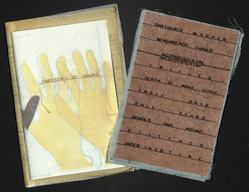
TAPESTRY OF HOURS
Anne Greenwood
[Portland, OR]: [Anne Greenwood], 2016
N7433.4 G744 T36 2016b
Greenwood took to needle and thread to tell the story of her life in Winter Count. She found that the language of textiles would be useful to tell yet another story, that of poet Hazel Hall. Like Emily Dickinson, Hall lived out her life in the upper room of her family’s house in Portland, Oregon, confined to a wheelchair. Despite the challenges she faced, Hall helped support her mother and two sisters by taking on an occupation of sewing and embroidering bridal gowns, baby dresses, altar clothes, and lingerie. For Hall, the topic of needlework was prolific in her poems and was often used as a metaphor to describe her limited mobility, isolation, and loneliness.
Greenwood’s affinity for Hall’s needlework poems is a natural fit, since her own work incorporates textiles, needlework, and print media to explore and extend historical and cultural understanding. For Tapestry of Hours, Greenwood collaborated with another artist, Shannon Ayuya, who also requires a wheelchair to navigate the world. Ayuya was born with a rare bone disease, osteogenesis imperfecta, and in the periods of recovery from surgery and pain, she learned to embroider and crochet.

Together, Greenwood and Ayuya cut up Hall’s poems, created fragments, reassembled words, and stitched up a whole new set of poems. The resulting project — from the media and materials used by the artists, to their lived experience and shared goals of collaboration and connection — is reflected back to us through analogies of mending and growth in Hall’s poetry.
Here are old things:
Fraud edges,
Ravelling threads;
And here are scraps of new
The text is machine stitched. Decorations are hand-stitched embroidery sigils by Greenwood and Ayuyu, pressure-printed on Washi paper. The tapestry is made of crinoline hand-dyed in madder, fustic, cochineal and indigo, with hand stitching and pochoir. The applique, a moon on the back of the tapestry is found doily, pressure-printed, and contains a poem printed with a polymer plate. Printing by Clare Carpenter. The artist’s book and tapestry are housed in a crinoline envelope-like portfolio which opens to reveal a flap embroidered with the title in a yellow crinoline circle. Under the flap are two pockets, one to hold the book and one to hold the tapestry. Four thread loops are added for hanging the tapestry. The portfolio is issued in a Tyvek pocket with the artist’s name, date and title machine-stitched on the front. Edition of twelve copies. University of Utah rare books copy is no. 9.

REMEMBER THE LADIES
Sande Washcher—James
Whidbey Island, WA: S. Wascher—James, 2008
N7433.4 W38 R45 2008
Many of the artists' books we have seen thus far have used the combination of text and textile to pay homage to the women before them, and this book is no different. In fact, it quite literally asks its reader to “remember the ladies” in a collage of floral prints, sequins, and lace. The title comes from a letter written by Abigail Adams, wife of former president John Adams.
In the letter, dated March 31, 1776 the future First Lady urges her husband and other members of the Continental Congress not to forget about the nation’s women when fighting for America’s independence from Great Britain. She wrote, in part,
“I long to hear that you have declared an independency. And, by the way, in the new code of laws which I suppose it will be necessary for you to make, I desire you would remember the ladies and be more generous and favorable to them than your ancestors. Do not put such unlimited power into the hands of the husbands. Remember, all men would be tyrants if they could. If particular care and attention is not paid to the ladies, we are determined to foment a rebellion, and will not hold ourselves bound by any laws in which we have no voice or representation.”
In her book, Sande Wascher-James uses Abigail Adams quote to honor and remember more than two dozen incredible American women such as Harriet Tubman, Sacagawea, Georgia O’Keeffe, Ida B. Wells, Eleanor Roosevelt, and Willa Cather. Each page of the book contains postage stamps that have been color copied onto fabric and collages, and stitched onto chintz backgrounds, with lines of text printed on white ribbon in black and collaged onto the page, as have bits of lace, sequins, and other fabrics, as well as additional copies of the stamp on different fabrics. The book was bound by Wascher-James in Liberty Lawn fabrics in an edition of ten copies. University of Utah rare books copy is no. 1, signed by the artist.

SOMETHING SORROW HAS MADE
Hazel Hall (1886-1924) and Dea Fischer
Hoboken and Jersey City, [NJ]: Granden Press, 2010
PS3515 A343 A6 2010
Another artist’s book which looks to Hazel Hall for inspiration is Dea Fischer’s Something Sorrow Has Made. This book revisits some of Hall’s poetry while offering a new presentation of the text through the tactile intimacy of textile media. From the textured paper to the threaded pages, Something Sorrow Has Made reflects the vibrant imagination that colored the life of Hazel Hall within those four grey walls.
In an introduction to the collection of needlework poems, John Witte writes, “As both seamstress and poet, she enjoyed the fortuitous coincidence of two activities that ingeniously referred to and informed one another — the interplay of stitch and song. In these needlework poems, Hall’s life and her art effortlessly converge, resulting in breathtaking sorties beyond her window, into the world of our shared experience."
Through the ritual of sewing, Hall recovers the memories and vivid sensations of childhood. Her sensuality is rediscovered, and with it a sexual insistence presses up… Startling for their range and reach, the sewing poems become at times oracular, foreseeing the death of the baby from whom she stitches a christening gown, and the fate of the passerby beneath her window, “spinning out life’s fine thread.” Through her needlework, and her poems, Hall was able to transform her loss into something of value, utility, and beauty. Having sewn and written all day, she would have by tomorrow “something sorrow has made”. Hall’s memory grows ever more inclusive, finally involving all working and sorrowing women, sewing together in concert.

Ellipses and dashes — reminiscent of Dickinson’s — proliferate. A new and clearly modern severity and intensity surges through these poems, propelled by startling imagery and muscular diction… Hazel Hall’s first published poem appeared in 1916, when she was thirty years old, with only eight more years to live. Refusing her confinement, Hall plotted in the poems that follow her escape into a world that was "lush, vivid, and throbbing with life."
Fourteen poems handset in Bulmer, titling in Dresden and Lightline Gothic. Letterpress printed by Barbara Henry on Yatsuo paper, decorated with pochoir illustrations inspired by the work of Dutch printer H. N. Werkman (1882—1945), in a flexible concertina structure. Some of the text is embroidered, some of the images are thread drawings. Bound by Barbara Mauriello in gray heavyweight cover sheets made by La Papeterie St. Armand, with decorative stitching. Edition of twelve copies, numbered and signed by the printer and binder. University of Utah rare books copy is no. 12.

CHANCCANI QUIPU
Cecilia Vicuña
New York, NY: Granary Books, 2012
N7433.4 V536 C48 2012
Although the language of textiles appears throughout the world and spans centuries of history, it is not necessarily a universal language. For instance, the deeper meanings of the quipu, have yet to be deciphered.
In archaeological terms, a quipu is defined as a set of knotted cords hanging from a primary cord or crossbar to record or transmit information. Every element in a quipu — from the number and position of knots, to the direction of spin, and the color carries meaning. The oldest archaeological quipu was discovered in the Peruvian city Caral, and dates back to 4,600 BC.
In cultural terms, the quipu embodies the Andean worldview of interconnectedness, a system of knowledge that reads not just as space, but everything in between. In a small highland community in Peru they are still in use.
Cecilia Vicuna’s Chanccani Quipu reinvents the concept of the quipu and transforms it into a metaphor in space. It is both a book and a sculpture that condenses the clash of two cultures and worldviews: the Andean oral universe and the Western world of print. In Quechua the word chancanni means to begin, while quipu means to knot. Here, the floating words take the place of the knots while the unspun wool takes the place of the twisted threads.
In the Andean mythopoetic universe, unspun wool represents that which has not yet happened, all potential, the uninformed. The thread, on the other hand, stands for the thread of life. And the knot, a thread turned on itself, is a metaphor for “awareness aware of itself.” The reader of the quipu is the khipukamayuq, which quite literally translates to “the one that animates, gives life to the knot.”
For Vicuna, Chancanni Quipu is “a prayer for the rebirth of a way of writing with breath, a way of perceiving the body and the cosmos as a whole engaged in a continuous reciprocal exchange.”
Edition of thirty-two copies, numbered and signed by Cecilia Vicuña and Jerome Rothenberg. University of Utah rare books copy is no. 14.

LINING
Denise Bookwalter
[Tallahassee, FL]: Small Craft Advisory Press, 2013
N7433.4 B665 L56 2013
At this point I must interject. The pictures simply do not do these books justice. And if we are to talk about the relationship between text and textile, we must also talk about texture. We must talk about the tactile experience one has when looking at these books, and how that experience influences our understanding of the material — both literally and figuratively.
So before I continue, I have to remind you that you can come view these books and other items from the rare books collection by appointment in the Special Collections reading room. Because there is truly nothing like holding the real thing.
Denise Bookwalter’s Lining is definitely a book that you’ll want to see and touch. It is all about the fabric in clothing that goes next to the skin. From silky solid polyester, to felt, satin, knit, and ripstop nylon — five fabrics which have been mounted on a page which folds out to reveal it as a lining. The pages are laser cut with images of each featured fabric as seen through the lens of a microscope, while poems describing each fabric are letterpress printed opposite the illustrations. Edition of thirty copies. University of Utah rare books copy is no. 19.

THE VOICE OF SILENCE
Diane Fischer
[Canmore, Alberta]: Dea Fischer, [2013]
N7433.4 F564 V6 2013
I am a firm believer that books speak to us in more ways than one. Beyond the text on the page, the size, shape, and material qualities of each book influence our reading and transmit information that we may not be entirely conscious of.
Notice the frayed edges and translucent silk organza wraps in Diane Fischer's The Voice of Silence. Imagine turning its weightless pages and the unexpected silence that occurs when they touch.

Silence is the key component in this artists book — the first in a series of works from Dea Fischer, conveying her journey with grief. The book’s form was inspired by the 1950s oscilloscope images that recorded sound waves made music. Meanwhile the text is taken from Kahlil Gibran’s poem, “Song of the Ages.” It reads,
… now I have learned to listen
to silence
to hear
its choirs singing
the song of ages
chanting
the hymns of space
and disclosing
the secrets of eternity.
Gibran and his family immigrated from Lebanon to the United States in 1895. They settled in Boston’s South End where the second-largest Syrian-Lebanese-American community was located at the time. Coincidently, Gibran’s mother, Kamila, worked as a seamstress peddler, selling lace and linens that she carried door-to-door.

LOOM
Richard Wagener and Alan Looney
[Santa Rosa, CA] ; [Petaluma, CA]: Nawakum Press ; 2014
NE1112 W33 A4 2014
According to linguist and translator Robert Bringhurst the idea of text “is an ancient metaphor: thought is a thread, and the raconteur is a spinner of yarns —— but the true storyteller, the poet, is a weaver. The scribes made this old and audible abstraction into a new and visible fact. After long practice, their work took on such an even, flexible texture that they called the written page a textus, which means cloth.” In Loom, the concept of the poet as weaver takes on a whole new meaning.
Loom was published by Nawakum Press in collaboration with printmaker, Richard Wagener and poet, Alan Loney. The origins of this interwoven tale begin with Wagener, who had developed a fascination with distressed fabrics and begun exploring the structure of the loom and the process of weaving in the only way he knew how — through art. After coming to the question, “how many threads does it take to make a weaving?” Wagener started a series of drawings exploring the threads of a loom. Those drawings then turned into woodcuts engravings.

Although the format didn’t seem right, the engravings resonated with Wagener. He showed the finished pieces to Alan Loney and asked if he would consider writing something to go with the prints. The initial three engravings were based directly on drawings, evoking the warp and weft of fabrics so loose you can count the number of threads. Three turned into sixteen, each progressively more complex, more densely woven textile fragments — giving way to grids of almost solid color.
Loney and Wagener both agreed that the accompanying poems should not simply “illustrate” or describe the wood engravings. Loney explains, “they became not things to write about or interpret, but vehicles for all the thought and feeling possible in the dual engagement I had with them — both in the nervous, tenuous, fragile lines… and the dense, solid, adamantine black of the slab in which the lines live.” It was a chance to explore the beauty between connection and disconnection found in both woven work and the fabric of life. In the end, Loney settled on a format of seven lines of poetry per page, with seven words in each line. When printed, the shape takes on that of the wooden shuttles used by handweavers to form the weft in woven fabric. One such poem reads,
What is longer nor the line
What is thinner nor the skin
What is deeper nor the dark
What is tighter nor the weave
What is denser nor the wood
What is sharper nor the blade
What is brighter nor the total sum
What is falser nor the heart
Typeset and printed by Patrick Reagh in Sebastopol, California. Designed and co-published by David Pasco (Nawakum Press and Richard Wagener (Mixolydian Editions). Binding is hand-sewn on linen tapes, laced into a limp paper case made of Handmade PC4 Blue from Timothy Barrett at the University of Iowa Center for the Book. Housed in a Japanese cloth—covered slipcase with a printed label on the spine. Printed on double-folded leaves of Zerkall Book mould made paper from Germany. Univerisity of Utah rare books copy one of thirty regular copies out of a total edition of forty-six copies.

WHITMAN CROSSHATCH …
Walt Whitman (1819—1892)
East Hampton, NY: Barry McCallion, 2015
PS3222 A7 2015
Book artist Barry McCallion uses text from Walt Whitman's poem, "As I Ebbed with the Ocean of Life" and plays with mood and meaning through structure and from. Excerpts of text are woven through colorful pages, to imitate a crosshatch. The poem was first published in the prestigious Atlantic Monthly in 1860, and later that year appeared in the third edition of Leaves of Grass. The poem muses about fathers, the shore, the failure of poetry, personal inadequacy, and profound uncertainty. According to McCallion, the book is “both a hunt for, and a despair of, meaning.” By setting the text on diagonals and verticals as odds page to page, the book captures the poet’s bleak mode. In contrast, Whitman’s own resolution takes the visual form of bright colors and a text that meanders — in and out as the tide — but does not dissipate.
Text printed on paper mounted on blue Saint Armand paper, interspersed with the broken up text on cream Richard de Bas, painted in various colored India inks, collaged onto various grids which form crosshatching. Binding by Joelle Webber: hand-sewn in gold suede with onlays of yellow, red, green, blue and white forming cross hatch on front panel. Housed in red cloth with blue edges over boards, clamshell box with title on spine on paper with repeat of crosshatch motif, crosshatch motif repeated on front panel. Signed by the artist.

DETOURS
Diane Fine and Katherine Kuehn
Plattsburgh, PA; New York, NY: The Moonkosh Press and The Salient Seedling Press, 2013
N7433.4 F555 D48 2016
Do you wear your heart on your sleeve? This phrase, we’ve all heard it before. It’s a way to say that you show your emotions in an open and honest manner. But have you ever thought about why we wear emotions? And why on a sleeve? The first recorded use of the expression can be found in William Shakespeare’s play, Othello. In the tragedy, the dishonest and villainous Iago says,
“For when my outward action doth demonstrate
The native act and figure of my heart
In complement extern, 'tis not long after
But I will wear my heart upon my sleeve
For daws to peck at: I am not what I am.”
But looking a little deeper, Shakespeare was likely inspired by medieval knights — jousters to be more specific. In the Middle Ages, sleeve not only referred to a part of a garment covering the arm but to a piece of armor for covering and protecting the arm. When participating in a joust, knights would often dedicate their performance to a lady of the court and wear something of hers, such as a scarf or ribbon, around their sleeve of armor, which indicated to the tournament's spectators which lady the knight favored. This chivalrous and affectionate gesture may be the true source of the saying "wear your heart on your sleeve."
Diane Fine and Katherine Kuehn are two contemporary artists who wear their hearts on their sleeves — or dresses, shirts, or other pieces of cloth. Their book, Detours, was developed over several years and many sessions of list-writing and editing. Together they compiled about one hundred phrases beginning with the words, “If only.” They read these back and forth to each other until they had honed the list, then they recorded the chosen texts by sewing them onto found remnants of clothing. These samplers were scanned and printed. Fine and Kuehn wrote lead-in phrases that were printed letterpress for each image. Bound by Kuehn in a case binding with a fall-away spine. Edition of twenty-eight copies, signed by the artists.

THE QUICKEST FOREVER
Inge Bruggeman
Reno, NV: Inge Bruggeman, 2017
N7433.4 B88 Q84 2017
A meditation on the passage of time presented as a geological artifact. Images of geological stratification accompanies fragmented text. Knotted, looped and braided thread creates another layer of imagery that signifies an act done with the hands in an attempt to document or control the passage of time. This use of thread was inspired by the quipus of the ancient Andean cultures. Printed lines based on the thread imagery lead the reader into spreads of landscape imagery where the reading process is broken up into a slow, considered pace. This reading is interrupted by drawn, stenciled, and printed text that accumulates like so much verbal debris throughout the pages of the book. The text references a quote by Robert Smithson included in the book, Writing drifts into strata, and becomes a buried language. Housed in a printed and sewn linen bag that is delivered in a library specimen box. Inge Bruggeman’s work revolves around the idea of the book — as object, artifact, and cultural icon. Her text-based art investigates personal and collective relationships to the shifting role of the book, print media and text.


A DARNING STITCH
Sue Carrie Drummond
Rosendale, NY: Women's Studio Workshop, [2017]
N7433.4 D78 D37 2017
For Sue Carrie Drummond, cloth often represented memories and scars. Where one would see a fraying seam or a rip in a shirt, Drummond saw marks on the skin. Looking to her own wardrobe, she learned to translate these marks in paper pulp and prints, imitating the subtle accumulation of life’s wear and tears. Drummond tangled herself up in the vernacular of textiles, mending together conversations with her mother and other women to emphasize the relationship between figure and frock.
In her book, A Darning Stitch, Drummond focuses on the sewing technique known as darning — a stitch that imitates the texture of a fabric that is to be mended. It is used for repairing worn areas in a garment in an attempt to make the repair as neat as possible, and restore the piece of cloth to its original integrity. It is also known as an “invisible mend.” The stitch requires vigilance. You have to mend from the inside out.

The metaphor of mending is found throughout the entire text, which articulates a deeply personal — though quasi-fictional — moment of reflection. The text collates sewing instructions between a narrative of a strained but ultimately rescued relationship. The narrative is ruptured to mimic unraveling cloth. For this, Drummond uses a blowout papermaking technique, in which punctures sheets of freshly pulled paper with water. Between these, she layered translucent sheets of overbeaten abaca paper, the gaps accentuated by the overlaid silkscreened images. In the artists statement, Drummond writes:
“We seek to give our pain value, importance, or significance. We return to it, wallow in it, hold onto it. The emotional pain we experience is the residue of past moments or encounters, alluding to personal narratives that cannot be erased. In my work I explore representations for this pain, creating a visual language with which to address the cyclical nature of damage and repair. I revel in the suggestive nature of degradation drawn to tattered edges, worn surfaces, and ragged openings in need of mending.
Through my studio investigations I examine forms of damage and deterioration mapping the accumulation of everyday losses, both small and large, and examine how they compile over time leaving a mark upon us. More specifically I draw from my intimate relationships and experiences as a way to explore these ideas while also commenting on larger themes of nostalgia, loss, and absence.
I consistently consider surface: what sits above, within, or below, questioning what is revealed or concealed? What is hidden, mended, or exposed? The physical layering of materials and processes communicates how these moments accrue over time, further emphasizing acts of damage or repair. Allowing the process to become concept as well, I employ repetition to highlight futile attempts to mask the past.”
Edition of forty-seven copies, signed by the artist.

WHAT ARE LITTLE GIRLS/BOYS MADE OF?
Lise Melhorn-Boe
Toronto: Transformer Press, 1989
N7433.4 M46 W5 1989
Lise Melhorn-Boe has been making books as a medium of art for more than forty years, drawing inspiration from women’s experiences in the political and personal spheres with her series of “textile” books. Through deliberate choices in relation to poetic and material content, Melhorn-Boe's book works can be interpreted as reclaiming what has been historically moderated by men.
What are Little Girls/Boys Made Of? compares nursery rhymes about the two sexes, pointing out the gendered differences inherent in these seemingly good—natured tales. For instance, little girls are made of “sugar and spice and everything nice,” while little boys are made of “frogs and snails and puppy-dogs' tails.”
The accordion fold structure imitates the paper doll chain with its alternating series of pink dresses and blue shirts and shorts. Printed in an edition of seven hundred and fifty copies. University of Utah rare books copy is number 30.

MENDING
Hazel Hall (1886-1924) and Lise Melhorn-Boe
Kingston, Ontario: Transformer Press, 2018
N7433.4 M46 M46 2018
Book artist Lise Melhorn-Boe is drawn to the world of text and textiles, the relationship of which can be found in the many writings of poet Hazel Hall. Hall was born in 1886, and lived for most of her life in Portland, Oregon. Following a bout of Scarlet Fever, at the age of twelve, she was confined to a wheelchair. Hall took in sewing to help with the family finances, and "Mending" is one of thirty-three poems she wrote about needlework.
The cover of each copy of the book is a pair of pants, or shorts. The first page is a collared shirt, the second a piece of household textile. Next follows a nightgown or pair of pajama pants, and the last page is a T-shirt. Most of the garments came from friends and family.
Dimensions vary according to size of pants for back and front covers; textile pages. Screen-printed. Found and donated garments. Sewn binding. Signed, dated, and numbered by the artist.

I SIT AND SEW
Alice Dunbar-Nelson (1875-1935) and Lise Melhorn-Boe
Kingston, Ontario: Transformer Press, 2019
N7433.4 M46 I75 2019
Alice Dunbar-Nelson (1875-1935) was a poet and suffragette. Her work reflected the Black female voice of her era and challenges to femininity. Notably, Dunbar-Nelson also utilized the book arts as a form of expression, creating scrapbooks chronicling her experience as a traveling speaker on suffrage. Like the act and labor of sewing, external perception is just as impactful as the meaning behind the act itself. “I Sit and Sew” is Dunbar-Nelson’s reflection on World War I, commenting on the fruitless task of a woman limited to merely sewing throughout the horrors of war. Melhorn-Boe was thus inspired to model I Sit and Sew on the physical structure of an early twentieth-century soldier’s sewing kit, known as a huswif or "housewife." The term itself is reflective of society's attribution of sewing with femininity.

Pages sewn in fold cloth wrapper. Screen printed. Poem published in Caroling Dusk: An Anthology of Verse by Negro Poets (1927). Signed and numbered by the artist

HEAVY THREADS
Hazel Hall (1886-1924) and Lise Melhorn-Boe
Kingston, Ontario: Transformer Press, 2021
N7433.4 M46 H44 2021
Using another one of Hall’s poem as inspiration, Melhorn-Boe created a star carousel structure out of dawn-colored fabrics. Some of the fabrics from Melhorn-Boe's “stash” came were hand-painted and came from her days as a graduate student. Given the supply of materials, the edition was limited to only seven copies.
As with the other textile books in this series, the text is screen-printed with screens made on a Thermofax machine. Carousel structure with ribbon closure. Screen-printed on various hand-painted, upholstery and guilt-making fabrics, as well as embroidered table linens. Edition of seven, signed and numbered by the artist.

IRONING BOARD
Lorna Crozier and Lise Melhorn-Boe
Kingston, Ontario: Transformer Press, 2021
N7433.4 M46 I76 2021
The text for Ironing Board comes from Canadian poet, Lorna Crozier, and is included in one of her odes to an unlikely candidate for literary celebration. Of the ironing board she says,
"There’s no harm in it, the ironing board. It is pared down to bare essentials, simply a level surface with two flat feet to stand on. It must be put away after every use. If not, things pile up — books, stacks of paper, wet mitts, a shirt with buttons missing, milk cartons that need to be recycled, nail clippers for a cat.”
To create this unique textile book, here every copy is different, Melhorn-Boe used up the fabric from her “stash” during the third Covid-19 pandemic lockdown. The fabrics are color-coordinated. Three plywood ironing board shaped leaves; four pages of text plus cover and colophon. Ironing boards covered with fabric with added enhancements of doll-sized clothes. Text screen-printed on cotton or linen fabrics. Edition of ten, signed and numbered by the artist.

THE DISTANCES WE'VE TRAVELED
Marnie Powers-Torrey
Salt Lake City, UT: Marnie Powers-Torrey, 2018
N7433.4 P69 D58 2018
The Distance We've Traveled is a frank, complex, and moving account of the writer's experience with breast cancer that brims with visual language. The book is a series of sixteen panels to be sewn into a stiff-leaf boustrophedon by readers during the journey. The text, divided by the author into twelve sections, was divided across thirteen panels to parallel the pre-existing structure of the manuscript. The text requires the reader to stitch together panels in order to map the progression of the journey.

The sixteen panels are packed in a cotton pouch made of cloth suggesting a hospital gown. The snapped breast pocket accommodates tools for the reader to use in completion of the project, including: needles and thread, colored pencils and a sharpener, a small hand-carved stamp, stamp pads, two sheets of custom-made stickers, a custom-made plastic drawing template, and a small, saddle-stitched journal. The pouch readily holds the sixteen panels before and after binding. Signed by poet and artist.

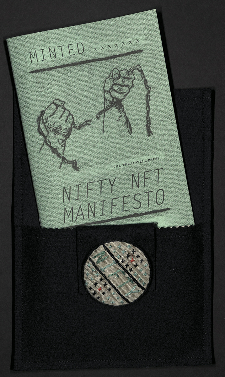
MINTED: NIFTY NFT MANIFESTO
Rachel Phillips
Pacifica, CA: Treadwell Press, 2022
N7433.4 P495 M45 2022
Minted: The Nifty NFT Manifesto is written in the voice of a fictional aging archivist and librarian named Madge Cameron (a longtime alter-ego for writer and artist Rachel Phillips). Seeking to combat the hype surrounding NFT’s (digital artworks), Cameron uses Minted to clearly define the basic components of the system — including blockchains, cryptocurrency, fungibility, NFT’s, the metaverse and Web3. Beyond definitions, Cameron urges us to take a critical look at what it means to understand NFT’s not just as new digital tools, but as a values system that elevates contrived digital scarcity over the intrinsically scarce material of our only planet.
Cameron also considers the challenges in preserving both analog and digital materials, drawing correlations and distinctions. Ultimately a deeply humanistic book, Minted warns of the perils in believing that technological newness is always progress — especially in the context of unregulated capitalism within a profoundly unequal and fragmenting society failing to effectively address climate change. Richly illustrated with photographs made by Cameron in her glitchy digital style using analog source material from her archive and the public domain.

The subtitle of Minted was inspired by a historic folk art protest pin in Madge Cameron’s archival collection of Early American Cryptographic Embroidery. The Arts & Crafts Nifty NFT Pin was intended to draw attention to the conceit of digital non-fungibility by being an intrinsically non-fungible object due to its handmade and physical qualities. In using handwork and natural materials to speak to this computerized “space” (a construct), she urges us to consider the mirage of technological promise — promise of what, and for whom? — more closely.