Printing Through the Pandemic
Checklist for Printing Through the Pandemic
Curated by Lyuba Basin and Marnie Powers-Torrey, 2022
Digital exhibition produced by Lyuba Basin, 2022
Printing Through the Pandemic
In early March 2020, under orders to evacuate the print shop, Emily Tipps and Marnie Powers-Torrey of the Book Arts Program hurriedly printed the title page and portfolio for the Festschrift for Bill , which Marnie took home to build and disseminate. The project kept minds and hands committed to progress.
Two months later, still isolated from the presses and the people who use them, the completed portfolios were shipped to participants, who sent messages of warm appreciation in return. Connecting with the book arts community in response to the passing of Bill Stuart of Vamp and Tramp Booksellers was a powerful healing and celebratory opportunity before the pandemic hit, and the impact was exponentially greater once the global grief began to settle in.
The repetition of printing offers consistency—each pass affirms progress through a stack of blank printer’s sheets, while the racked prints exude productivity. Print exchanges provide shared goals and deadlines, helping to prioritize the making—collectively, printmakers are producing timely, innovative work that serves to connect us with one another and our audiences, despite our being distanced.
Throughout the pandemic, for a myriad of reasons, many printers responded to print exchange invitations and others created artists’ books. This exhibition presents prints from a selection of print exchanges and recently purchased artists’ books from the Rare Books Collection, all produced in 2020-2021, and many in direct response to current issues.

IN A NUTSHELL
Andras Böröcz
Brooklyn, NY: Dobbin Books, 2020
N7433.4 B673 I53 2020
Continuing Böröcz's absurdist exploration of walnut shells, In a Nutshell branches off into proto-Russian Constructivist imagery of the nut-cracking hammer (minus the sickle). Böröcz was inspired by a Soviet educational children’s program from his youth. In the cartoon's logo, a young pioneer arrives on a spaceship next to a giant walnut and breaks it with a sledgehammer. Drypoint print on Masa paper with watercolor hand-coloring. Scroll housed in a walnut shell, on a walnut wood base. Edition of twenty copies, signed and numbered by the artist.
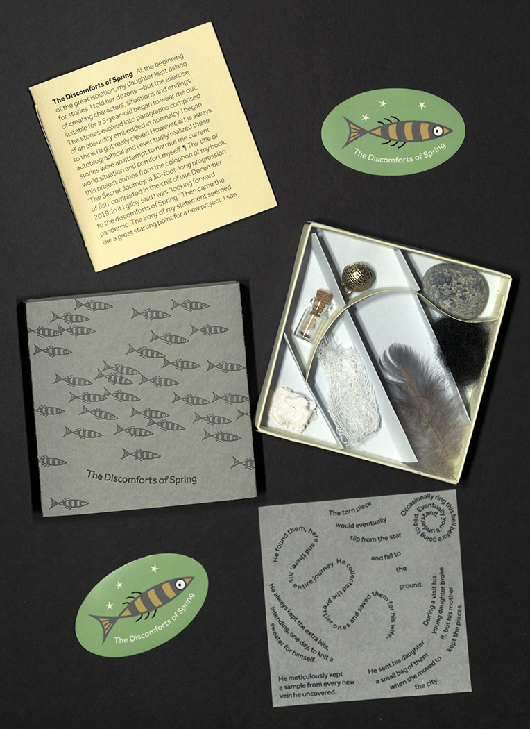
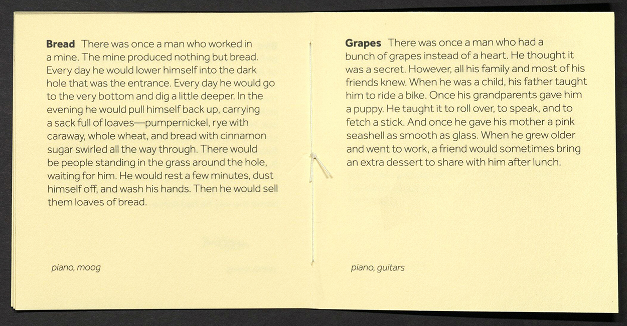
THE DISCOMFORTS OF SPRING
Robert Buchert
Provo, UT: Tryst Press, 2020
N7433.4 B833 D57 2020
From the author’s statement: “At the beginning of the Covid-19 pandemic my daughter kept asking for stories. I told her dozens – but the exercise of creating characters, situations and endings suitable for a five-year-old began to wear me out. The stories evolved into paragraphs comprised of an absurdity embedded in normalcy. The title of this project comes from the colophon of my book, The Secret Journey, a thirty-foot-long progression of fish completed in the chill of late December 2019. In it I glibly said I was 'looking forward to the discomforts of Spring.' Then came the pandemic. The irony of my statement seemed like a great starting point for a new book project. I saw the substance of the project within the stories I’d been telling. Luckily, I’d had the presence of mind to write some of them down. From these I chose seven, but couldn’t seem to coax them into pages and covers. It was when I started experimenting – mixing one of the stories into a short piece of music – that I found a working form.”
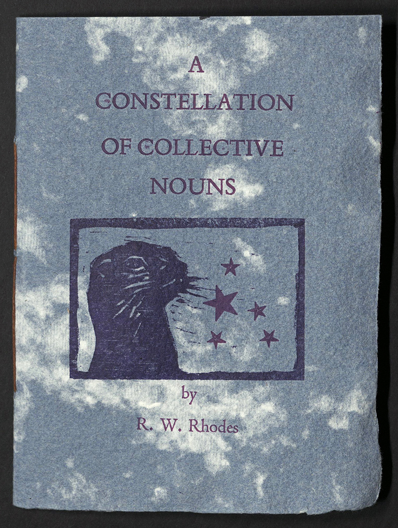
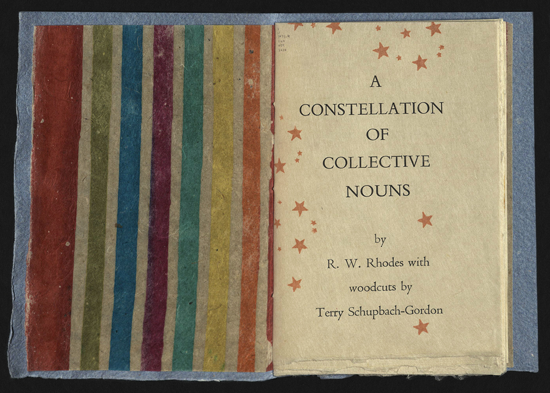
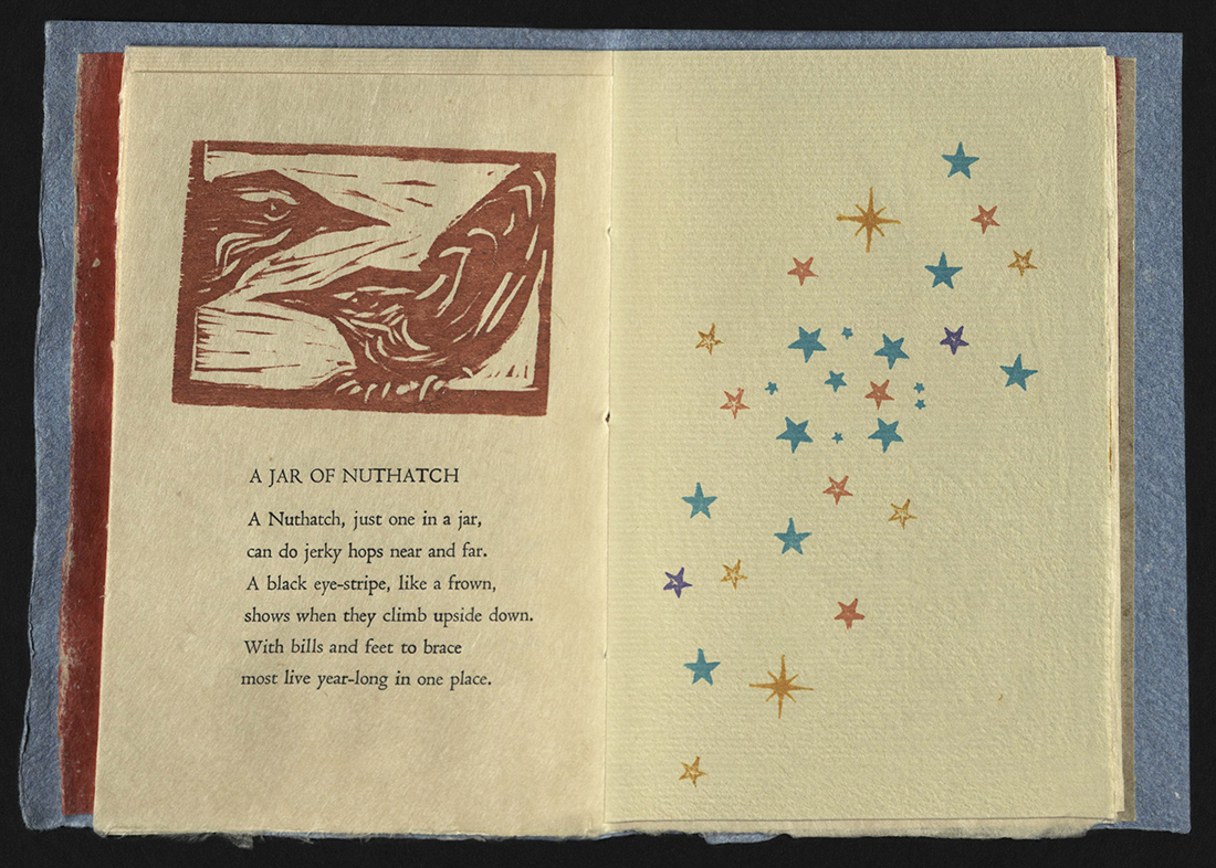
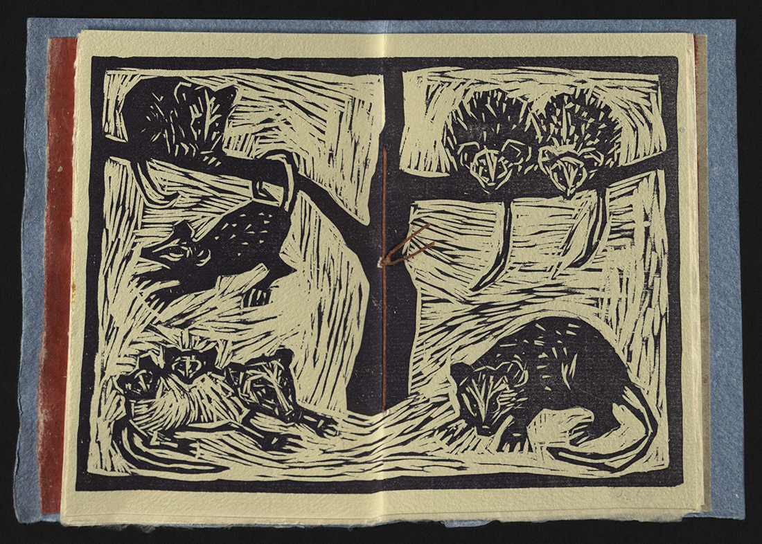
A CONSTELLATION OF COLLECTIVE NOUNS
Toby Gordon, Terry Schupbach-Gordon and R.W. Rhodes
Tobaccoville, NC: Catbird (On the Yadkin) Press, 2020
PS3618 H65 C6 2020
From the colophon: "What did we do during the pandemic of 2020? Some wrote poems, some milled wood, some set type and some cut wood. All knew that HOPE, LOVE, and ART would bring us together again… This book was made with love at Catbird (on the Yadkin) Press by Toby Gordon, Terry Schupbach-Gordon and R. W. Rhodes." Text based on the collective names of animals discovered while writing daily letters to a granddaughter. Pamphlet bound in covers of St. Armand papers. Interior sheets Kitakata to Akatoshi to Iyo glazed, and more St. Armand in various colors. Edition of fifty copies, signed and numbered by Rhodes and Schupbach-Gordon.
HOW BIG IS HOME?
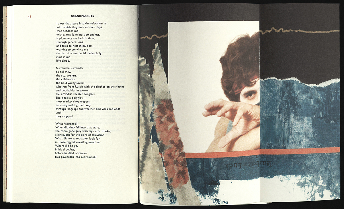
Barbara Luck
Vermont: Janus Press, 2020
N7433.4 L83 H68 2020
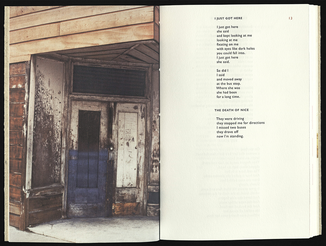
The photographs, ink knife images, and collages were digitally prepared for printing by Fletcher Manley and have been printed with an Epson SureColor P600 using UltraChromeHD inks on Strathmore Cotton and Gruppo Cordenon Canletto papers. The text was set in Gill Sans, with photopolymer plates made by Boxcar Press and printed on Canaletto paper by Andrew Miller-Brown on a Vandercook SP15; the cover is Canal paper made by St Armand Papeterie. Binding was accomplished by Amber Holden, Nancy Southworth, and Linda Lembke. This is edition is limited to one hundred and twenty copies.

A CASE OF EQUILIBRIUM
Cheri Marks
Tallahassee, FL: Blue Section Press, 2020
N7433.4 M376 C37 2020
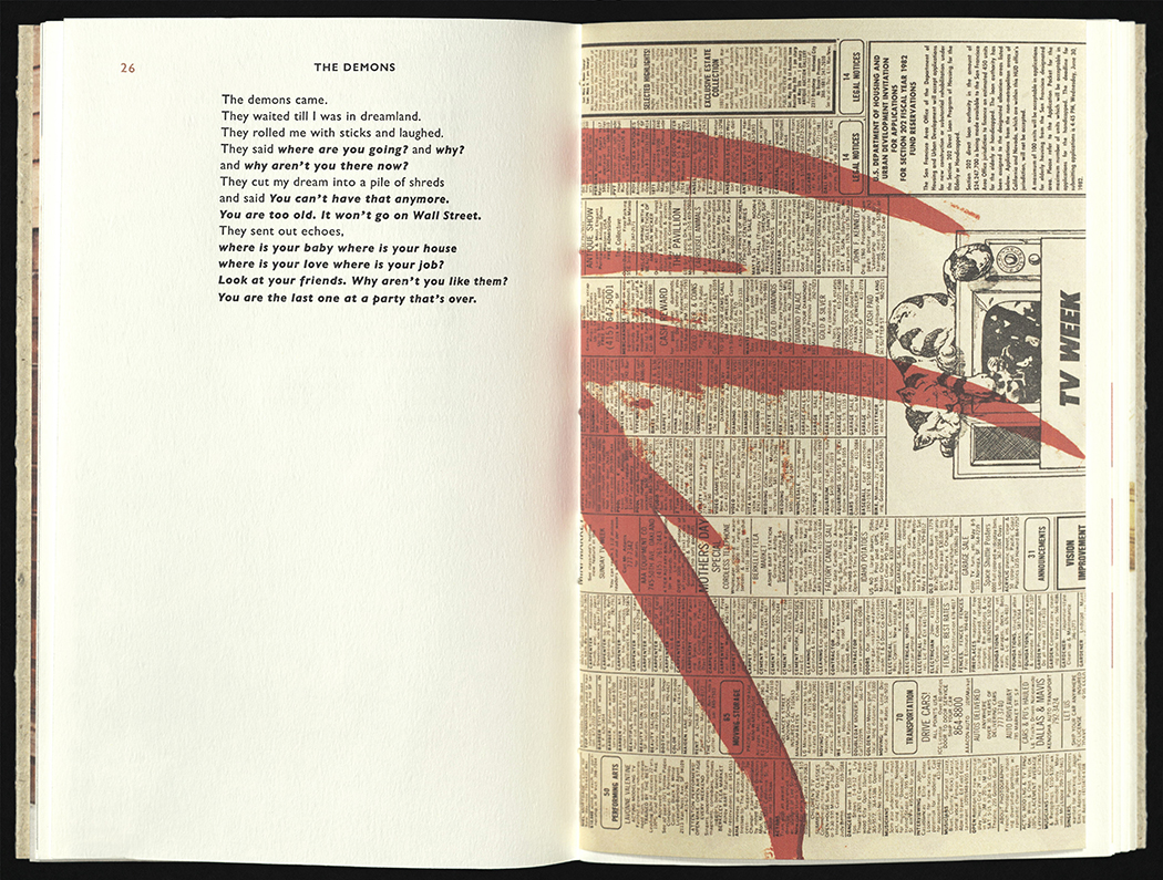
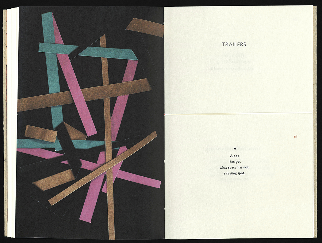
From the artist’s statement: A Case of Equilibrium explores the relationship between cyclical systems that occur, whether by deliberate choices, or natural forces, to sustain balance. The book investigates two particular cyclical events: the Gulf Stream Ocean current and personal movement within a structural space. The two form a personal connection based on geographic location. They are built around stability and intentionality while considering constants that occur throughout cycles to maintain equilibrium.” Images inspired by the Gulf Stream Ocean current and floorplan of the artist’s current residence. Text inspired by Walter Cannon's four core concepts that define homeostasis found in his book, The Wisdom of the Body, and Matthew Fontaine Maury's The Physical Geography of the Sea. Double sided accordion. Letterpress Printed using photopolymer and placemats on French Paper Smart White. Boards covered in book cloth with paper title label. Edition of twenty-five copies, signed and numbered by the artist.

PHLOGISTON
Clifton Meador
Boone, NC: Clifton Meador, 2020
N7433.4 M43 P45 2020
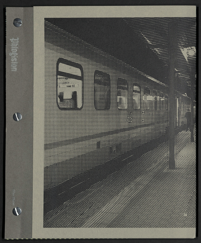
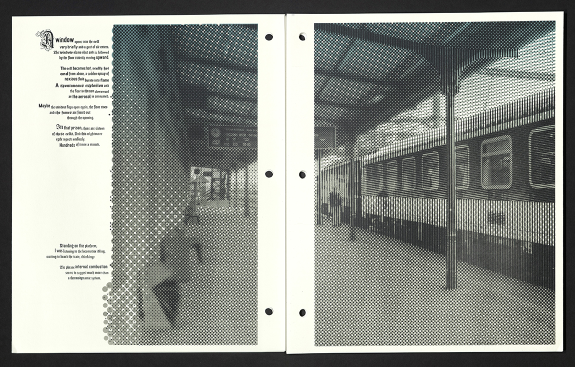
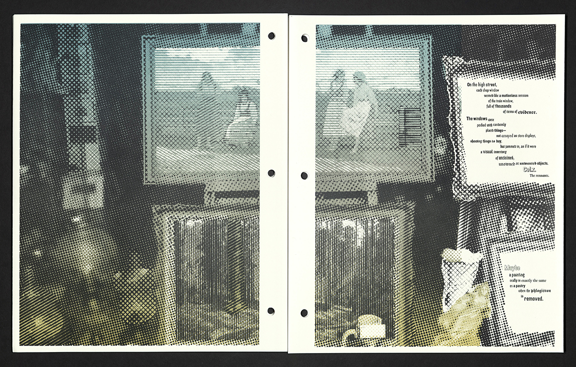
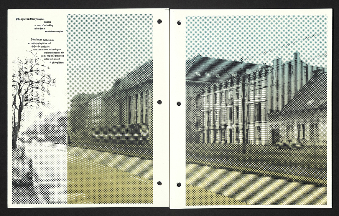
From the artist’s statement: "When the Pandemic started, like many people, I started reading books about the plague. Daniel Defoe’s Journal of the Plague Year – while tedious – caught my imagination. So many of the things he described in London in 1665 seemed familiar. The rich fleeing the city, leaving their servants behind to protect and maintain their properties (and thus die from the plague!), strange ideas about the origin of the plague circulating wildly, and an odd precursor of doom-scrolling – a daily publication in the City of London of deaths – becoming a popular obsession. Looking over the digitized books in the internet archive on the topic of the plague left me with the impression that there were a very large number of books written about the plague. Being fascinated by the history of typography, I started collecting the title pages of these books. One thing led to another, and I produced this little project of the bills of mortality printed opposite overprinted plague book title pages. During this process I discovered that one of the risograph colors in our studio is somewhat opaque, and that led to the cover. History feels like a pile of old title pages: nothing human is really new, and this plague is either a re-run of an old story, or foreshadowing of something much worse." Offset lithographed in split fountain and black. Printed on Mohawk Superfine Post bound with wrap cover from back to front over fore-edges. Edition of one hundred twenty-five copies.
DON'T CUT YOUR HAIR, IT'S BEAUTIFUL
Reno, NV: Black Rock Press, 2020
Kellee Morgado
N7433.4 M649 D66 2020
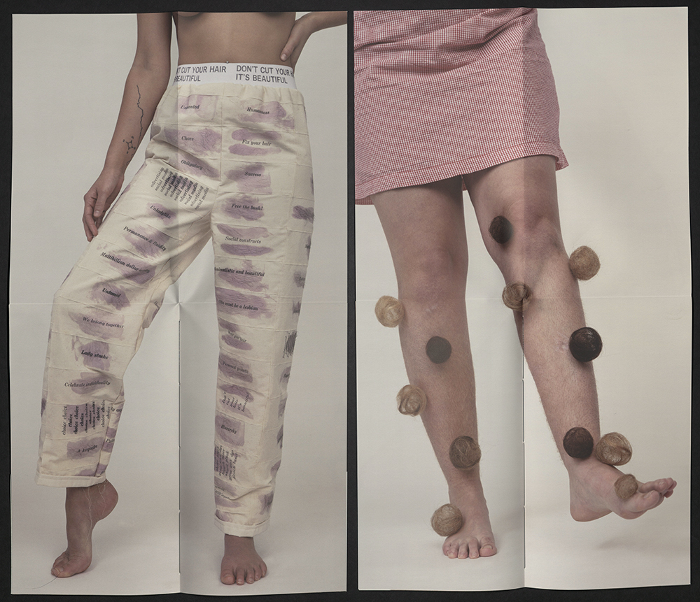
Don’t Cut Your Hair It’s Beautiful disrupts and explores the relationship between hair that is considered valuable and hair that must be hidden, removed, and made invisible. The book includes contributions from twelve creatives in particular, but not limited to, those working with hair as a subject or material. These individuals were invited to respond to one of several prompts or to generate their own response about hair on the body. They could also choose to include an image, either found or made. These twelve writings provide thoughts and experiences surrounding hair, multiple points of access, and themes connected to hair on the body including: shame, resistance, and identity. Don’t Cut Your Hair It’s Beautiful is a set of interactive books that asks the reader to fold and unfold pages to construct or reveal images and text. Through the use of fragmented images, readers are encouraged to explore multiple possibilities of sequencing and arrangement where covers pair with center spreads to construct complete images. Offset printing on Ultra Green Film, letterpress printed with News Gothic Bold and Century Bold Italic. Participants include AB Gorham, Alisa Banks, Frances Melhop, Althea Murphy-Price, Rebecca Drolen, Jayoung Yoon, Kellee Morgado, Kate Kretz, Suzanne Gold, Kat Howard, Sarah Scarr, and Judith Rodby. Edition of fifty copies, signed and numbered by Kellee Morgado.
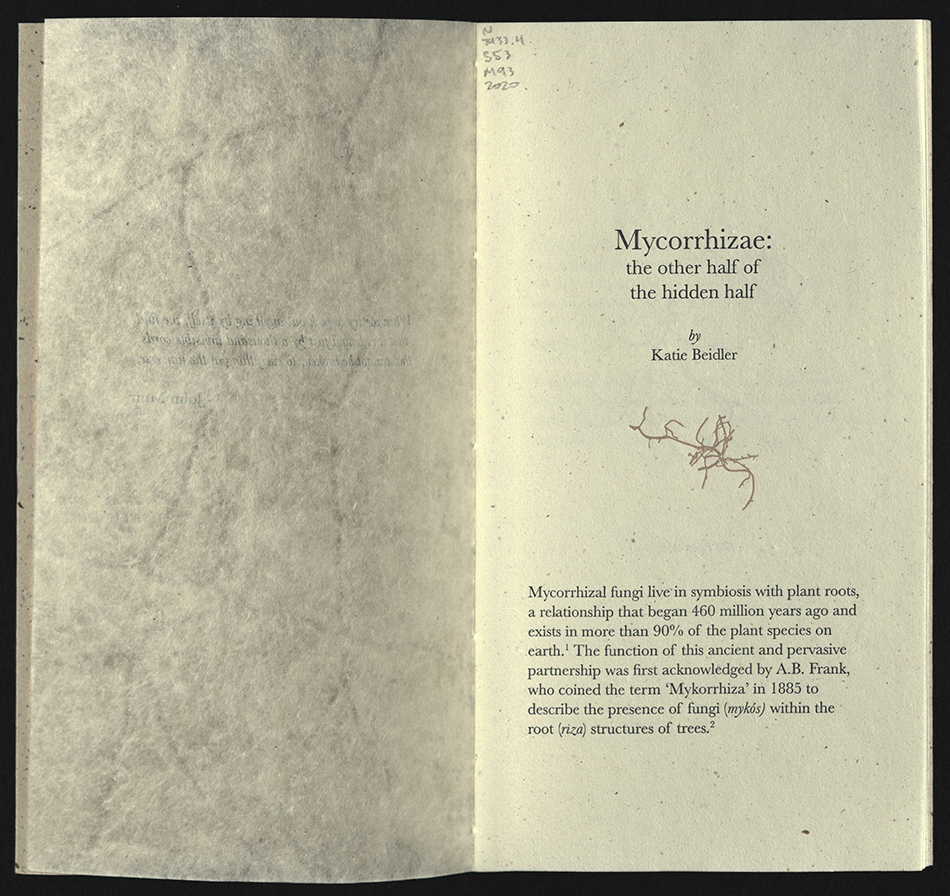
MYCORRHIZAE
Jillian M. Sico
Tuscaloosa, AL: Frogsong Press, 2020
N7433.4 S53 M93 2020
From the artist’s statement: "Mycorrhizae explores connectivity and loss from a personal and ecological perspective through an examination of mycorrhizal fungi… Research for this project took place in the Cohutta Wilderness and Wildlife Management Area in the mountains of North Georgia. Throughout the course of the project, personal reflections on love and loss became intertwined with research about mycorrhizae and the history of the forest. I knew that I was documenting only a moment in time: this place as I knew and remembered it would one day be gone. Although we may lose a place, we can adjust and form new connections while still earnestly mourning the loss of what was. I used papermaking as a performative medium to tie the book materially to a specific place and time. I formed sheets from linen fibers that had been buried at the base of a tulip poplar tree in the Cohutta, intertwining with mycelium, fine roots, insects, and worms, and drew organic patterns in the pulp with charcoal harvested from the same tree. I created watermarks based on images of mycelium I saw in soil samples under a microscope, scanned tree roots, and poured jugs of mushroom spores into paper pulp. The sound and texture of the finished paper, along with reflective text and images, recreate for the reader the experience of genuine connection with the forest. Mycorrhizae is a collaboration that includes a personal, reflective text by the author and an accompanying informational text by ecologist Katie Beidler. The collaboration highlights both the personal, specific and scientific, universal aspects of mycorrhizal connections in a forest ecosystem." Letterpress-printed on a Vandercook #4 press at the University of Alabama with Baskerville type. Edition of twenty-two copies, signed and numbered by Jillian Sico.
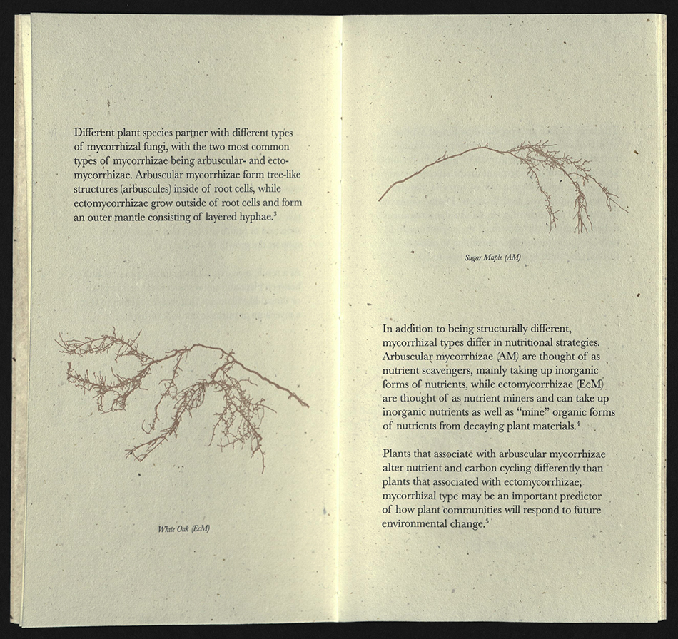
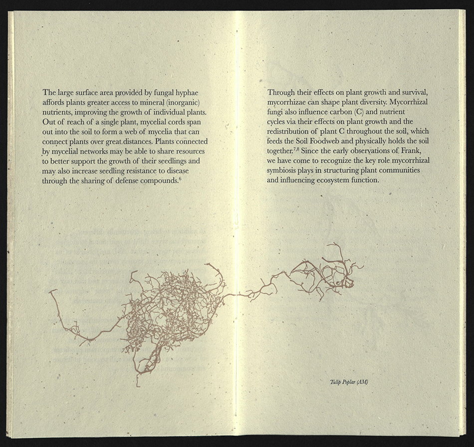
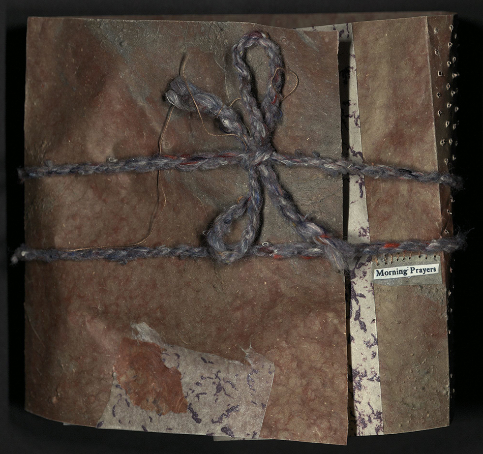
MORNING PRAYER 3
Robbin Ami Silverberg
Brooklyn, NY: Dobbin Books, 2020
N7433.4 S548 M67 2020
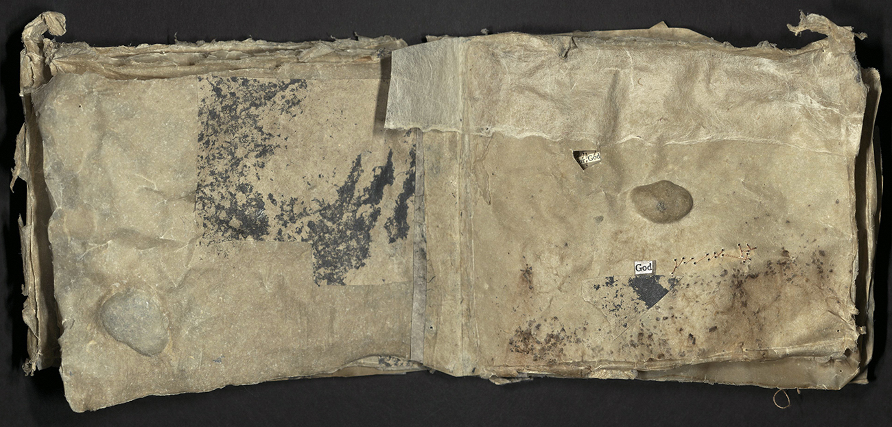
From the artist’s statement; "This small series is a re-visit to an earlier project of the same name. The book focuses on the misogynistic portion of the Jewish morning prayer which males recite: giving thanks for not being born female. This misogynist phrase is sewn onto at the penultimate page with a ripped piece of cloth embedded into the paper (referencing the rent clothing, part of Jewish ritual mourning). The series is made of skin-like (flax) papers with embedded stones (referencing the stoning of the adulteress) and materials that scar and deface it." Sewn text on Dobbin Mill papers with embedded stones and other mixed media. Encased in a parchment-like paper wrapper with patterned piercing. Made in an edition of six variants.
DELIRIUM
Philip Zimmermann
Tucson, AZ: Spaceheater Editions, 2020
N7433.4 Z55 D45 2020
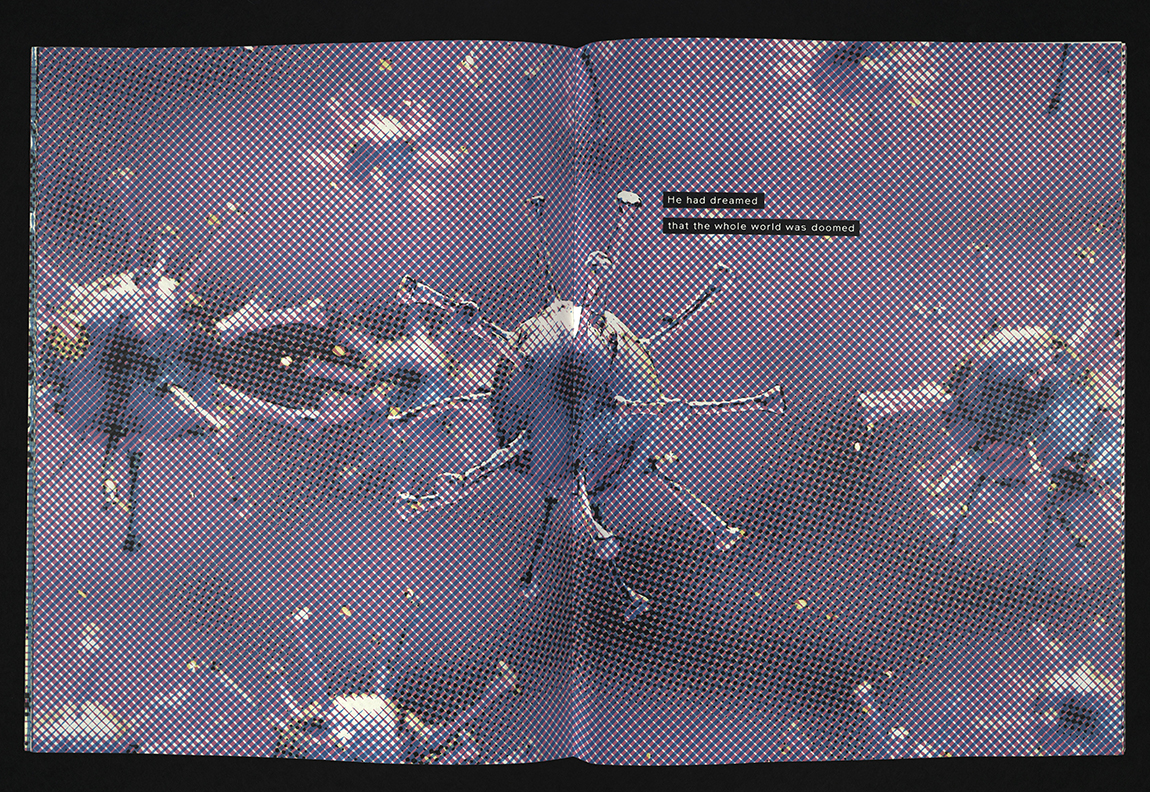
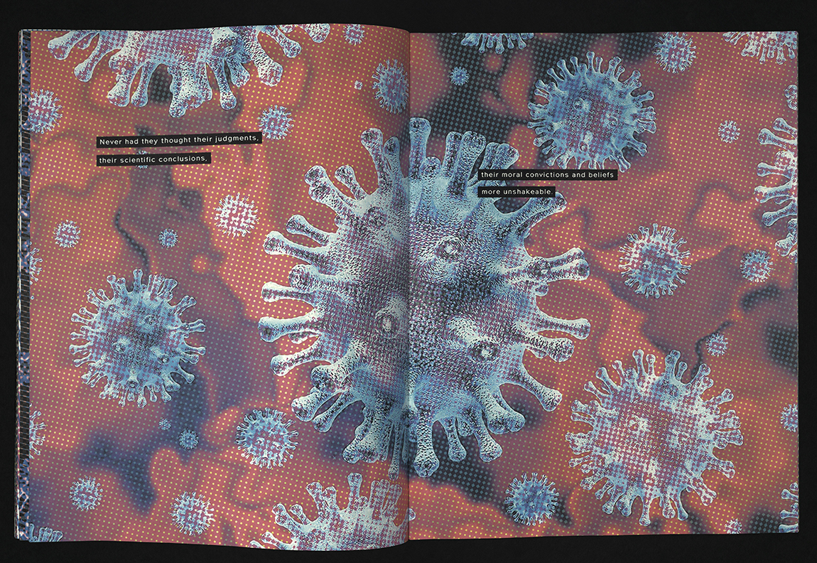
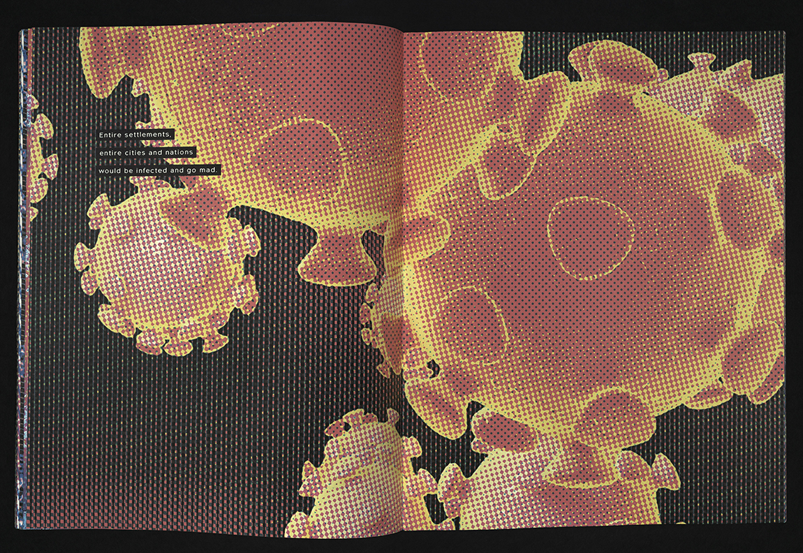
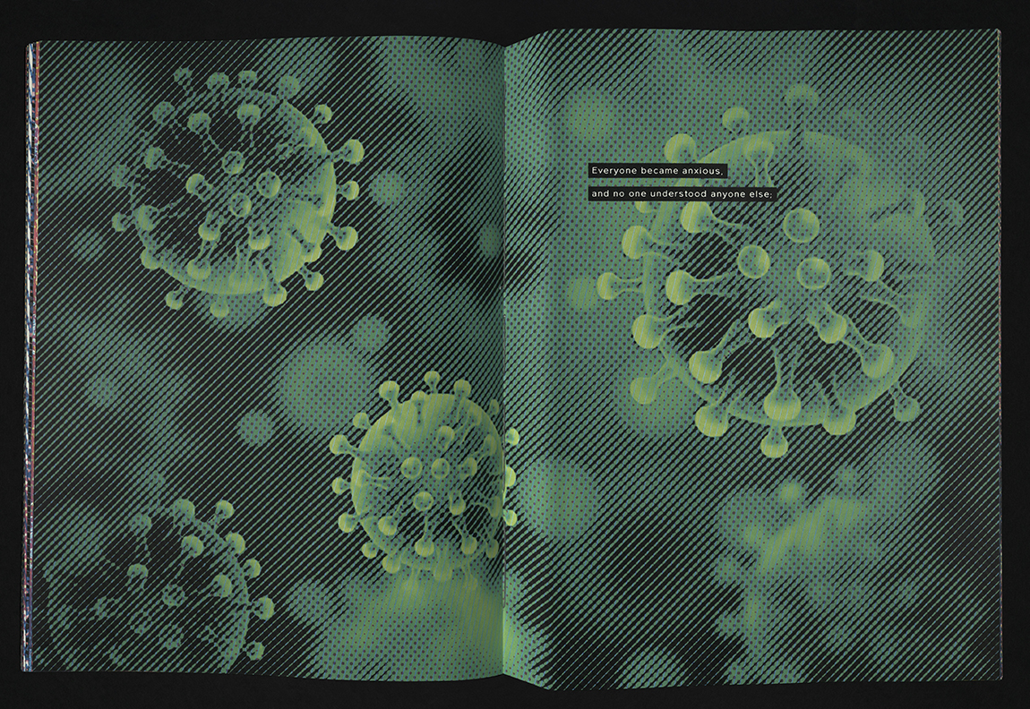
Delirium is a book born of the Covid-19 pandemic and time spent in lock-down. The text uses a paragraph from the 1866 masterpiece, Crime and Punishment by Fyodor Dostoyevsky. Towards the end of the book, his protagonist, Rodion Romanovich Raskolnikov, has a feverish dream. This strangely prophetic text is quoted and used as a narrative line in this book. Highly manipulated images of jewel-like approximations of the coronavirus appeared all over the web in the first few months of the pandemic, and serve as the illustrations. Delirium was printed in 2020 using archival-pigmented inkjet on Mohawk acid-free paper, 60 pages, in an edition of thirty, handbound by the artist, and signed and numbered. The font used for the text is Northwoods, by Cultivated Mind Foundry in Vancouver, BC, Canada. It was picked for its resemblance to a late nineteenth century schoolbook typeface, while appearing quite modern. Like many of their digital fonts, it was originally created with careful strokes of a sign-painter’s paintbrush. University of Utah rare books copy is number 11.
SHE FEELS YOUR ABSENCE DEEPLY
Golnar Adili
Rosendale, NY: Women’s Studio Workshop, 2021
N7433.4 A35 S54 2021
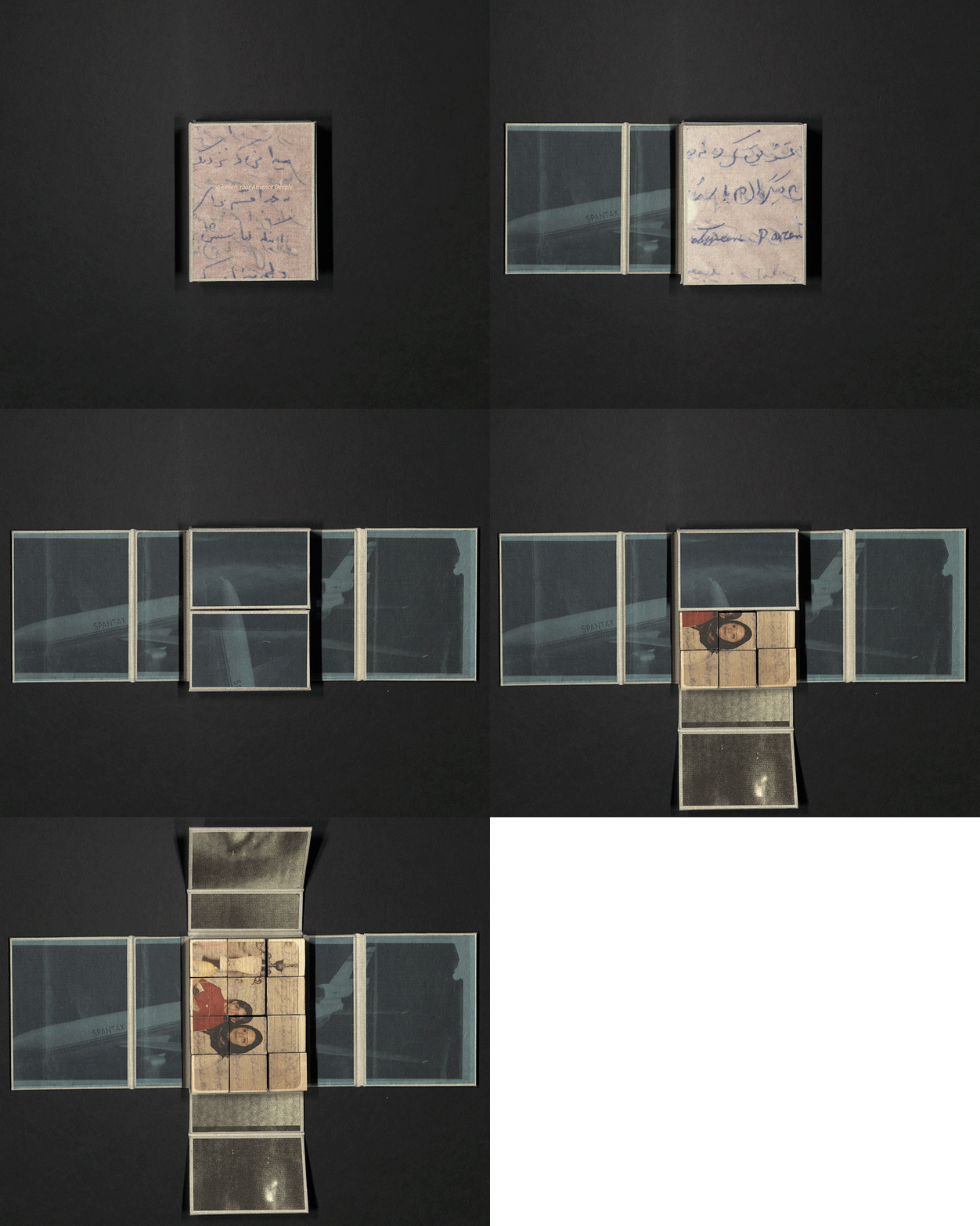
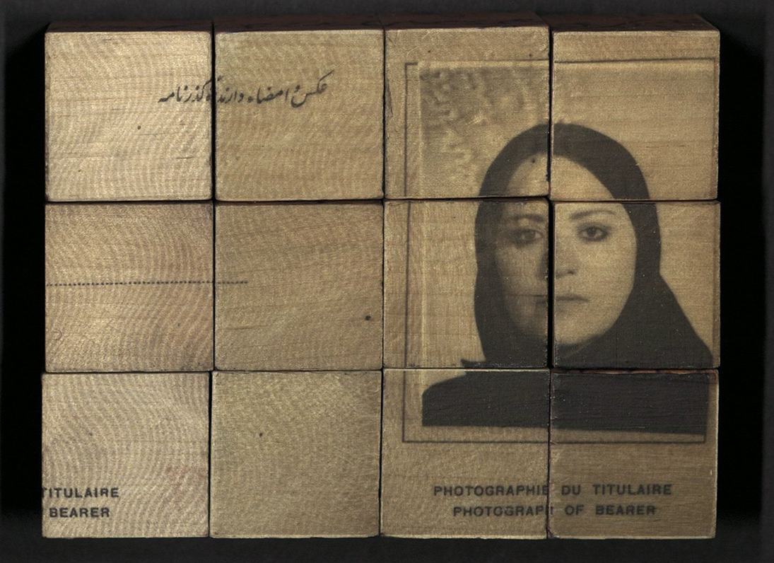
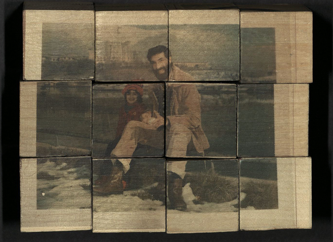
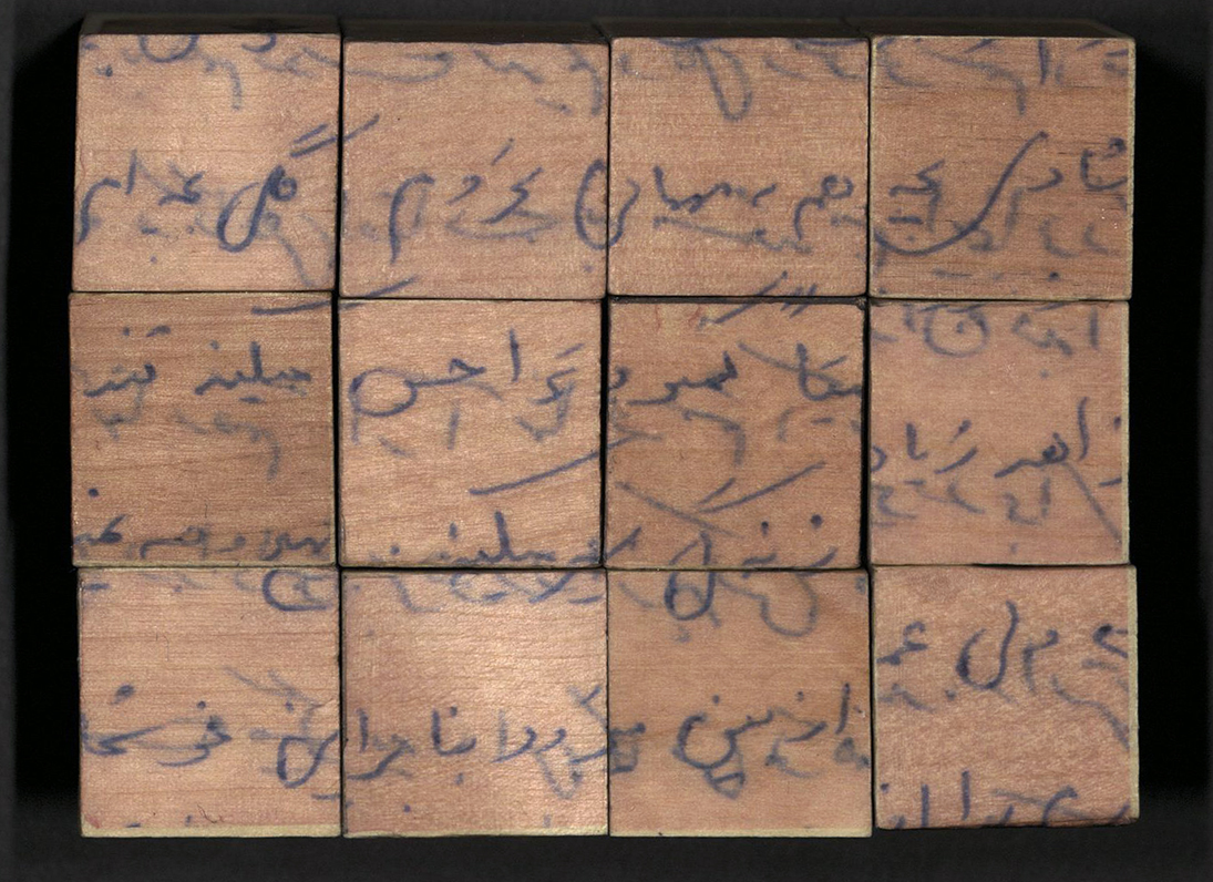
She Feels Your Absence Deeply utilizes materials from artist Golnar Adili’s archive of letters, photos, and printed matter once owned by her father. The collection spans from 1979, when Adili’s family migrated back to Iran from the United States, and continues through 1981, when her father escaped Iran for fear of persecution due to his activism. Inspired by children’s puzzle books, images are printed on six-sided cubes allowing the viewer to obscure, reveal, mix, and match the intimate artifacts from Adili’s collection. The blocks are housed inside a portfolio box that opens flat and carries the print of the airplane ticket used in the final leg of her father’s long journey from Iran. When the box is closed the airplane hugs the blocks, keeping the events inside until they unravel again to tell a visual story of how a family was affected by larger political shifts. Created in an edition of fifty copies.
LA MANO DELL'UOMO
Bruno Caruso (1927-2018)
Santa Fe, NM: The Press at the Palace of the Governors, 2021
NC257 C37 A4 2021
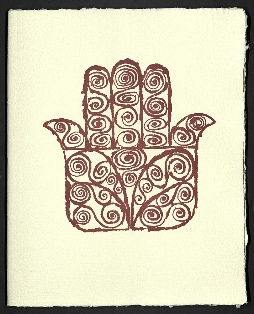
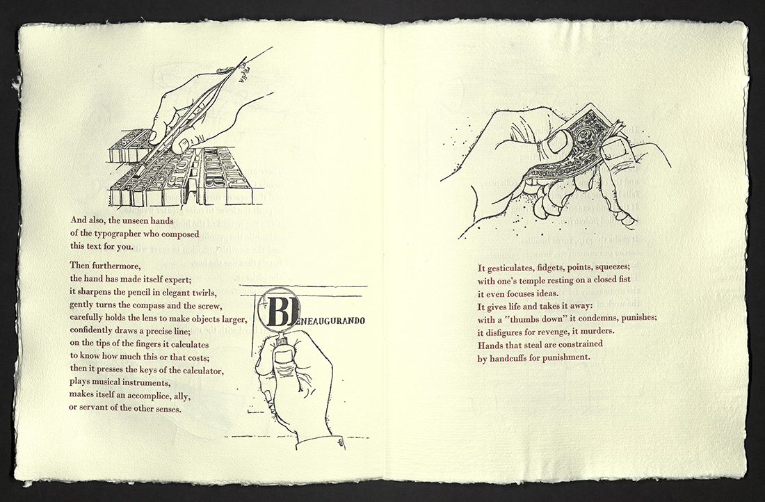
In La Mano dell’Uomo, Brian Caruso’s line drawings show hands engaged in activities humble, practical, and tender. The book, originally published in 1965, inspired Tom Leech and Lynn Sures to create a translated, fine press edition. In keeping with Caruso’s vision, it was important for the pair that the book be as “handmade” as possible – the type would be set by hand and the paper would be handmade. Leech and Sures began the work in Fabriano during an artists’ residency at the Museo della Carte e della Filigrana. There, they made nine hundred sheets of paper bearing the historic watermarks from Fabriano, where paper has been made for almost eight hundred years. The project later continued back in the United States but was delayed for more than a year by the ongoing pandemic. The final “hands-on” sessions took place in Santa Fe at the Palace Press in the summer of 2021. This fine press edition of La Mano dell’Uomo was letterpress printed on twenty-four pages, soft-bound and enclosed in a clamshell box made by Rosalia Galassi. The typefaces are handset in Bembo and Monotype Bodoni, cast by Ed Rayher at Swamp Press. Caruso’s illustrations were printed from polymer plates made by James Bourland. Printed in an edition of one hundred copies. University of Utah rare books copy is numbered 25.
THIS WAY, THAT WAY: LOST IN A PANDEMIC
Marcia Ciro
Watertown, MA: Marcia Ciro, 2021
N7433.4 C57 T45 2020
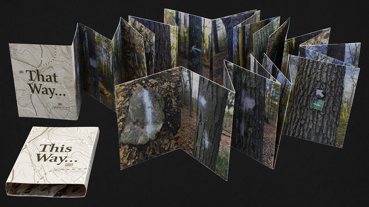
From the artist’s statement: "Like many, I have felt the push and pull from this chaotic pandemic event of 2020-2021, where information changed daily and no one knew what was on the way. At the same time, many of us found solace in the outdoors, which, really, was the only place we could go for a while. My book combines the chaos with nature to express the feelings of uncertainty and fear that we have all experienced over the last year and a half, and a little comic relief at the pandemic's expense." Snake fold construction. Original photographs digitally printed on recycled paper. In printed sleeve. Edition of twenty-five copies, signed and numbered by the artist.
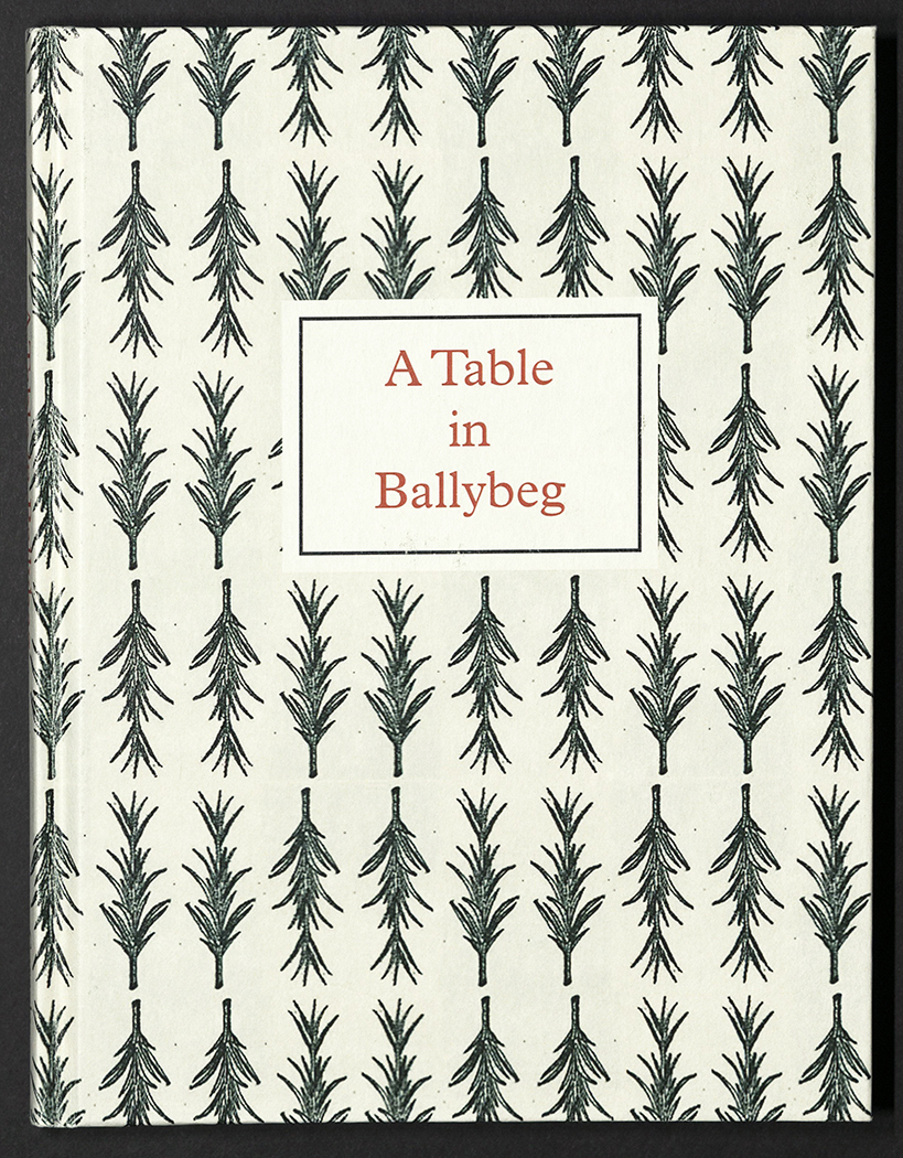
A TABLE IN BALLYBEG
Simon Cutts
Clonmel, Tipperary, Ireland: Coracle, 2021
PR6053 U875 T33 2021
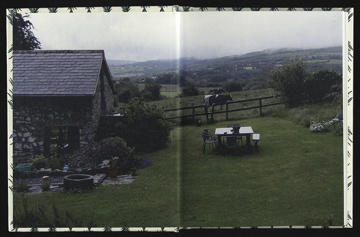
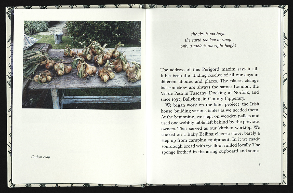
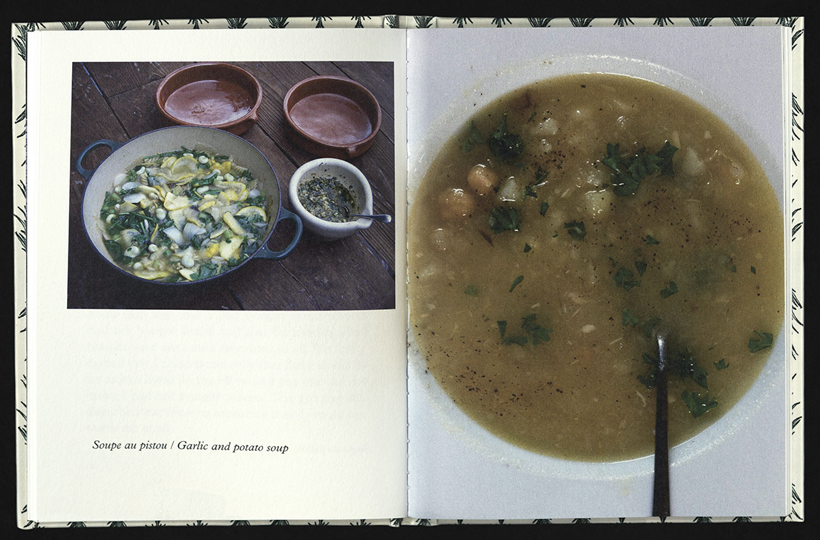
A selection of dishes and images made at the time of the pandemic lockdown in Europe, but where life in the valley of Ballybeg was much as it usually is – although with no visitors. For almost a year, Simon Cutts and Erica Van Horn, along with other contributors and collaborators of Coracle Press, made their own food, as there were no cafés to visit, no tables to travel to, no take-away. The selection of dishes and images was largely an accident. What was photographed and sometimes listed becomes what was remembered. This assembling is about food eaten immediately at the time it is prepared, shared and lingered over with friends. There are not recipes, just a chance occurrence of available produce modified by intention and previous use, sometimes permanent leftovers, the joy of ingredients within an attitude to eating. Edition of two hundred and fifty copies.
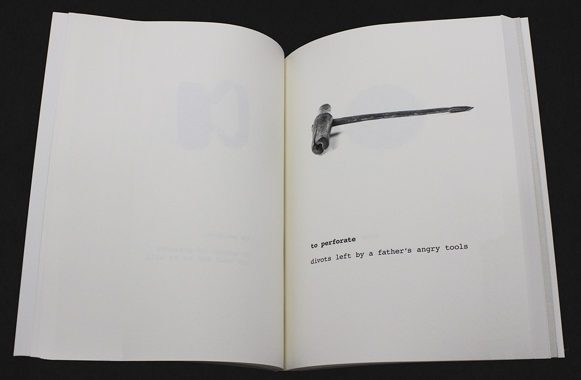
THE INTERPRETED OBJECT
Lyall Harris and Patricia Silva
Charlottesville, VA: Lyall F. Harris, 2021
N7433.4 H36866 I59 2021
An artists’ statement and a short essay by Brunella Baldi (Cartavetra Gallery, Florence, Italy) introduce sixty-four black and white images of objects, each with a corresponding poetic text, that represent the body of work from The Interpreted Object. Originally an installation, this work by collaborators Patricia Silva and Lyall Harris finds form in an artists’ book. In The Interpreted Object, forgotten objects find new artistic and poetic expression. The artists searched for quasi-obsolete objects where the original purpose or use had been lost. The ‘action’ intrinsic to the object – a knife cuts, a spoon stirs – was therefore also lost, which allowed the artists to assign new actions (‘title’ verbs), according to what they perceived to be the ‘spirit’ of the object. Along with the verbs came poetic phrases that further interpreted the objects and imbued them with meaning. Verbs and phrases found form in corresponding booklets, one for each object. Through this process of (re)discovery, Silva and Harris revisit, in new ways, familiar themes of motherhood, loss, memory, and relationships. Edition of one hundred copies.
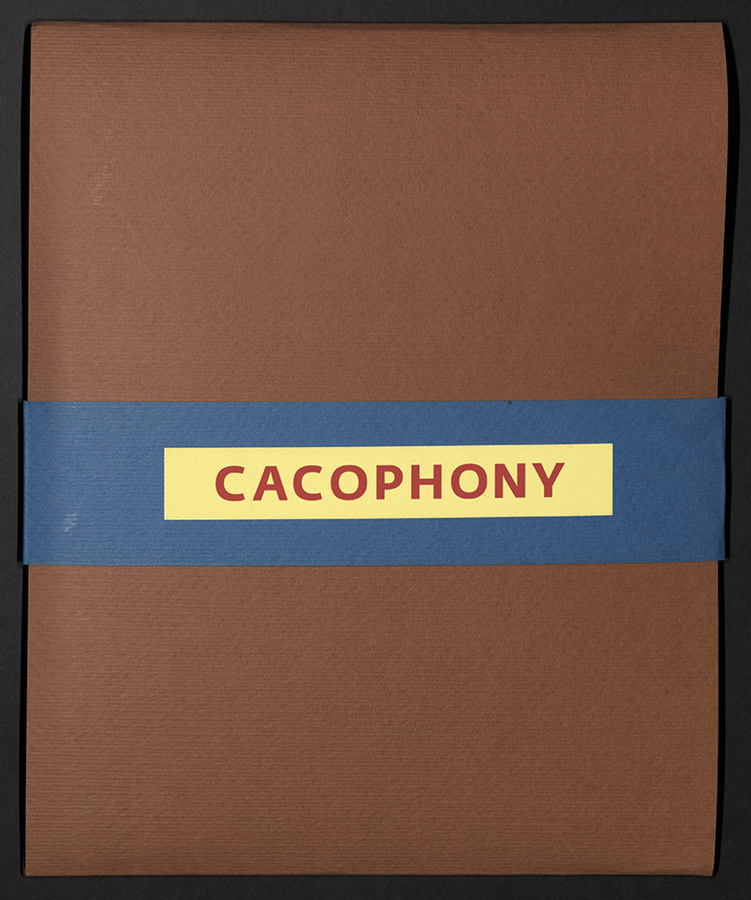
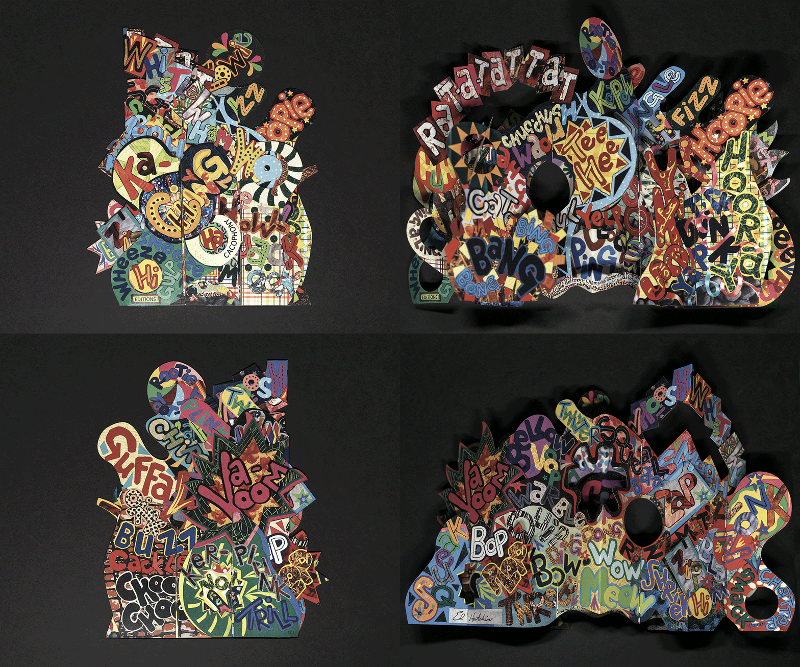
CACOPHONY
Ed Hutchins
Salem, NY: Ed Hutchins, 2021
N7433.4 H87 C33 2021
From the artist’s statement: "Sounds are unseen, they can be heard but not viewed. Five interwoven pages fold flat, yet spring open to a visual uproar of sounds… sounds from nature, wild beasts, machines, weather, music, excitement, frustration, and life itself. Racing across intersecting surfaces and erupting from interior chambers – whether seen from the top, bottom, front, back, sides, or through viewing ports – a wide-ranging cacophony of sound expressions emerges in visual form. The kaleidoscope presentation begs to be picked up, unfolded, turned, twisted, tumbled, and contorted in every way to explore the many nooks, crannies, and hidden crevices. Each perspective presents additional words, resulting in a cacophony of imaginative sounds.” Five interwoven pages fold flat. Non-adhesive pop-up structure. Laser printed in full color on 12pt. Accent Opaque White Cover Smooth paper. Laser-cut and hand-assembled. Custom Fabriano Morillo portfolio and information card. Vector diagram and laser cutting by Joe Freedman. Structure design and artwork by Ed Hutchins. Edition of two hundred copies, signed and numbered by Ed Hutchins.
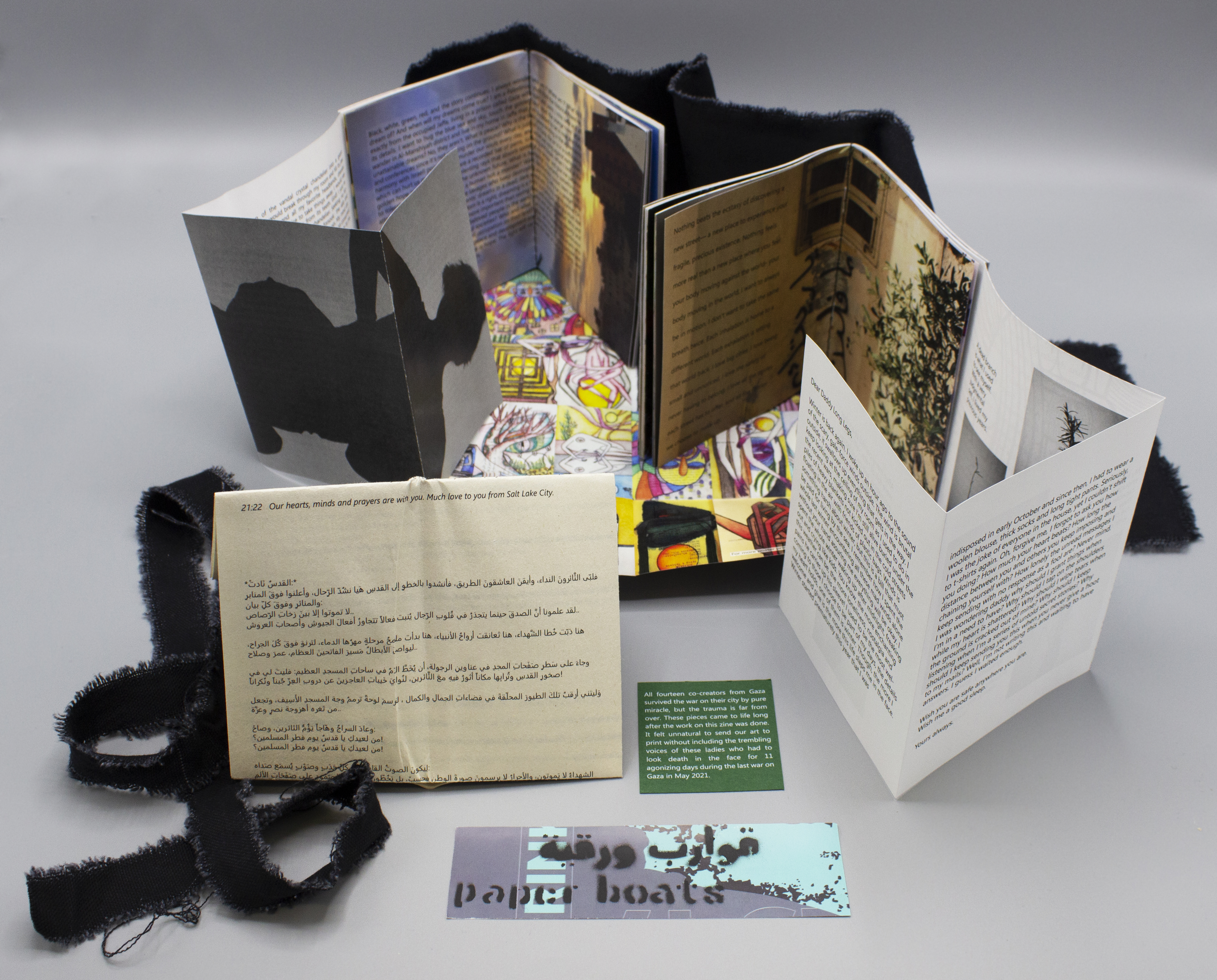
PAPER BOATS ZINE
Tamrika Khvtisiashvili
Salt Lake City, UT: 2021
N7433.4 H313 P37 2021
Paper Boats is a collaboration between fourteen Palestinian women living in Gaza and three American women living in Salt Lake City. It is a collection of essays, poetry, photography, and art. The zine was compiled before, during, and after the last Gaza-Israel eleven-day war in the spring of 2021. Only one hundred editions of the zine were printed through a small press with many parts of the book made and assembled by hand. The project was part of Skidmore College MDOCS Storyteller Institute Forum in April of 2021.
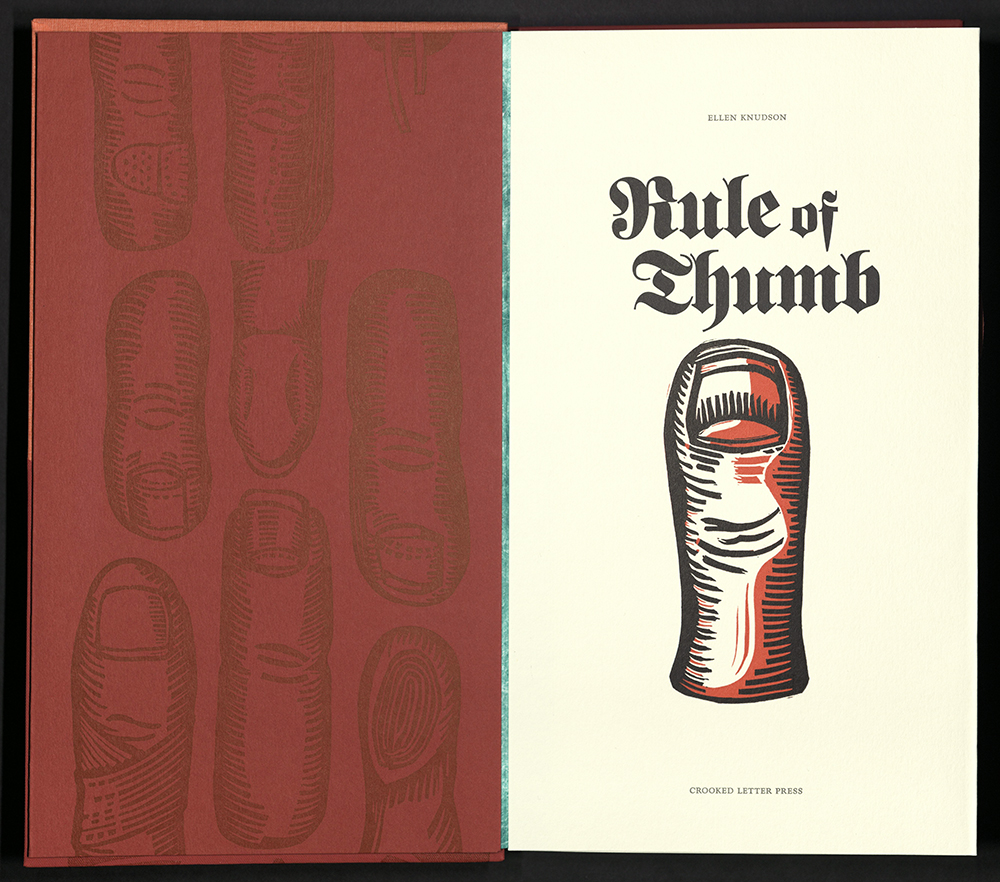
RULE OF THUMB
Ellen Knudson
Gainesville, FL: Crooked Letter Press, 2021
N7433.4 K636 R85 2020
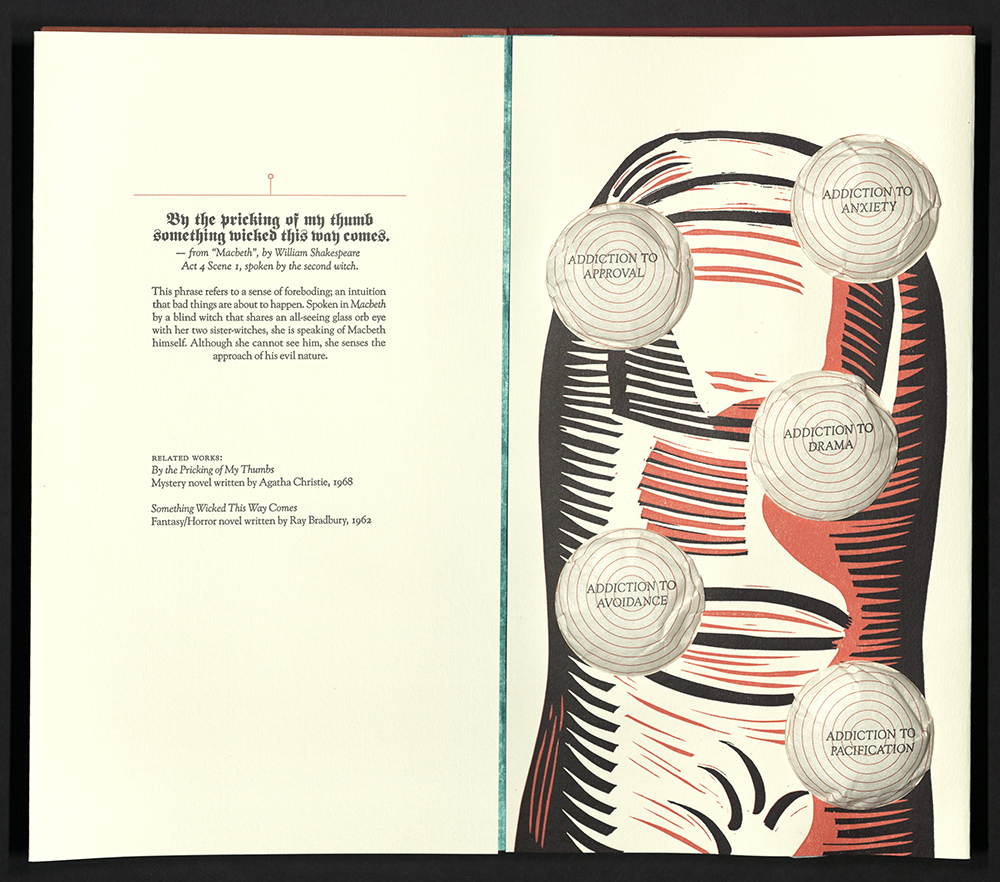
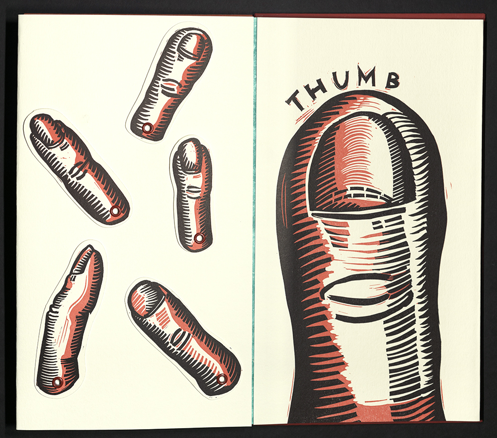
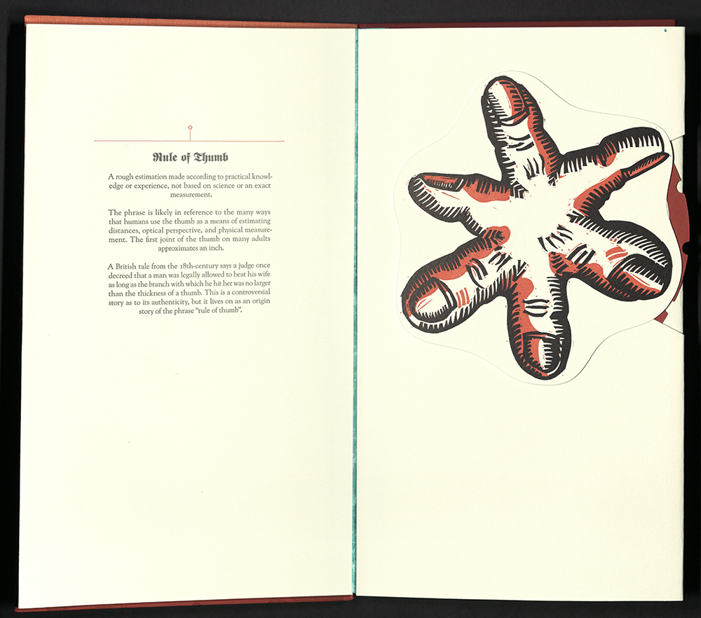
Rule of Thumb by Ellen Knudson is a moveable book about the historical human obsession with ourselves and with approval from others. In the last ten years, we have become obsessed with living online instead of actual living. We seem to only care about how many thumbs up, likes, or hearts we can accumulate on social media platforms. We practice a psychological social separation. We live virtual lives. Now, with the proliferation of the Covid-19 virus, we are living with the physical reality of social distancing. How will we make it back? Can we make it back? Rule of Thumb considers the ways in which humans have used our thumbs to twist reality and ruin ourselves. Rule of Thumb uses types of moveable construction (pull-tabs, volvelles, and pop-ups) to accentuate the use of thumbs in our lives. Quotations about thumbs accompany the illustrations and movables. Quotes and references range from the song "Under My Thumb" by the Rolling Stones to a quote from "Satires" by Juvenal. Printed on and constructed from Colorplan paper. Letterpress printed from linoleum reduction blocks and photopolymer plates. Printed using Goudy Old Style typeface for text and Fette UNZ Franktur for titles; Frutiger typefaces for Colophon. Accordion spine binding with illustrated boards. Laid in matching folding box. Edition of forty copies, signed and numbered by the artist.
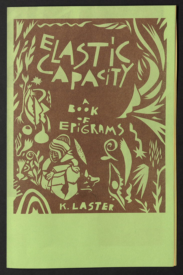
ELASTIC CAPACITY
Kate Laster
Oakland, CA: National Monument Press, 2021
N7433.4 L366 E53 2021
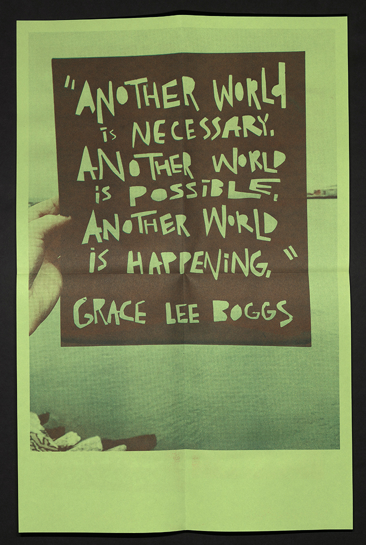
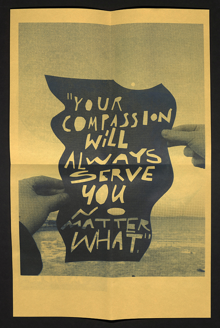
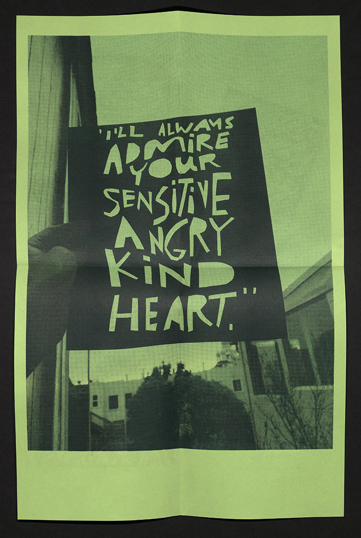
From the colophon: “This book of epigrams is for my father, Martin Moshe Laster (1952-2021)… All these papercuttings were done after hours at my job amid the shite year of 2021. Late-stage capitalism, anxiety, collateral political urgency, embedded grief, a cavalcade of rejection, while working full time. The year I lost my dad. We carry people with us. And yes, I carry words with me. Incendiary texts. Growing up so many pages echoed in our home. Now my dad echoes in pages…” National Monument Press is the California-based publishing project of Zach Clark, focused on sharing uniquely American stories through small edition artists’ books, zines, printed ephemera, and curatorial projects, conceived of and completed largely through collaboration with other artists. National Monument Press published mostly using a Riso RZ310, RZ220 or MZ1090, a Challenge proofing letterpress, and various screen-printing screens and squeegees.
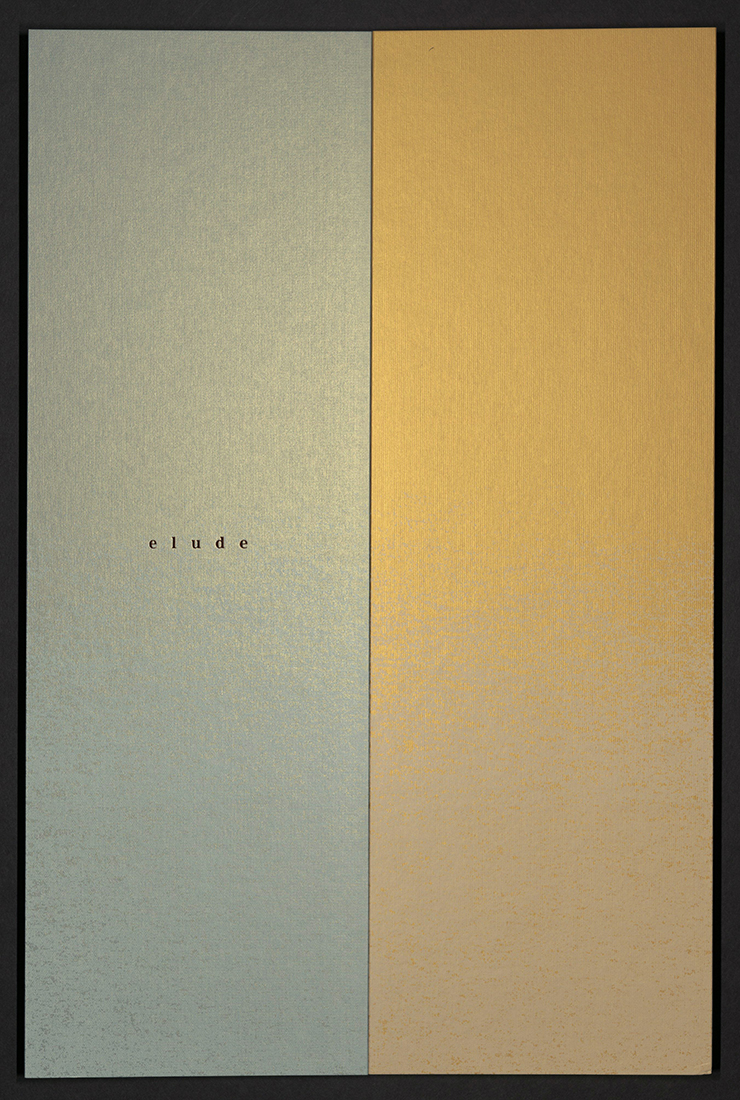
ELUDE
Jule Claudia Mahn
Leipzig, Germany: Verwandte Objekte, 2021
N7433.4 M338 E48 2021
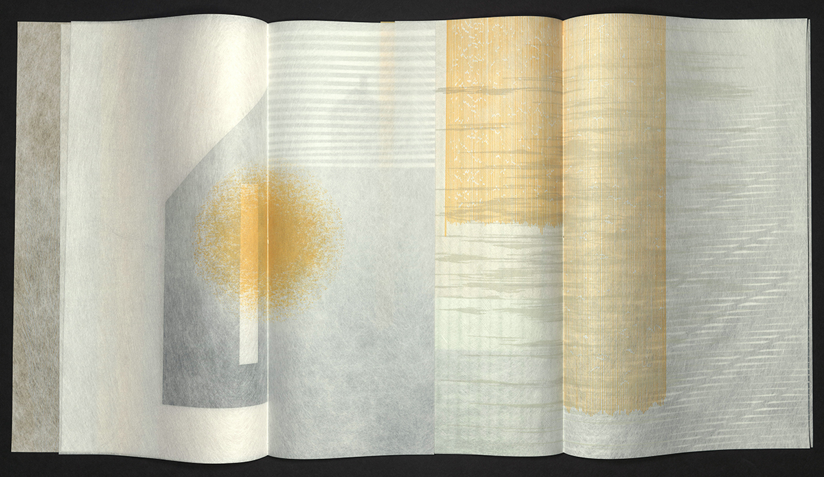
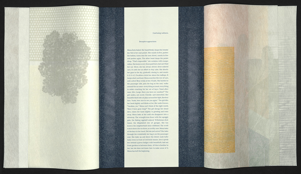
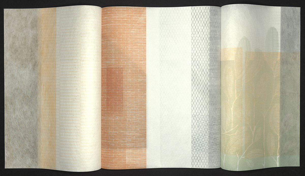
From the artist’s statement: "Mona is standing in the living room in front of the ancestral portrait gallery. Her eyes wander along the long rows of small frames. Carefully, she looks at one face after the other; a lot of polite smiles, mostly friendly distance in them. Next to this, rare exuberance. Now and again, the beautiful moment of absent concentration can be seen. 'Please tell me what,' whispers Mona, 'do you have to do with me – and what do I have to do with you?' The disappearance begins unnoticed. Gradually, but steadily, the connections to people and events are cut. If Mona tries to hold a thought, it slips away into the diffuse. Then the restlessness returns: Who am I if I can’t remember anything? A cut runs lengthwise through the text. Mona’s story is held together by parallel page turning and thus becomes readable. On semi-transparent pages of varying widths, house facades, water, ventilation shafts, fences and other set pieces of urban space are constantly overlapping and rearranging themselves in relation to one another. The individual rhythm of turning the pages on both sides results in a multitude of possibilities for wandering through the terrain. At the same time, a feeling of disorientation arises, because in the end one will have to find the way back." Translation by Bradley Schmidt. Archival pigment print on Metapaper Greenwhite. Embossed with foil as well as printed letterpress using photopolymer plates and linocuts on Hollytex nonwoven. Experimental binding with open stitching on both sides. Housed in a paper-covered case. Edition of sixteen copies, signed and numbered by the artist.
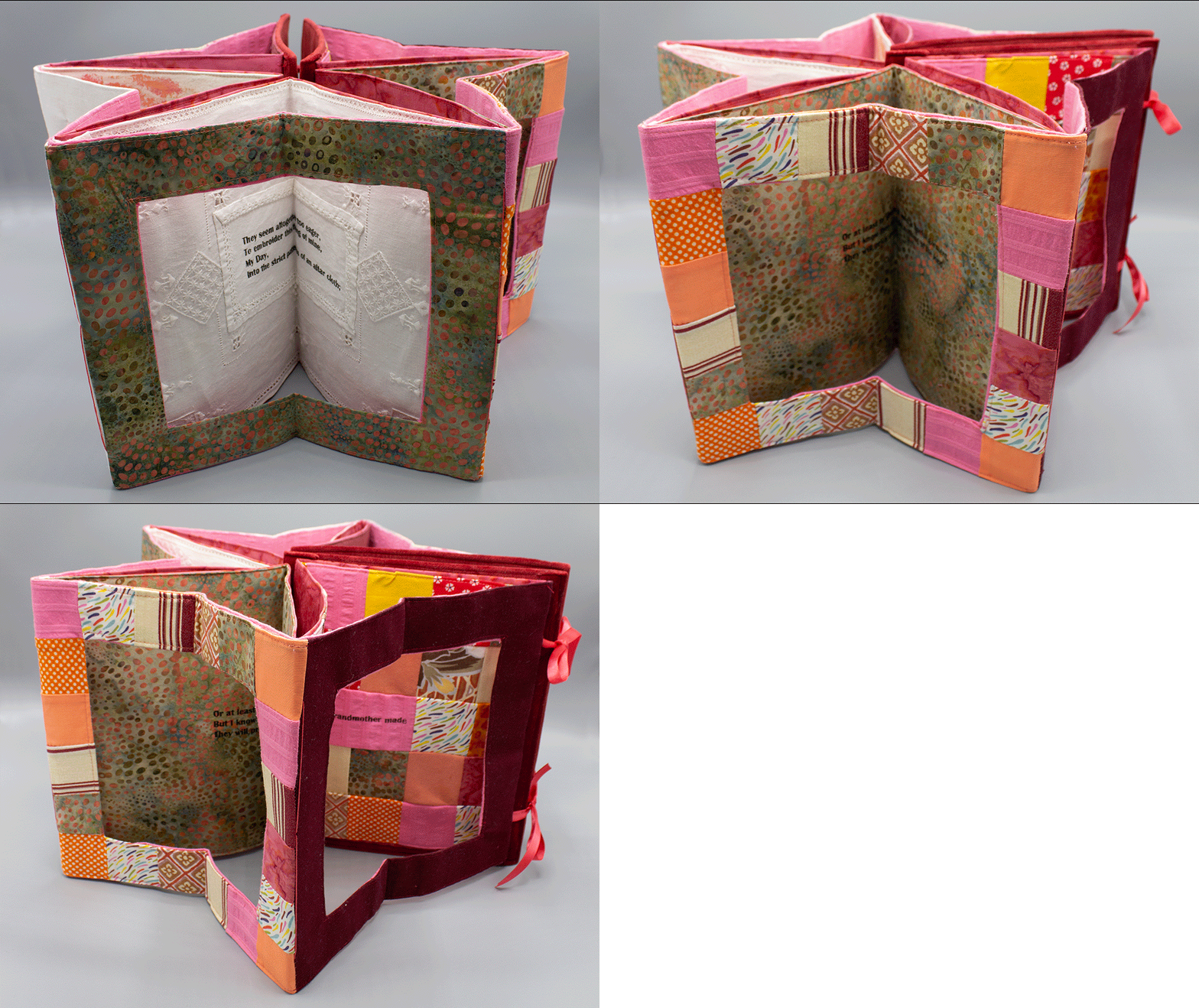
HEAVY THREADS
Lise Melhorn-Boe
Kingston, Ontario, Canada: Transformer Press, 2021
N7433.4 M46 H44 2021
Lise Melhorn-Boe is drawn to the world of text and textiles, the relationship of which can be found in the writings of American poet Hazel Hall (1886-1924). Using Hall’s poem – which starts out with a window – as inspiration, Melhorn-Boe created a star carousel structure out of dawn-colored fabrics. Some of the fabrics from Melhorn-Boe's “stash” came were hand-painted and came from her days as a graduate student. Given the supply of materials, the edition was limited to only seven copies. As with the other textile books in this series, the text is screen-printed with screens made on a Thermofax machine. Carousel structure with ribbon closure. Screen-printed on various hand-painted, upholstery and guilt-making fabrics, as well as embroidered table linens. Edition of seven, signed and numbered by the artist.
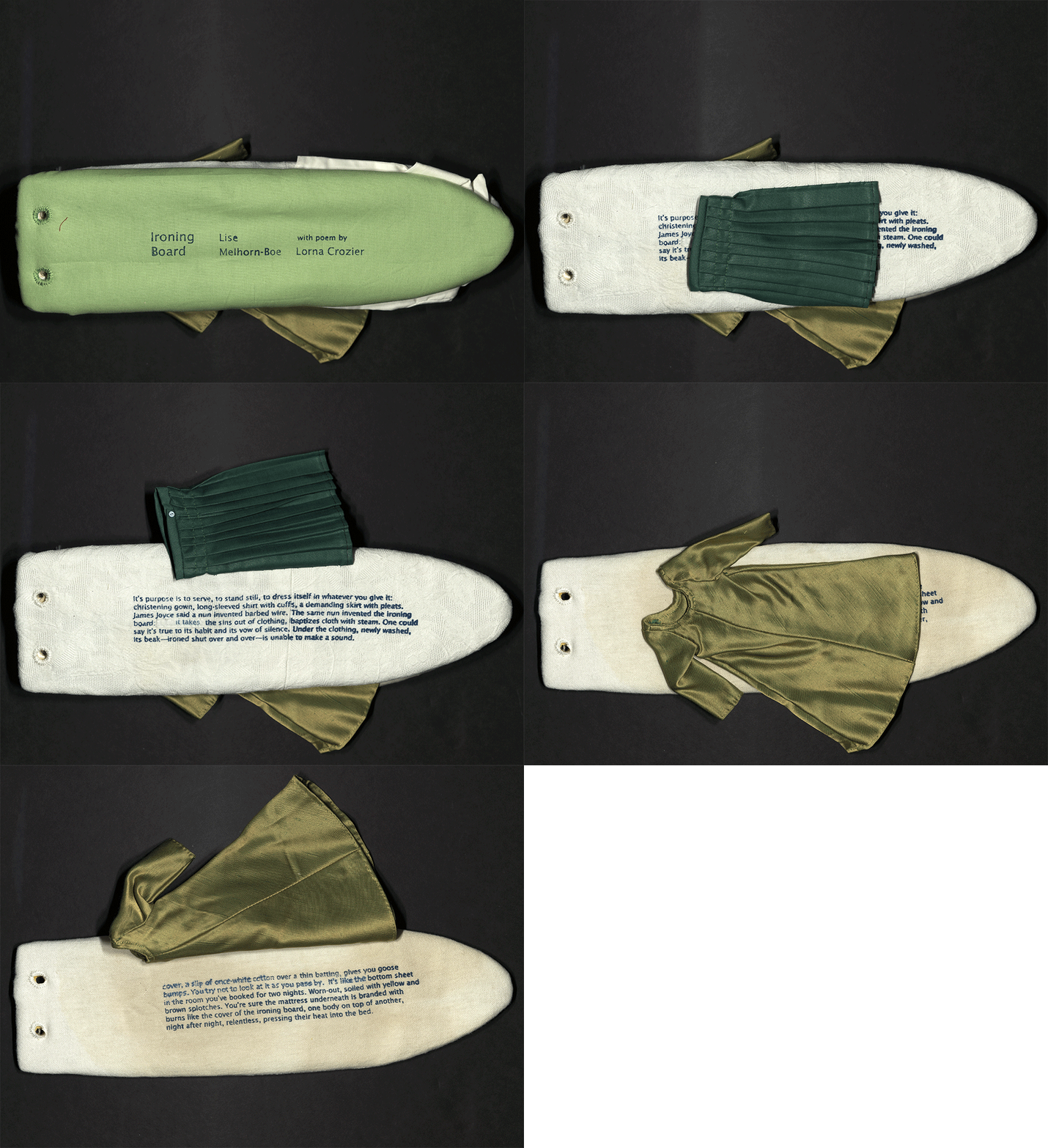
IRONING BOARD
Lise Melhorn-Boe
Kingston, Ontario, Canada: Transformer Press, 2021
N7433.4 M46 I76 2021
The text for Ironing Board comes from Canadian poet, Lorna Crozier, and is included in one of her odes to an unlikely candidate for literary celebration. Of the ironing board she says "There’s no harm in it, the ironing board. It is pared down to bare essentials, simply a level surface with two flat feet to stand on. It must be put away after every use. If not, things pile up – books, stacks of paper, wet mitts, a shirt with buttons missing, milk cartons that need to be recycled, nail clippers for a cat.” To create this unique textile book, here every copy is different, Melhorn-Boe used up the fabric from her “stash” during the third Covid-19 pandemic lockdown. The fabrics are color-coordinated. Three plywood ironing board shaped leaves; four pages of text plus cover and colophon. Ironing boards covered with fabric with added enhancements of doll-sized clothes. Text screen-printed on cotton or linen fabrics. Edition of ten, signed and numbered by the artist.
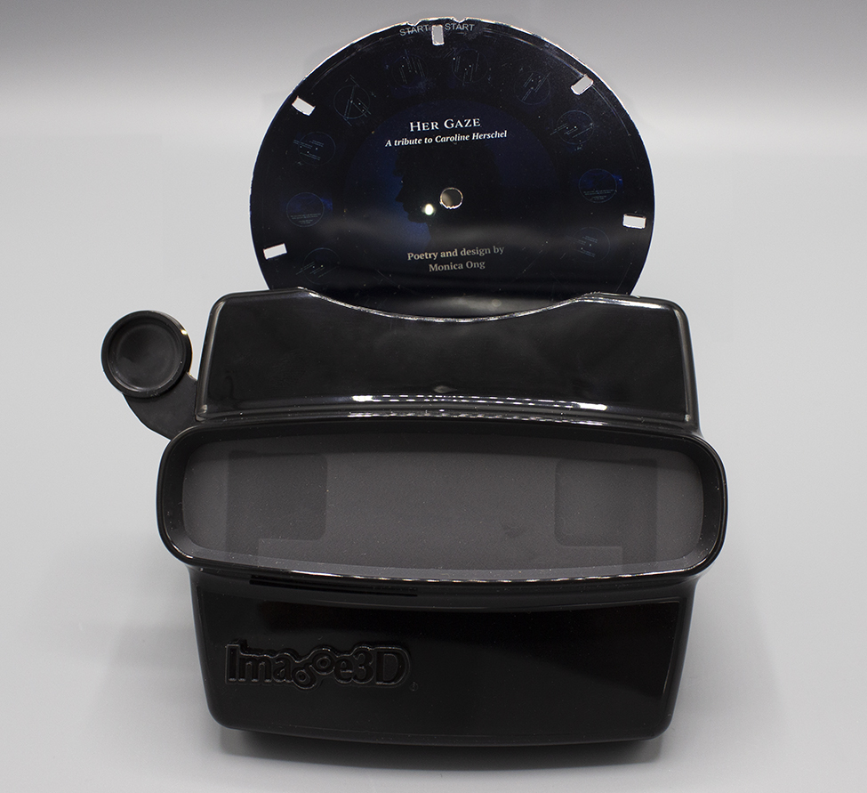
HER GAZE
Monica Ong
Trumbull, CT: Proxima Vera, 2021
N7433.4 O546 H47 2021
Her Gaze pays tribute to the life and work of astronomer Caroline Herschel (1750-1848). As a visual poem, the text is framed by Herschel's sketches of Comet C/1786 P1 (Herschel), which she observed on 1 August 1786 between the constellations Ursa Major and Coma Berenices. These diagrams were featured in the first paper by a woman ever read to the Royal Society and frame the story of Herschel’s accomplishments. Produced as a ViewMaster reel, the poem invites the reader to look skyward, embodying the stargazing stance and pointing the gaze towards this incredible woman’s labor. Poetry, typesetting, and design by Monica Ong.
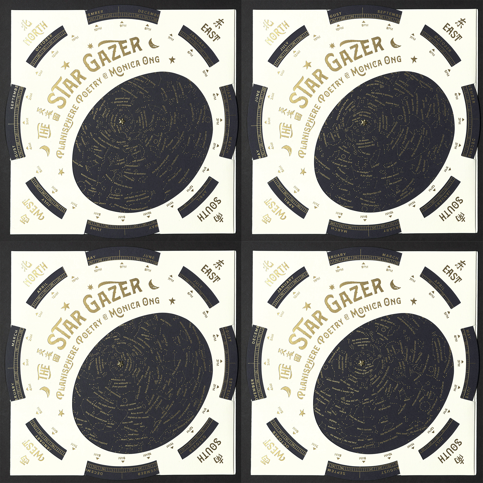
STAR GAZER
Monica Ong
Trumbull, CT: Proxima Vera, 2021
N7433.4 O546 S53 2021
Based on the Soochow Astronomical Chart of 1193, this planisphere depicts the Chinese night sky as seen from the northern hemisphere. To view the stars, turn the disc to align the desired date with the hour of night. Face south and hold the planisphere overhead with the corner marked North facing north. The map will reveal a celestial poem that awaits you among the asterisms. Let the eyes wander and read aloud to someone dear. Poetry, typesetting, and design by Monica Ong. Letterpress gold foil stamping, die cutting, and assembly by Boxcar Press in Syracuse, New York.
THE DEVIL CAME TO ALABAMA
Voice Porter
Tuscaloosa, AL: Red Hydra Press, 2021
PS3616 O78826 D48 2021
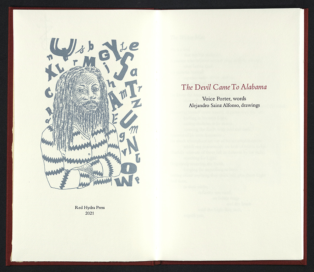
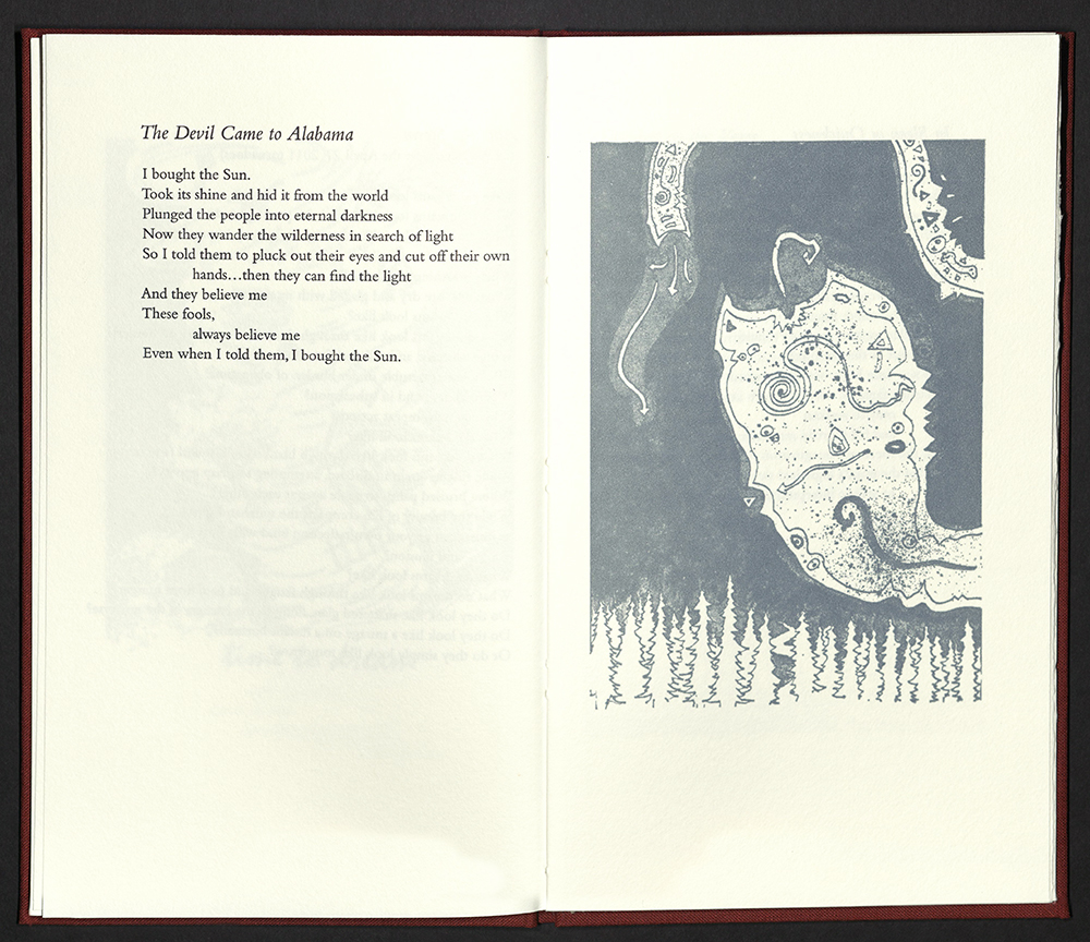
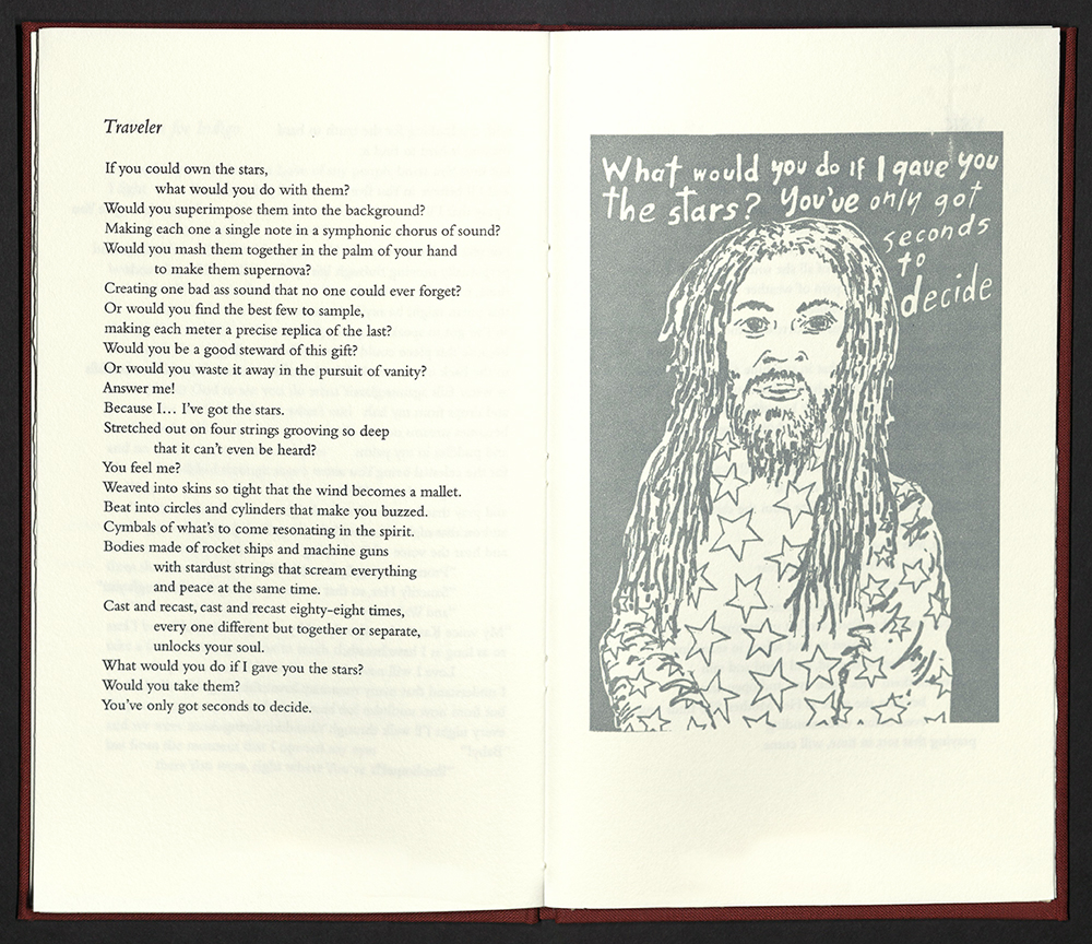
The Devil Came to Alabama is a collaborative project with work by Birmingham poet, performance artist, and community organizer Brian 'Voice Porter' Hawkins and Cuban artist Alejandro Sainz, who contributed eight drawings for the book. After hearing Voice Porter powerfully speak his poems in the famous Courthouse at the Monroeville Literary Festival this book began to take shape. The book was designed, letterpress printed, and bound in regal red cloth over boards by Steve Miller. Edition of forty-five copies, signed and numbered by author and artist.
INDIA'S LOVE LYRICS
Carol Schwartzott
Freeville, NY: Carol Schwartzott, 2021
N7433.4 S384 I53 2021
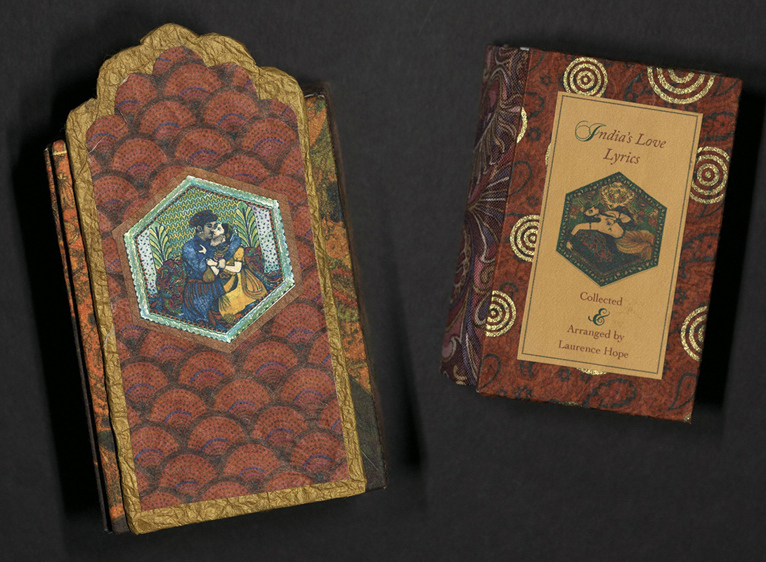
India’s Love Lyrics was originally compiled and translated by Laurence Hope (1865-1904). The 1906 edition came into the possession of Carol Schwartzott from a used bookstore. Using the book as inspiration, Schwartzott produced a tiny book, King Zada’s Song, in 1995. India’s Love Lyrics uses and reworks the original illustrations. The text and illustrations follow a simple flutter style/accordion format, with each of the six hand-cut arched windows folding out to create tiny theaters displaying illustrations reminiscent of classic Indian miniatures. The text consists of seven poems and uses Chopin Script for all the elegant drop caps, and Adobe CaslonPro for the text. Digitally printed on Mohawk superfine vellum, the seven illustrations are combinations of line drawings with additional pattern collage, a more modern approach to the classic Indian miniature. They have been hand-colored and reduced via scanning and transforming on computer. Bookboards and droplid box are covered with combinations of dyed, scanned and printed papers. Edition of twenty copies.
BASED ON YOUR CURRENT TRAJECTORY
Rachel Simmons
Orlando, FL: Rachel Simmons, 2020-2021
N7433.4 S5498 B37 2021
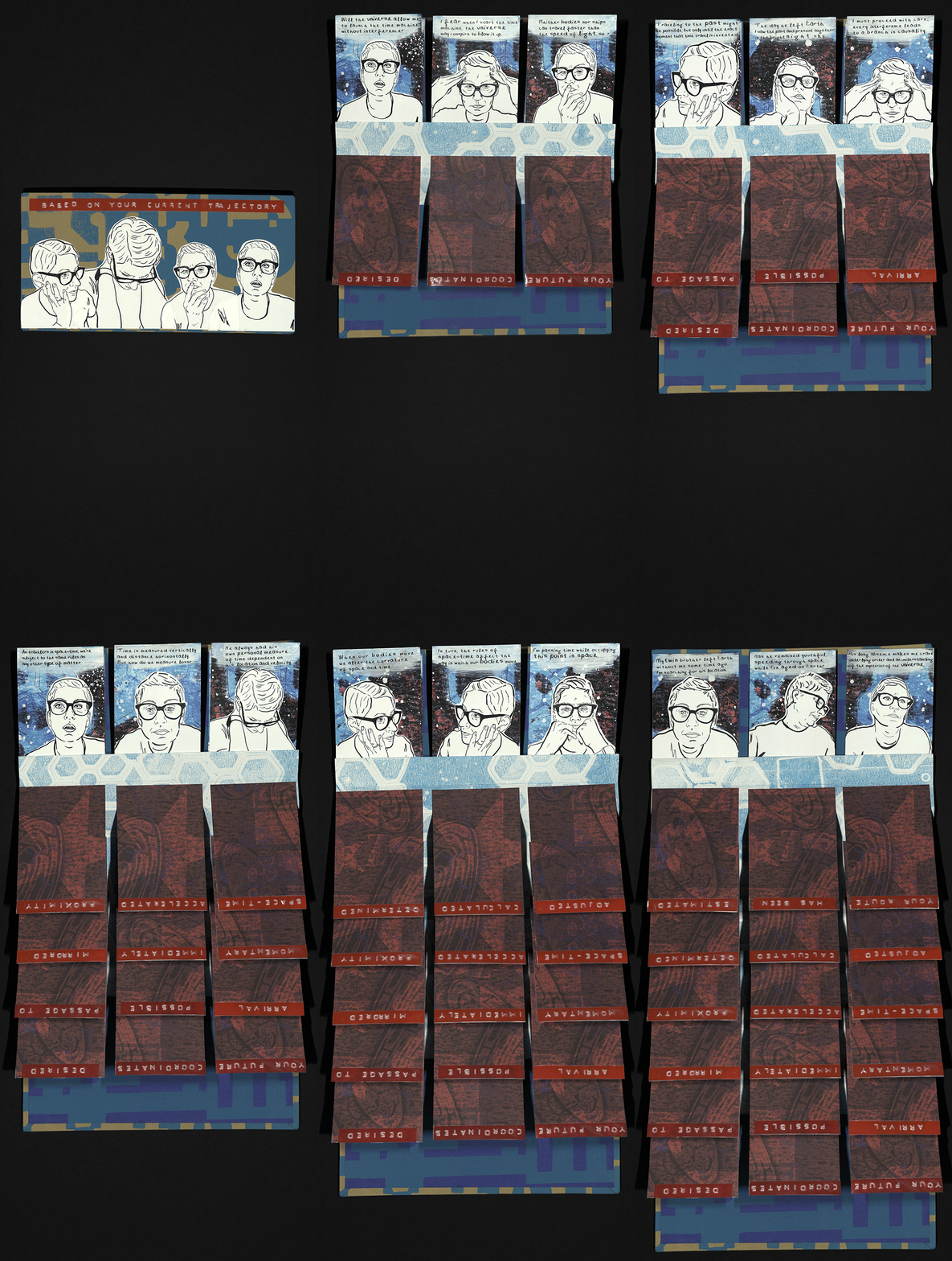
From the artist’s statement: "This book began during the early days of the global pandemic as a meditation on the passing of time. At the beginning of 2021, I returned to the book, and began reading theories of space-time and time travel, eventually discovering the concept of the twin paradox – which asks what happens when one identical twin departs Earth to travel near light speed in through space and the other twin remains on Earth, aging normally. How do they experience time differently? How does time change their identities and relationship? From that point on, I focused creating a narrative about a time traveler seeking to understand the laws of space-time as they search for their lost twin, a story based on the real-life disappearance of my youngest brother, who hasn’t been seen since 2018. Aesthetically this book brings together my love of experimental mixed media printmaking and comics through an interactive flag book structure. By including illustrations of myself and a font made from my own handwriting, I sought to personalize the narrative like a visual journal. Unlike most flag books, this structure is meant to be laid flat on a table with the accordion spine down, then read by flipping each row of cards towards you from front to back while reading up and down or left and right. Once you’ve read either the red or blue sides of the cards, you can close the book and start from the opposite side. The duality and complexity of the structure echoes the difficulty of understanding our personal relationships and our place in space-time.” Relief, screen and digital prints on paper and board with adhesive label paper, punch labels, gesso and marker. Illustrations and text adapted from Stephen Hawking’s A Brief History of Time. Edition of ten copies.
TENSILE: A SUBLIME LOVE STORY
Jessica Spring
Tacoma, WA: Springtide Press, 2021
N7433.4 S713 T46 2021
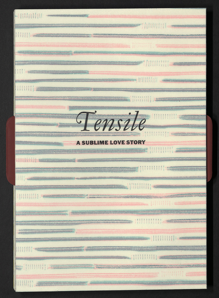
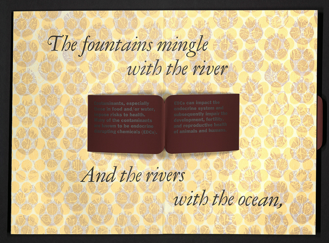
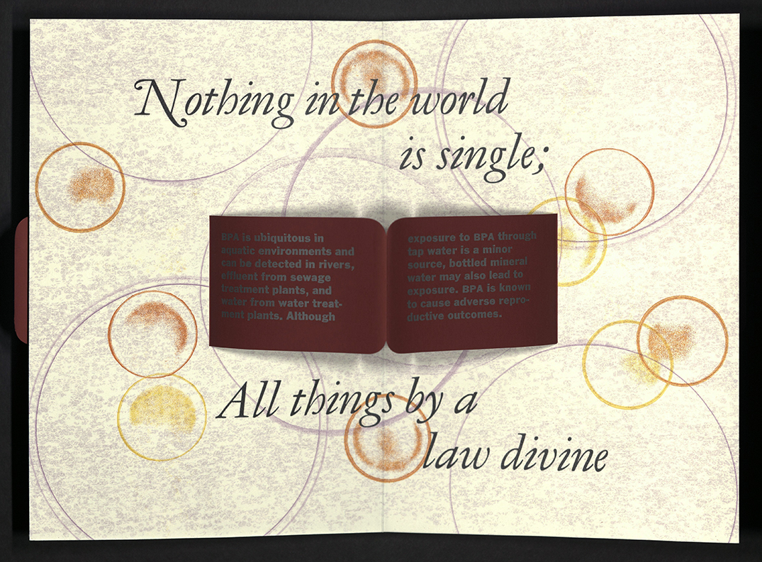
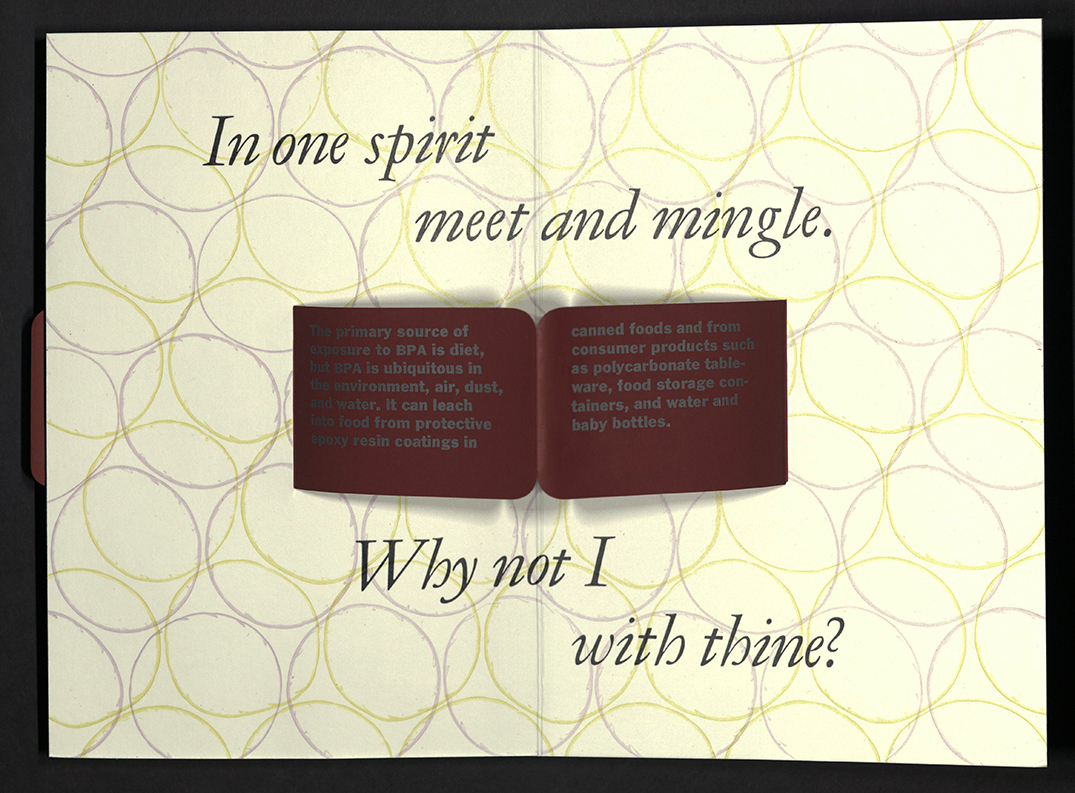
From the artist’s statement: Tensile: A Sublime Love Story weaves together a nineteenth century poem of seduction by Percy Bysshe Shelly (1792-1822), titled “Love’s Philosophy,” with current research on bisphenol contamination in our environment, food, water, and bodies. Used to manufacture plastics and resins for food and drink packaging, bisphenol A (BPA) impacts the endocrine system, impairing development and reproductive health of animals and humans. BPA analogues, including BPE and BPS, are similar reproductive toxicants with transgenerational effects. Nineteenth century writers didn’t know synthetic plastic would emerge in 1907 to change the world. Mary Shelley’s Frankenstein, published in 1818, foreshadows the cost and complexity of scientific progress and defying the natural order. In the midst of industrialization, Romantic era poets bore the responsibility of reinvigorating a spiritual connection to nature by portraying the Sublime. Both poet and scientist note the world is full of interconnectedness. Percy Shelley celebrates the mingling of rivers and oceans while scientists conclude that exposure to bisphenol contamination is ubiquitous. Tensile explores the irony of our sublime love affair with plastic, a monster of our own creation." Spring used single-use plastics to print the patterns onto the pages: She placed items like old bubble wrap, bendy straws, contact lens cases, bread bag clasps, and produce netting (think: avocado bags) into her press—even those skinny rings that we discard when opening milk containers. She chose fluorescent ink for a provocative effect, while a ribbon of red paper running through the middle of the book prominently displayed the research findings compiled by Alyce DeMarais, Professor Emerita of Biology at the University of Puget Sound. Letterpress printed from single-use plastics and handset type by Jessica Spring. Paper Rite-in-the Rain and Pike. Binding leporello structure with pop-up text panels. Plastic covers. Bound by Jessica Spring and Gabby Cooksey. Edition of thirty-five copies, signed and numbered by Jessica Spring.
WHY THE ASSEMBLY DISBANDED
Roberto Tejada
México City, México: Periferia, 2021
N7433.4 T44 W59 2020
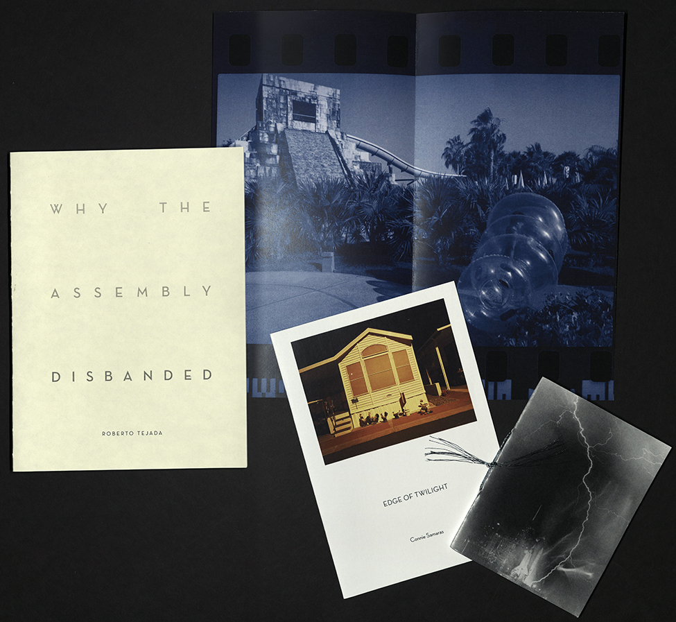
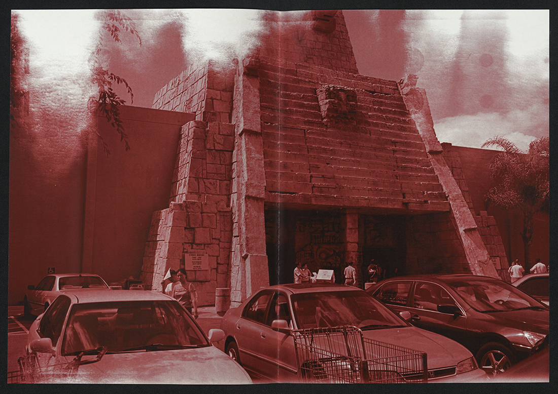
From the author’s statement: “Why the Assembly Disbanded wonders, from the uncontainable perspective of a present already becoming the past, whose purpose does it serve to wager on the future’s history? Thanks to the photography of Connie Samaras and Rubin Ortiz Torres, and Cristina Paoli’s book design, including a hand-sewn bound sequence of archival images I assemble in retro-futurist speculation, the words and images that designate a provisional unity here are a thought-form offered in donation to a limited number of collecting institutions such as yours. Please accept this bookwork then as an “act of social faith,” an exchange Lewis Hyde described in The Gift: Imagination and the Erotic Life of Property. Insomuch as the reciprocities of gift giving are meant to keep cultural vitality in motion, so do these pages aspire to engender other forms of indebtedness, accountability, and survival. As with gift logic, the acoustic afterlife of poetry’s syllabic self, inclined to enable, follows images into the curvature of space, so to speak, and then circles back to the time zone of the present. A form of dispersion, it stages a series of anterior futures: those junctures that will have enlivened the intervals between perception, imminent act, expectation, and adjustment. In this hour, the planes of composition are an atmosphere of means given to sight and sound transformed by action in historical time. In an instant, components assemble in such a way as to inaugurate a habitus for communion in the name of substance and design already disintegrating – or to claim a fugitive locality in the ether of night. Then human sensual life is given to so imagine its own life-enhancing and geological chances as to overturn the fate of nations… to draw the contours of the universe from the endpoints of our solar system, and to arrive at a meaning in the provisional fullness of the assembly.” Edition of one hundred copies. University of Utah copy is numbered 53 and signed by the artist.
CASCADIA
Richard Wagener
Gig Harbor, WA: Nawakum Press and Mixolydian Editions, 2021
PS595 F7 W37 2021
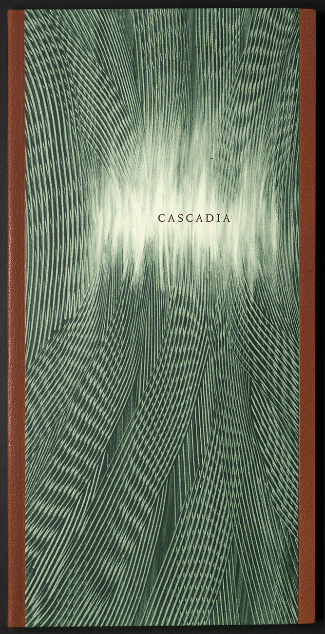
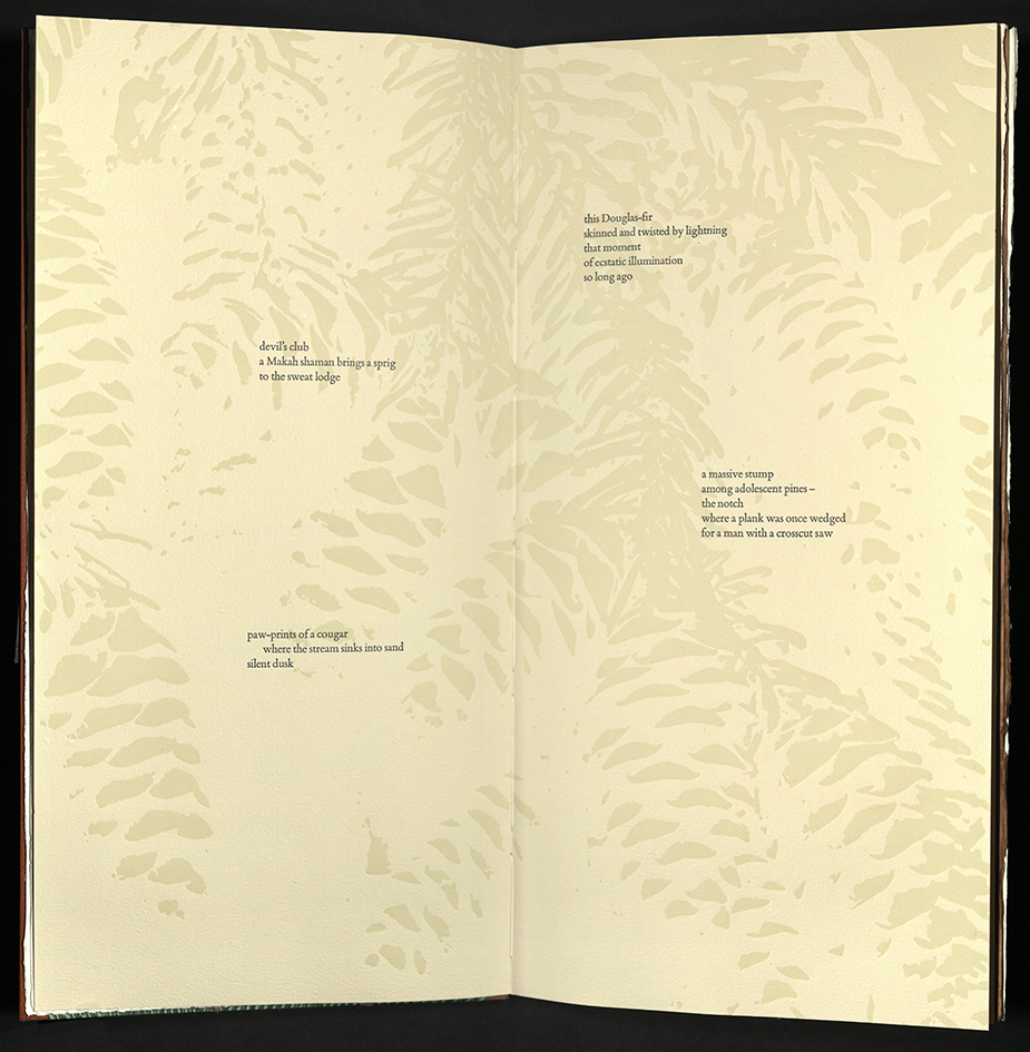
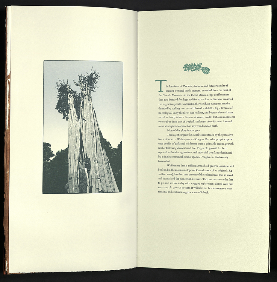
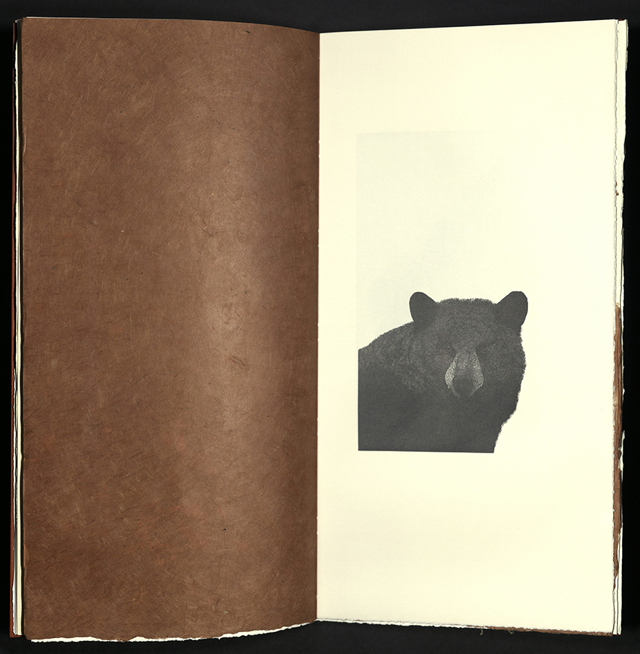
Cascadia is an exploration and celebration of the wild forests of the Pacific Northwest. In this homage to natural grace and wonder, a master wood engraver, Richard Wagener, Pulitzer prize-winning writer, William Dietrich, and acclaimed haiku poet, Christopher Herold, weave a rich and insightful tapestry of old growth forests and uncertain futures. Cascadia, from which the book takes its title, is a unique coastal bioregion, as well as a bioregional movement, located within the rugged northwest corner of the North American continent. It covers an area of exceptional geography and biodiversity. This book is a remembrance of what was lost, an appreciation of what is left, and a celebration of what could be. Cascadia was designed and co-published by David Pascoe of Nawakum Press and Richard Wagener of Mixolydian Editions. The printing was done by Richard Wagener and Patrick Reagh, who typeset and cast the type. The typefaces are Monotype Bembo and Centaur Titling. Calligraphic kanji characters by Chiyo Sanada. The papers are handmade St. Armand from Montreal, Zerkall from Germany, along with Japanese Bichhu and Yamagampi. Endpapers are from Hook Paper in Indiana. Paste papers for the covers were created by artist Meredith Broberg in Massachusetts. The bindings and enclosures are by hand bookbinder John DeMerritt in California. University of Utah copy is the Deluxe Edition copy “U.”
DREAMS
Ramón Vargas
Tuscaloosa, AL: Red Hydra Press, 2021
NE1336 V37 A64 2021
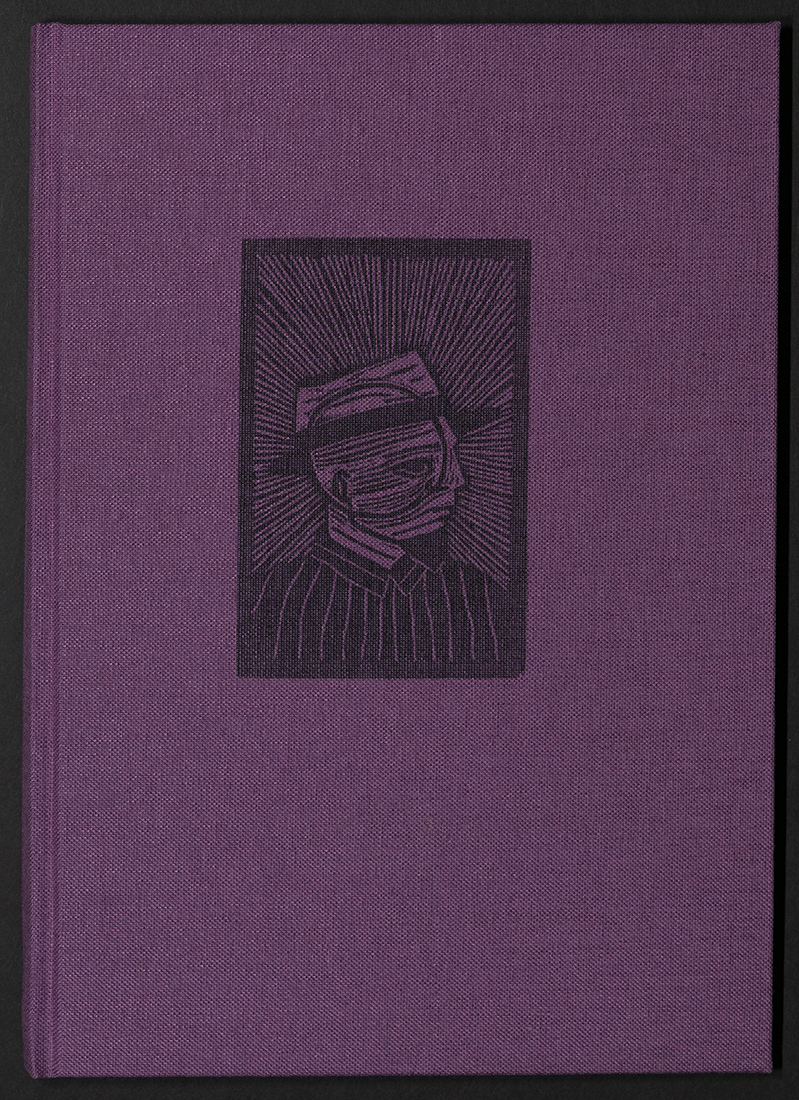
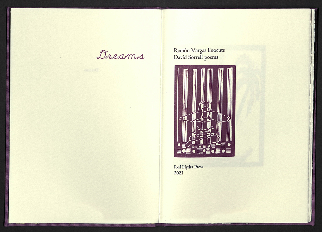
Eight mysterious, figurative, magenta-colored linocuts by Cuban artist Ramón Vargas, with accompanying poems by David Sorrell. Vargas cut these linocuts for the printer, given no direction about a theme. Poet David Sorrell then responded to the images. The printer describes Dreams as a “mystery book that rests easily in the hand.” Letterpress printed in Centaur types on Zerkall Book paper. Edition of forty-five copies, numbered and signed by poet and artist.
INSPIRING WOMEN
Kathryn Hunter, curator
Baton Rouge, LA: Blackbird Letterpress, 2020
N7433.4 H8655 I57 2020
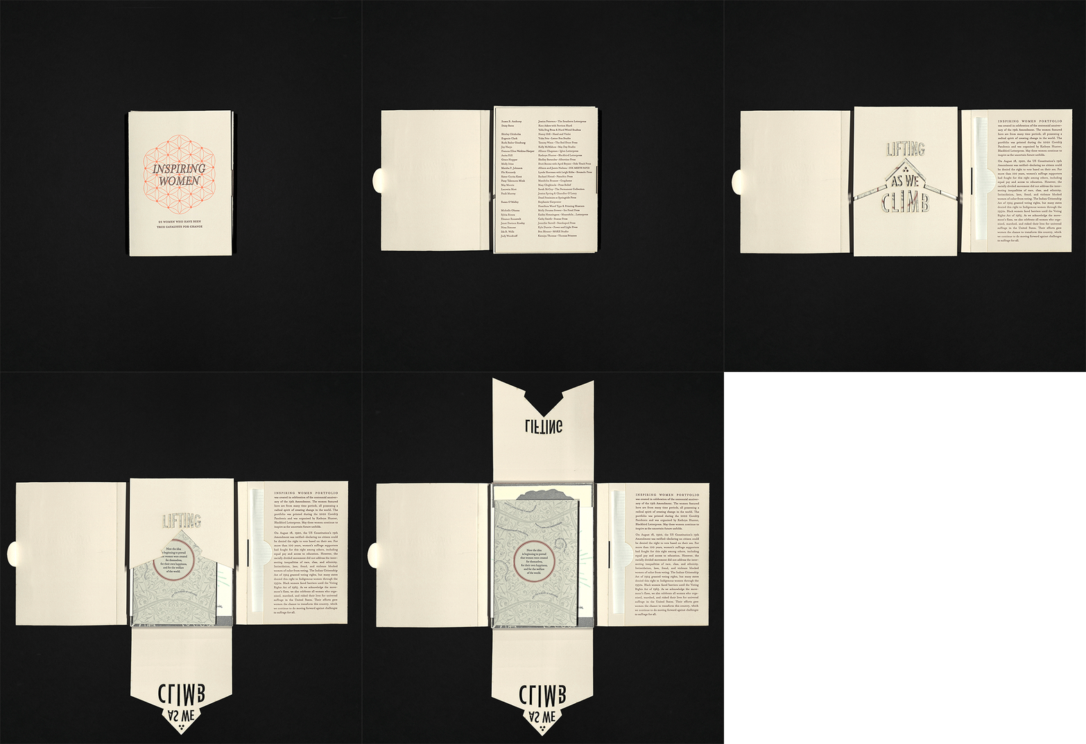
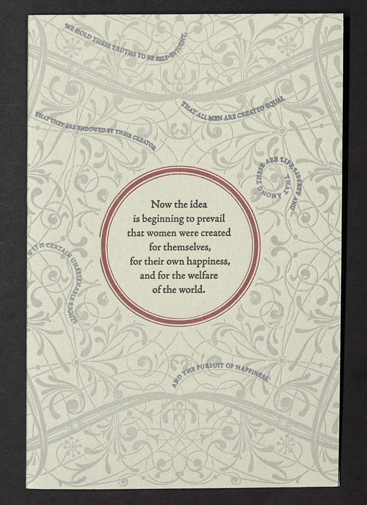
Inspiring Women was created in celebration of the centennial anniversary of the 19th Amendment, which granted women the right to vote. The women featured within this portfolio come from many time periods, but all possess a radical spirit that seeks to create change in the world. The portfolio was organized by Kathryn Hunter of Blackbird Letterpress and printed during the 2020 Covid-19 Pandemic. The portfolio features letterpress prints inspired by the likes of Nina Simone, Molly Ivins, Anita Faye Hill, Daisy Bates, Eleanor Roosevelt, Eugenie Clark, Flo Kennedy, Grace Hopper, Ida B. Wells, Janet Davison Rowley, Judy Woodruff, Lucretia Mott, Marsha P. Johnson, Michelle Obama, Patsy Takemoto Mink, Ruth Bader Ginsburg, Susan B. Anthony, Susan O’Malley, Sylvia Rivera, and others.
Susan B. Anthony
Jessica Peterson | The Southern Letterpress
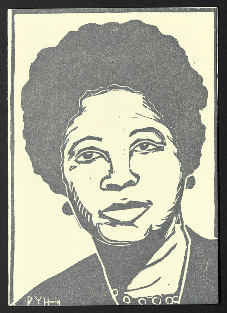
Daisy Bates
Kate Askew with Perrion Hurd | Yella Dog Press and Hurd Wired Studios
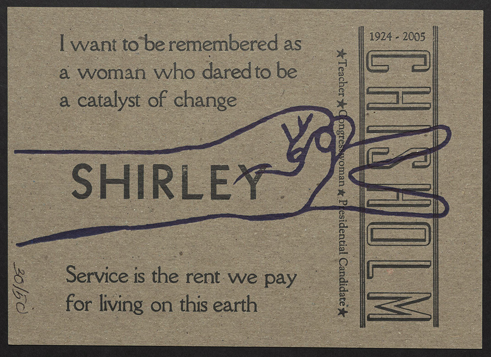
Shirley Chisholm
Nancy Hill | Hazel and Violet
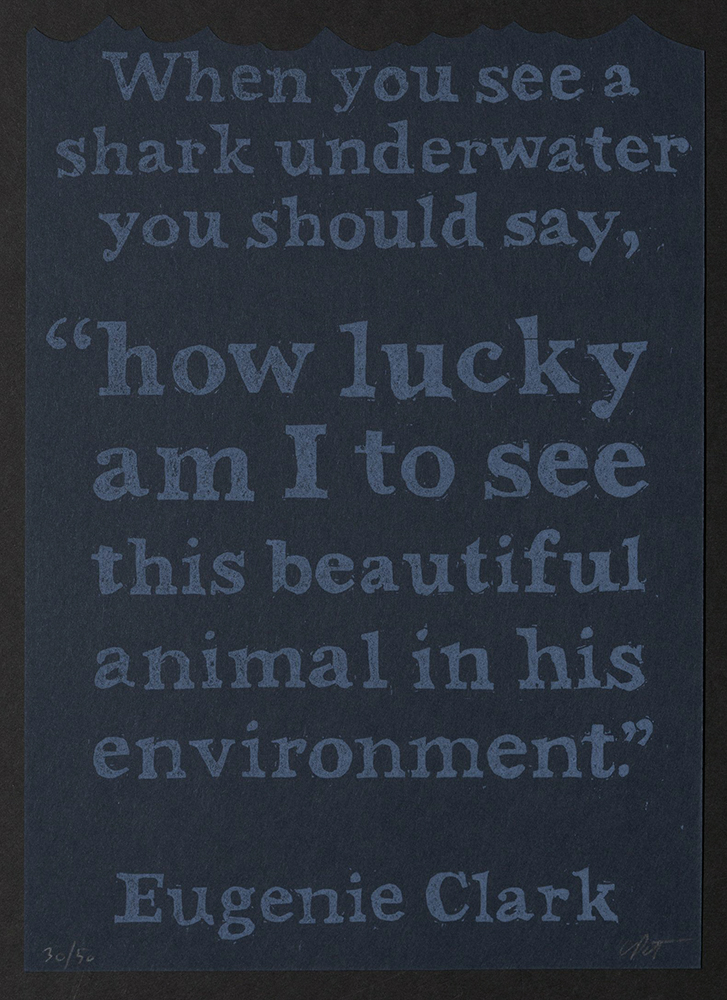
Eugenie Clark
Yuka Petz | Letter Box Studio
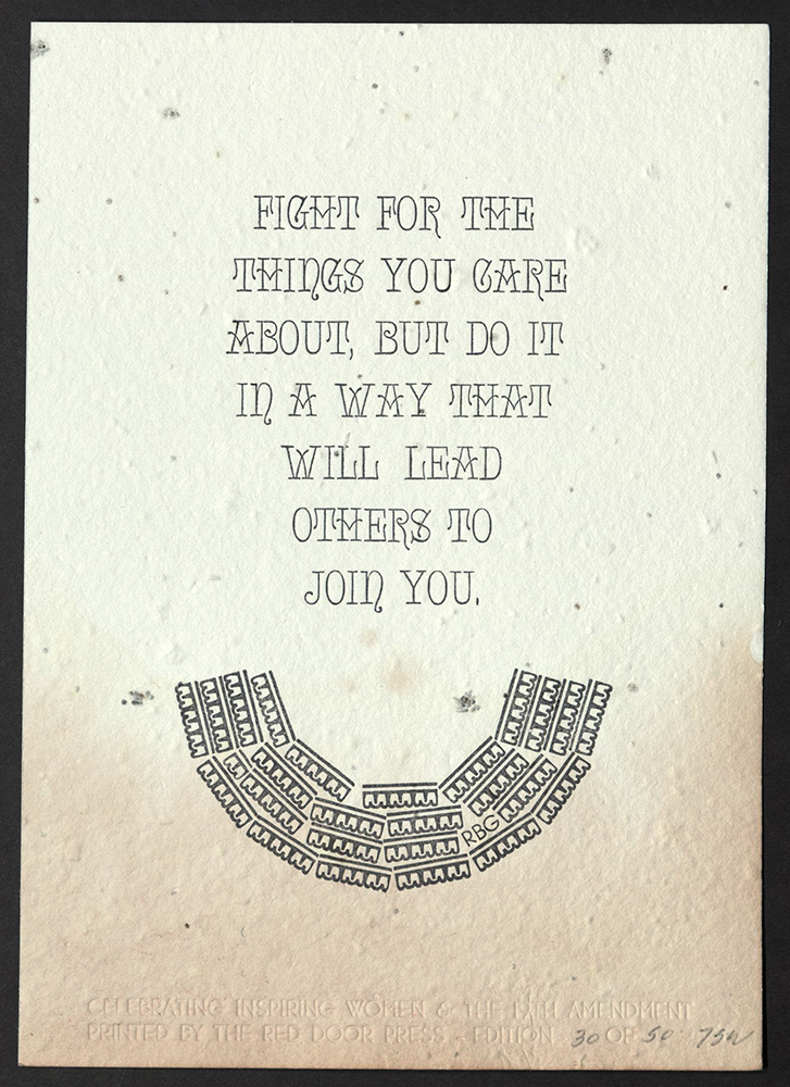
Ruth Bader Ginsburg
Tammy Winn | The Red Door Press
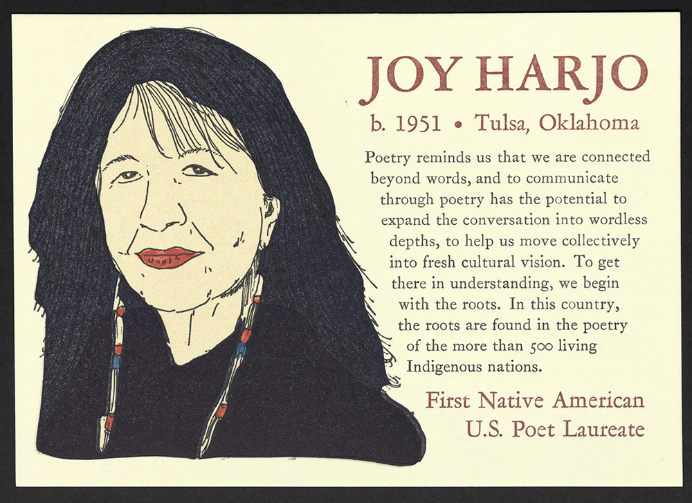
Joy Harjo
Kelly McMahon | May Day Studio
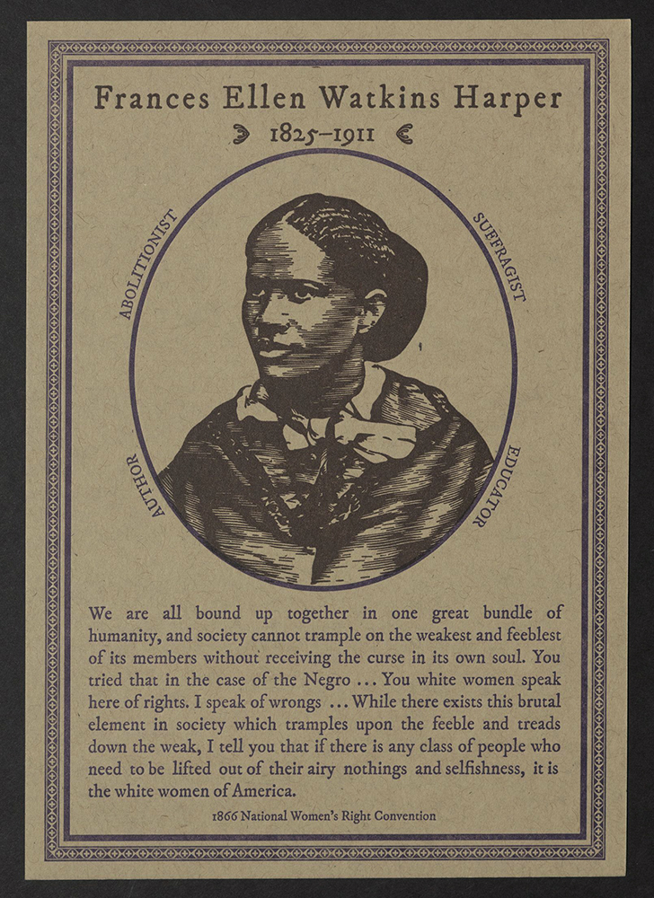
Frances Ellen Watkins Harper
Allison Chapman | Igloo Letterpress
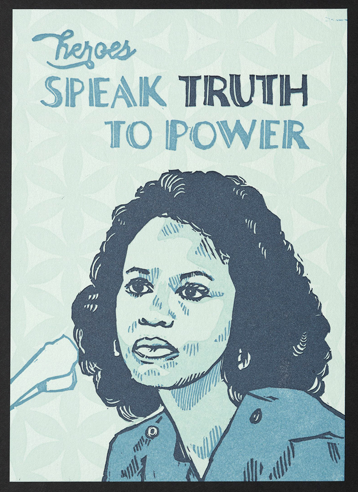
Anita Hill
Kathryn Hunter | Blackbird Letterpress
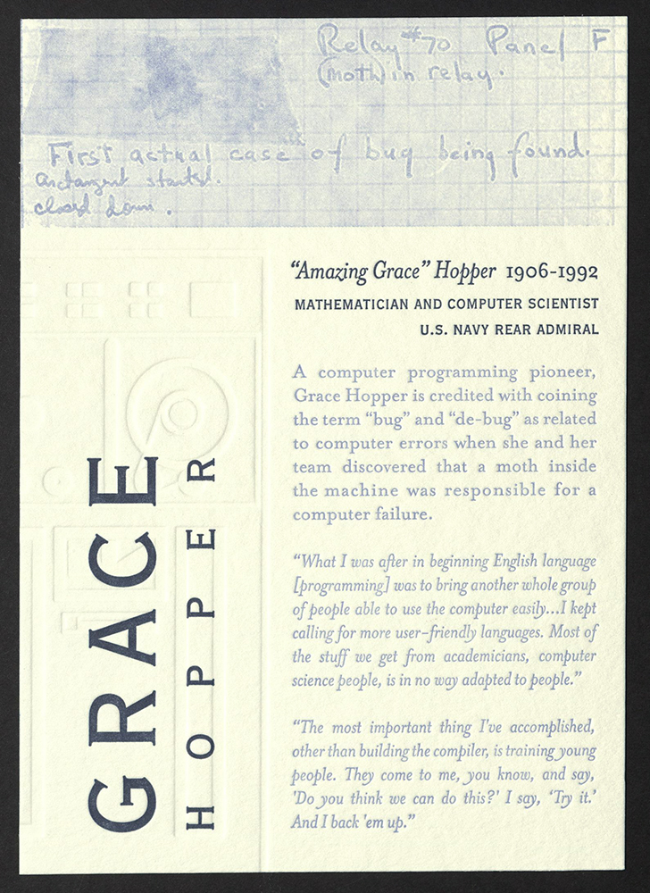
Grace Hopper
Shelley Barandes | Albertine Press
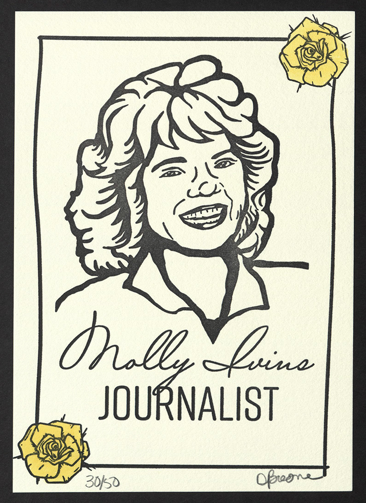
Molly Ivins
Dori Boone with April Bryant | Side Track Press
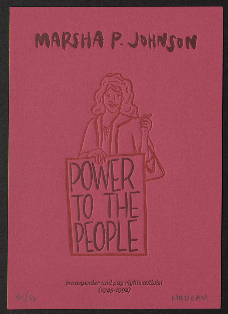
Marsha P. Johnson
Allison and Jamie Nadeau | INK MEETS PAPER
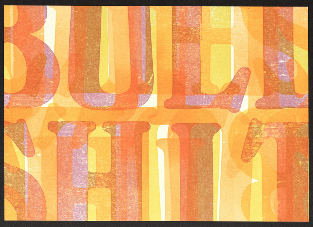
Flo Kennedy
Lynda Sherman with Leigh Riibe | Bremelo Press
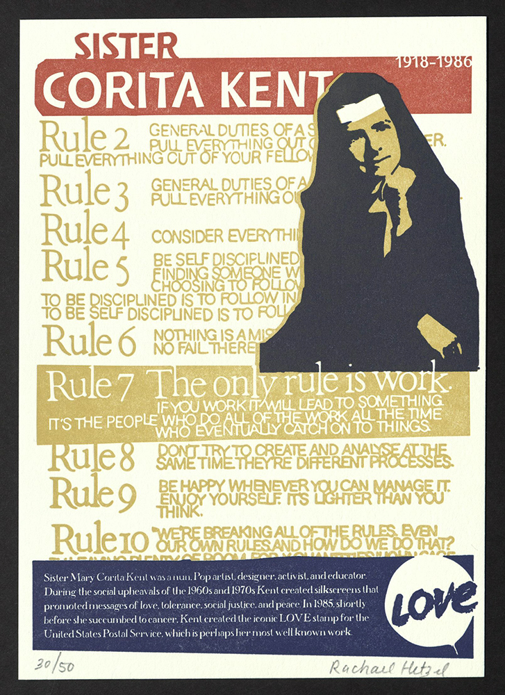
Sister Corita Kent
Rachael Hetzel | Pistachio Press
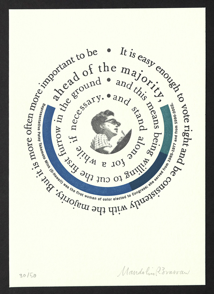
Patsy Takemoto Mink
Mandolin Brassaw | Grapheme
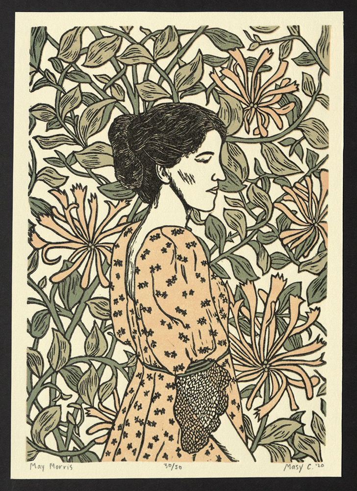
Mary May Morris
Masy Chighizola | Press Relief
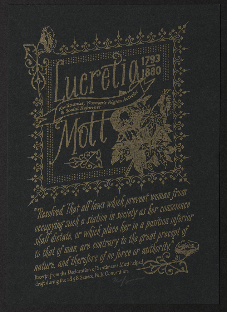
Lucretia Mott
Sarah McCoy | The Permanent Collection
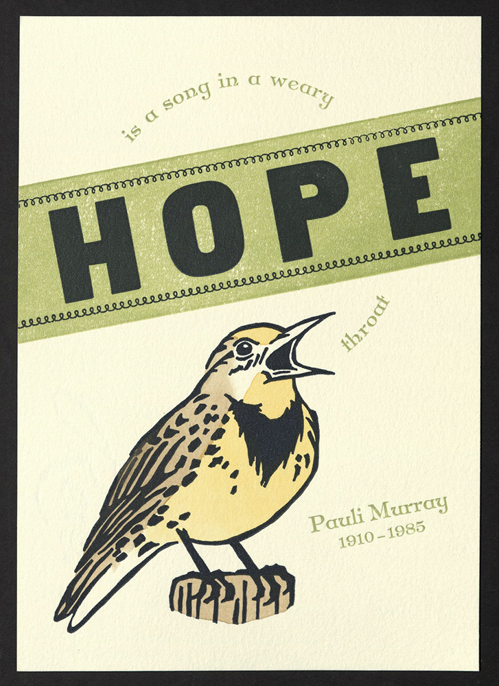
Pauli Murray
Jessica Spring and Chandler O'Leary | Dead Feminists at Springtide Press
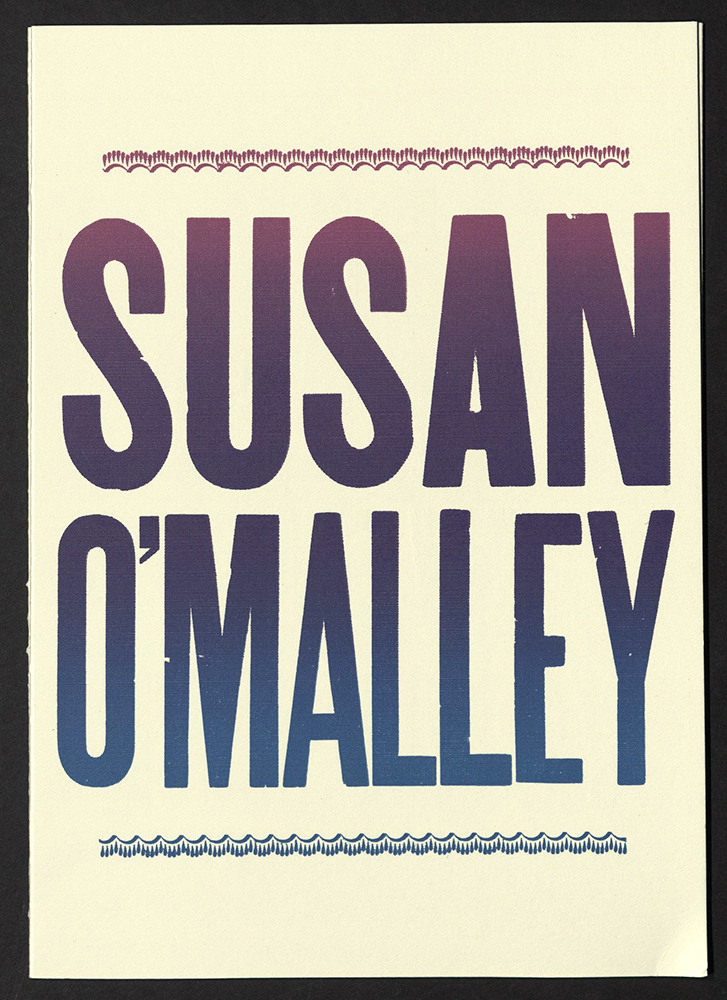
Susan O'Malley
Stephanie Carpenter| Hamilton Wood Type and Printing Museum
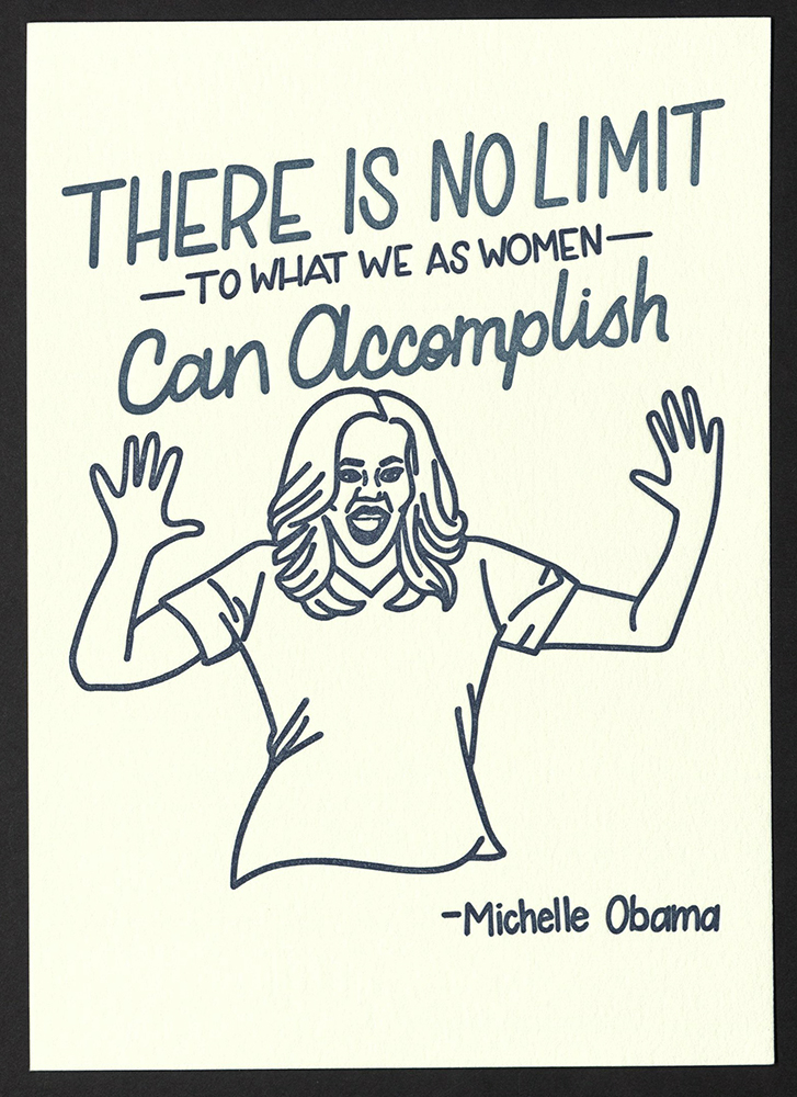
Michelle Obama
Molly Douma Brewer | Ice Pond Press
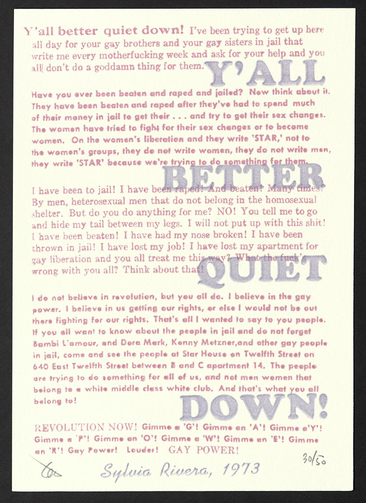
Sylvia Rivera
Kadin Henningsen | Meanwhile... Letterpress
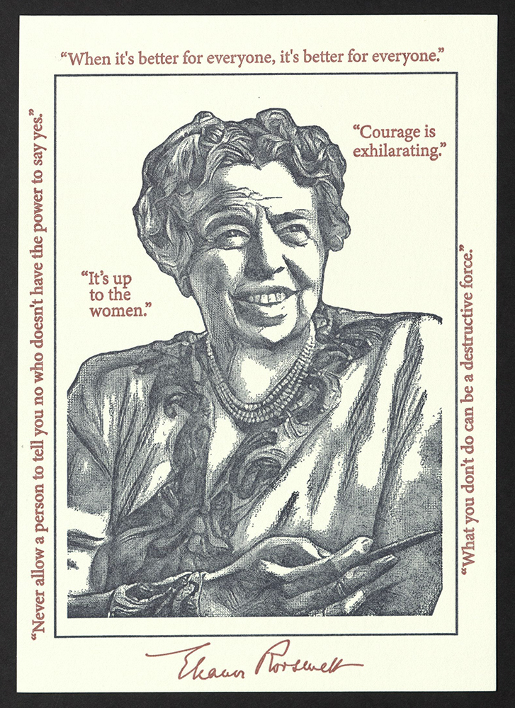
Eleanor Roosevelt
Cathy Smith | Boxcar Press
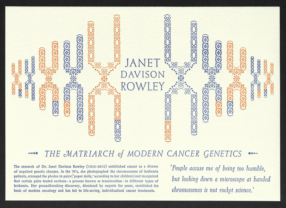
Janet Davison Rowley
Jennifer Farrell | Starshaped Press
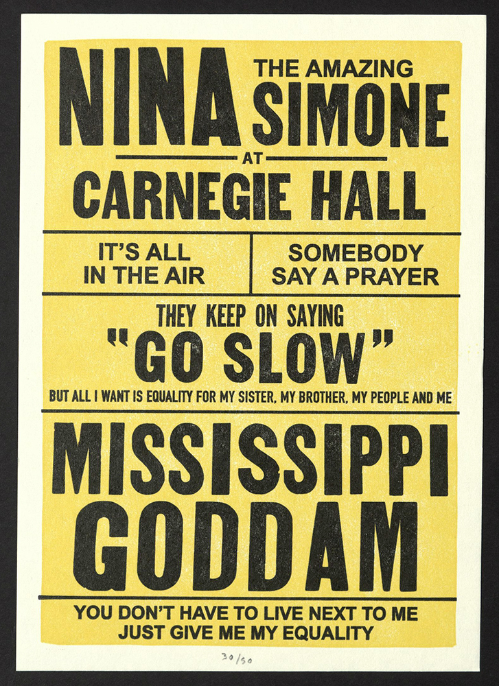
Nina Simone
Kyle Durrie | Power and Light Press
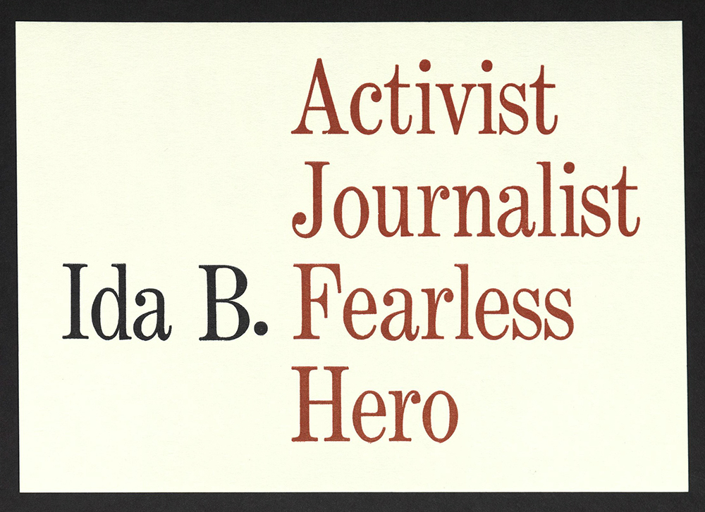
Ida B. Wells
Ben Blount | MAKE Studio
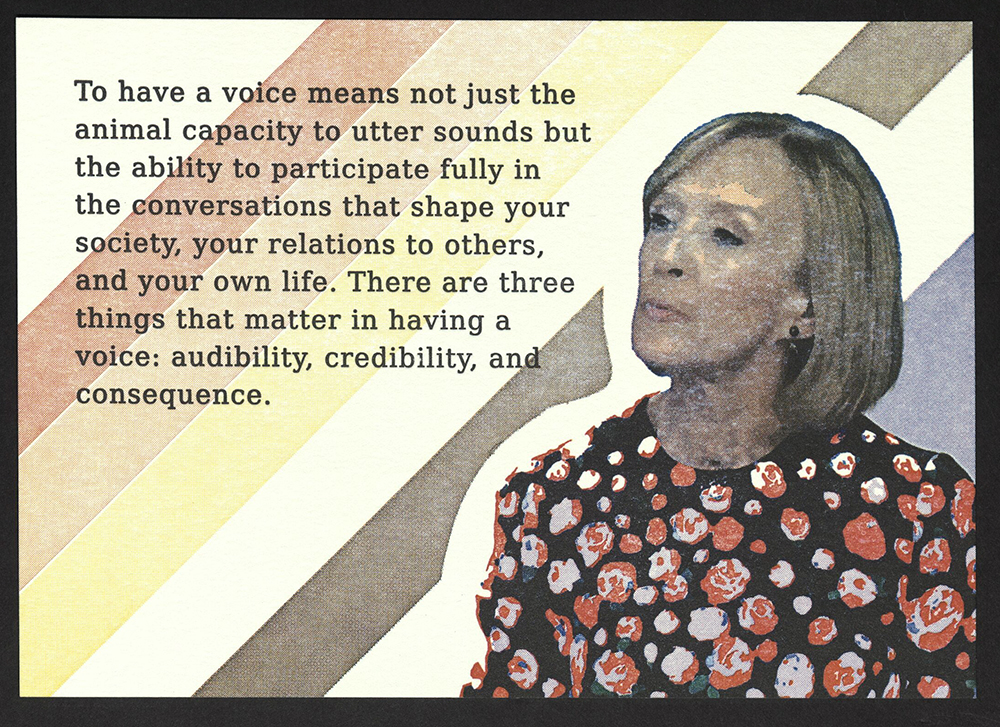
Judy Woodruff
Kseniya Thomas | Thomas Printers
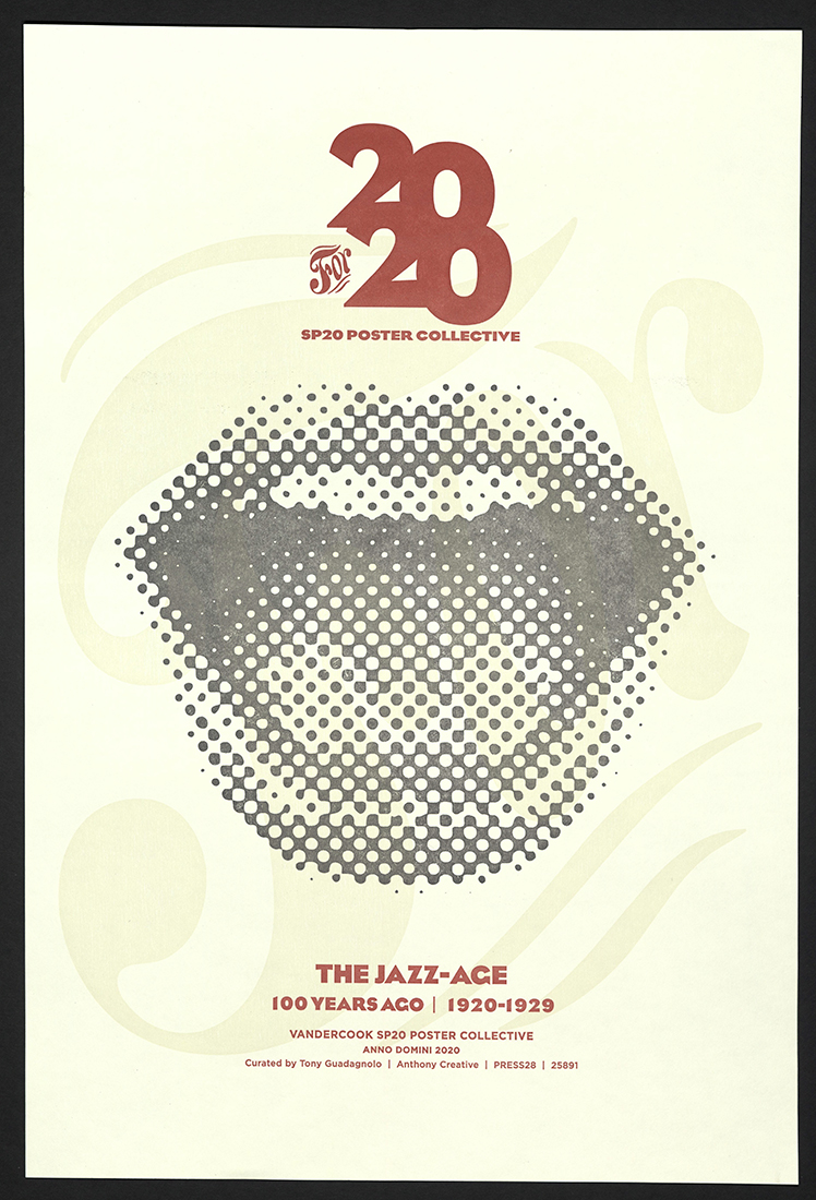
THE JAZZ-AGE
Tony Guadagnolo, curator
Arlington, TX: Anthony Creative, 2020
N7433.4 G845 J39 2020
In February 2020, Tony Guadagnolo invited twenty Vandercook SP20 owners to produce a 1920s jazz-themed print as a member of the 20 for 20 SP20 Print Collective. The Collective was formed as the pandemic took root, and the project was actuated “separately together” over the course of the year, with flexible deadlines in response to COVID-19 fallout. Tony kept in touch by emailing early jazz trivia questions and mailing collective T-shirts and printers’ manicules to participants. The following February, participants received the smartly designed portfolio of twenty diverse prints. The portfolio was physical evidence of the critical value of collective productivity—being part of a larger whole whose individual members worked in parallel spaces in response to a common call with a shared timeline.
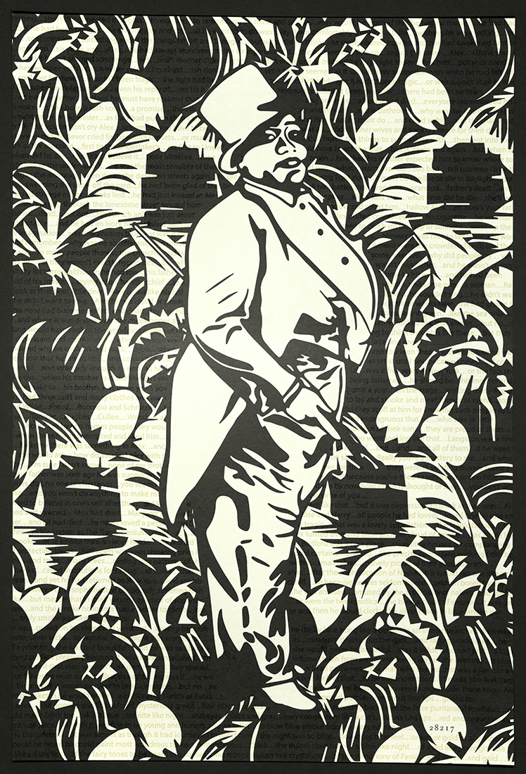
Gladys Bentley
Kevin Auer | Texas: University of Houston at Victoria
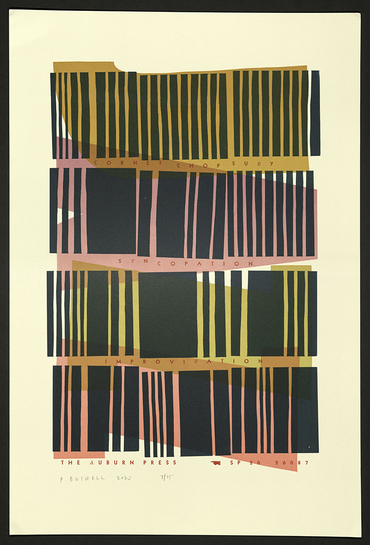
Cornet Chop Suey – Reprise
Peter Bushell | Illinois: The Auburn Press
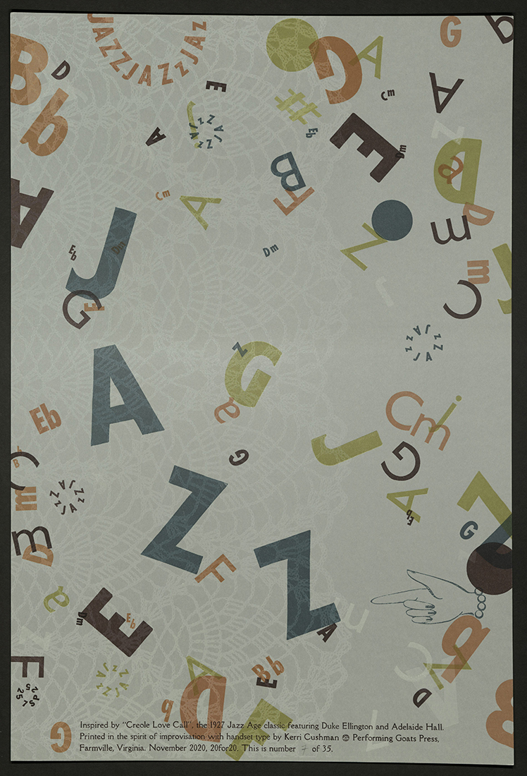
Jazz: Creole Love Call
Kerri Cushman | Virginia: Longwood University
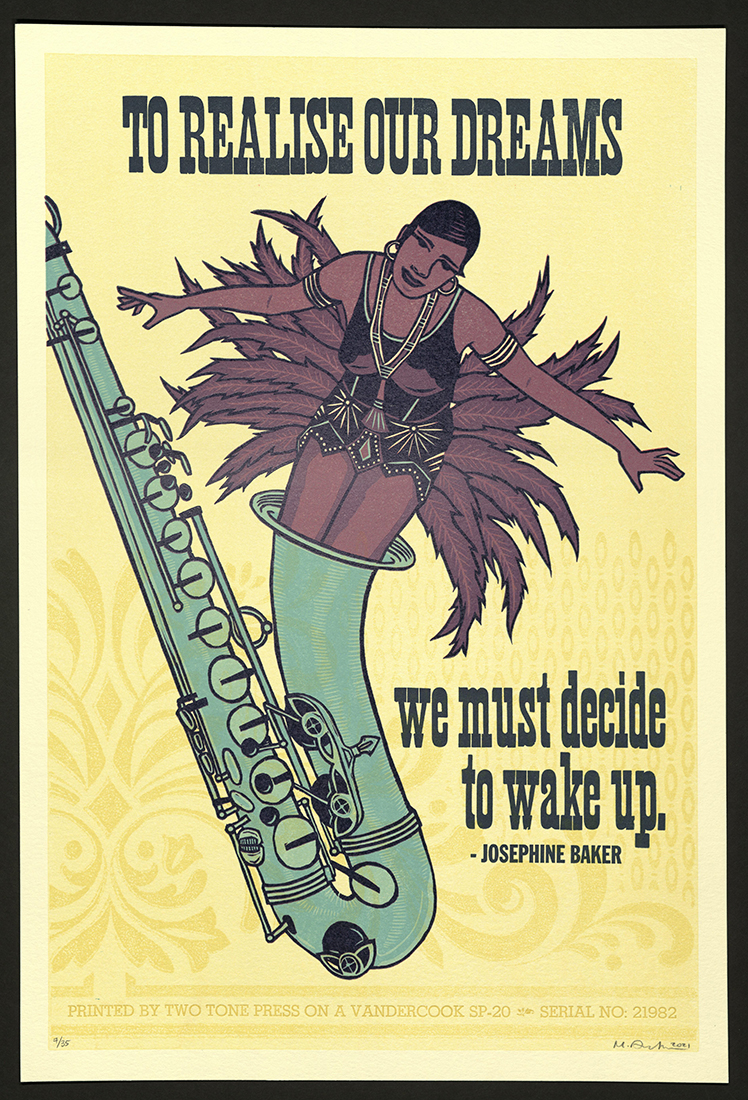
Wake Up
Michelle Dreher | Missouri: Two Tone Press
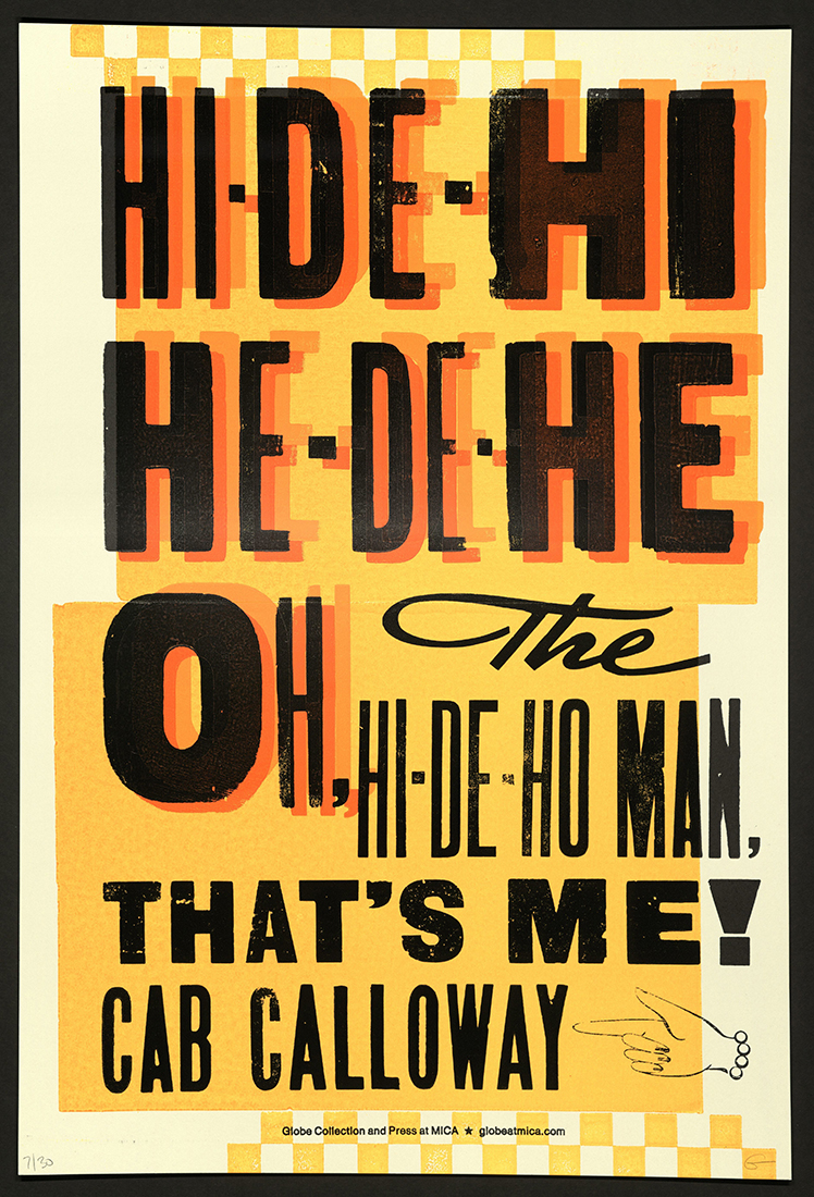
Hi-de-hi
Allison Fisher and Katherine Stankewicz | Maryland: Globe Collection and Press MICA

Good-by Boys
John Gialanella | Washington: Western Washington University
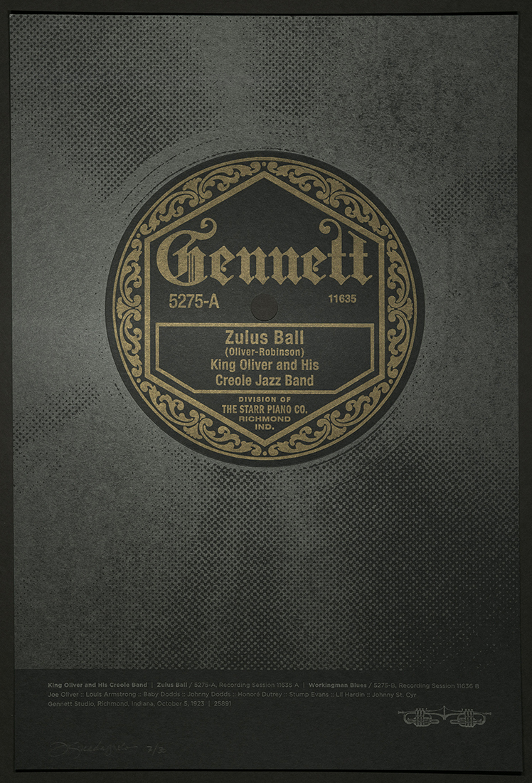
Zulus Ball
Tony Guadagnolo | Texas: Anthony Creative::PRESS28
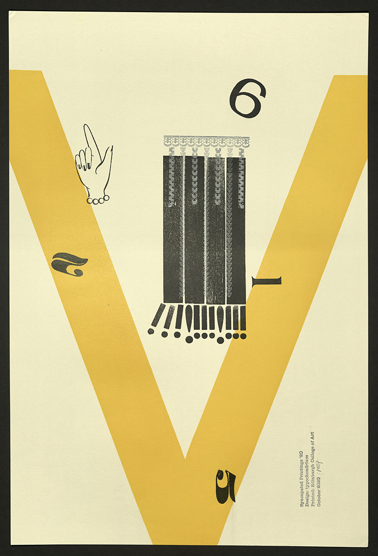
Syncopated Printings
Gen Harrison | Scotland: Edinburgh College of Art
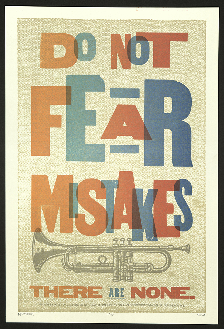
No Mistakes
Michael Hepher | Canada: Clawhammer Press
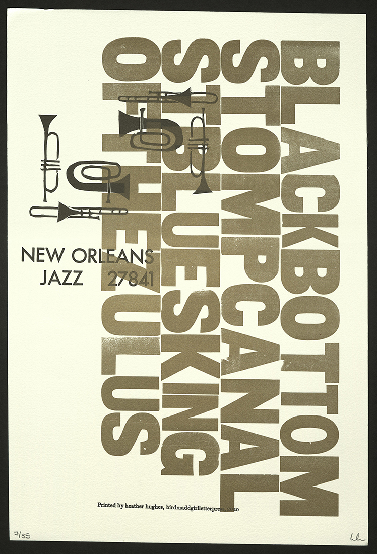
New Orleans Jazz
Heather Hughes | Massachusetts: Bow & Arrow Press
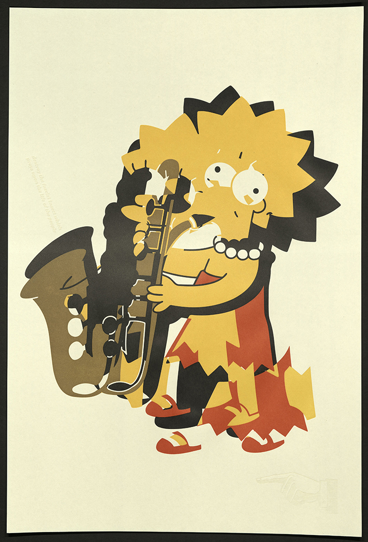
Saxamaphone
Max Koch | Texas: Koch Printing
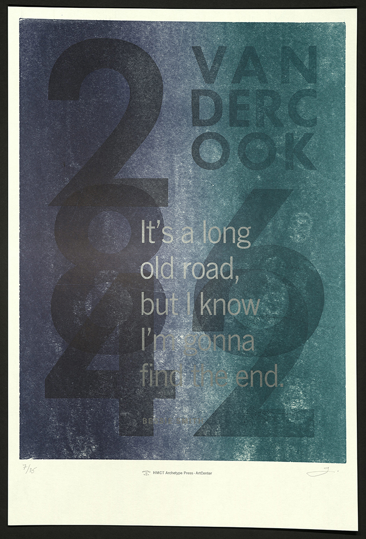
It’s a Long Old Road
Gloria Kondrup | California: ArtCenter College of Design
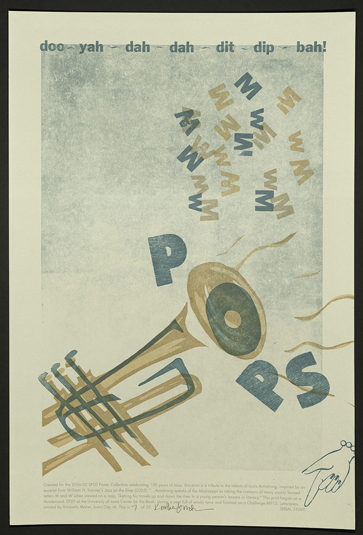
Pops
Kim Maher | Iowa: Following Moon Press
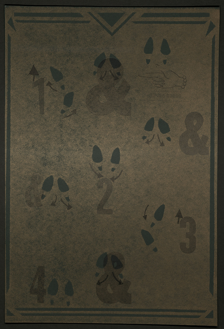
Do the Charleston
Amanda McKenzie | Canada: Society of North Alberta Print-artists (SNAP)
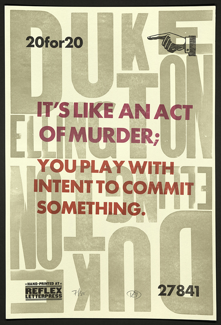
Play to Commit
Ted Ollier | Massachusetts: Reflex Letterpress
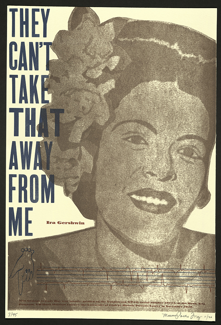
You Can’t Take That Away From Me
Marnie Powers-Torrey | Utah: Book Arts Program and Red Butte Press
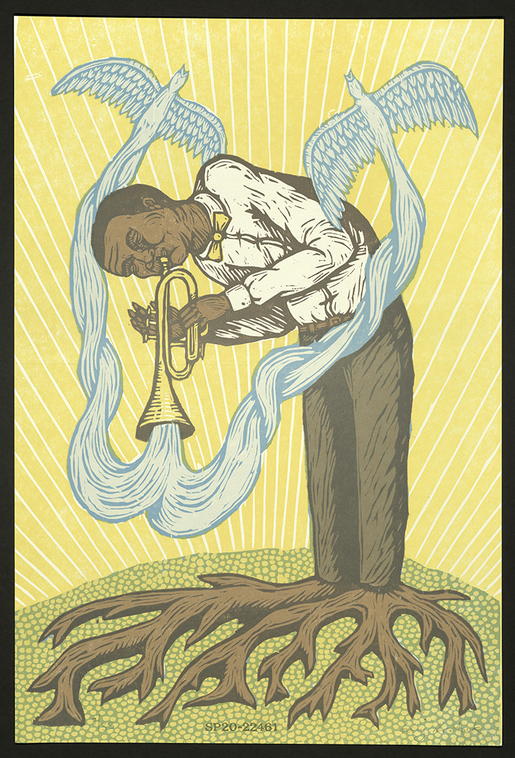
Satchmo
Bobby Rosenstock | Ohio: JustAJar Design Press
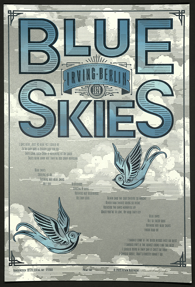
Blue Skies / Irving Berlin
Kevin Rudynski | Indiana: Marian University – Indianapolis Art and Design
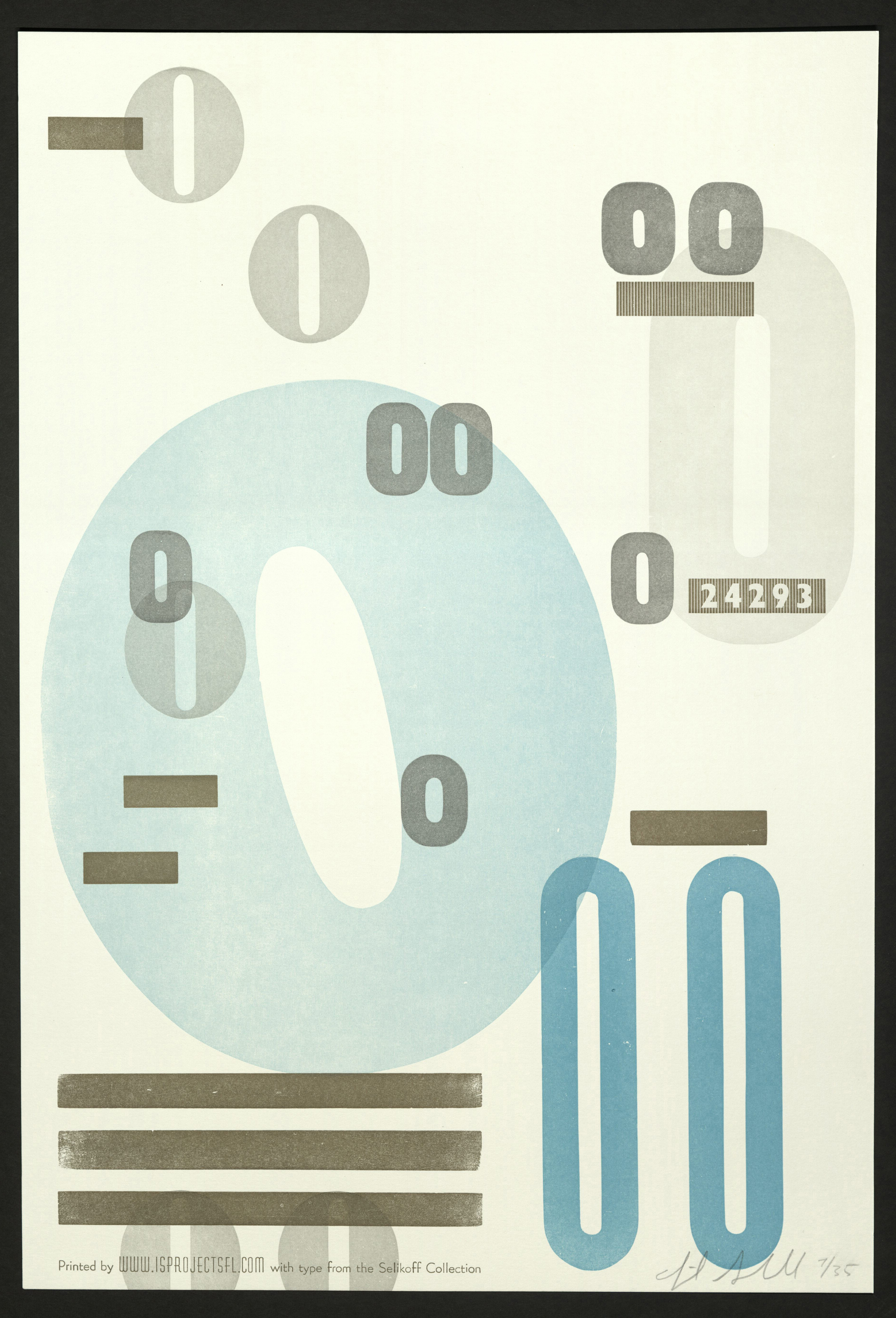
Sam Smooth
Ingrid Schindall | Florida: IS Projects :: Nocturnal Press
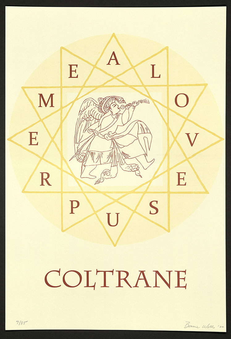
Coltrane, a Love Supreme
Bonnie Wells | California: Wild Bird Press
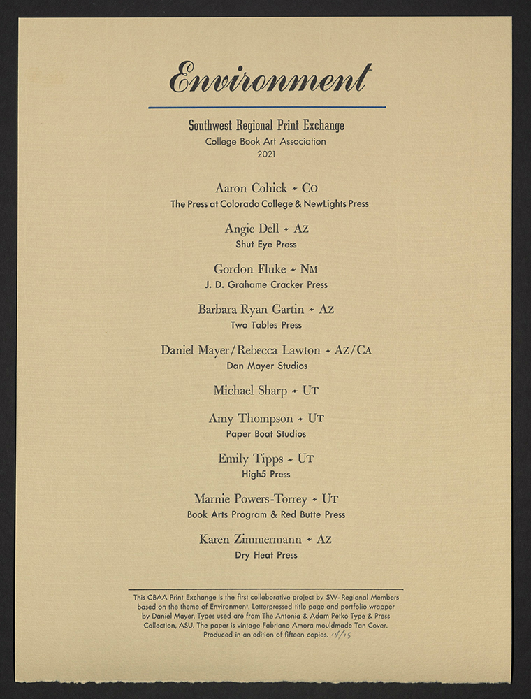
ENVIRONMENT
Dan Mayer, the College Book Art Association Southwest Regional Leader, organized a member exchange with the theme of Environment in March 2020. The theme was sufficiently open to consider global or more localized concerns that seemed amplified by the period of intense news-watching and ceiling-staring. The national exchange connected makers in each region and repurposed feelings of angst and hopelessness to fuel ideation and printing. This CBAA Print Exchange is the first collaborative project by SW-Regional Members, produced in an edition of fifteen copies.
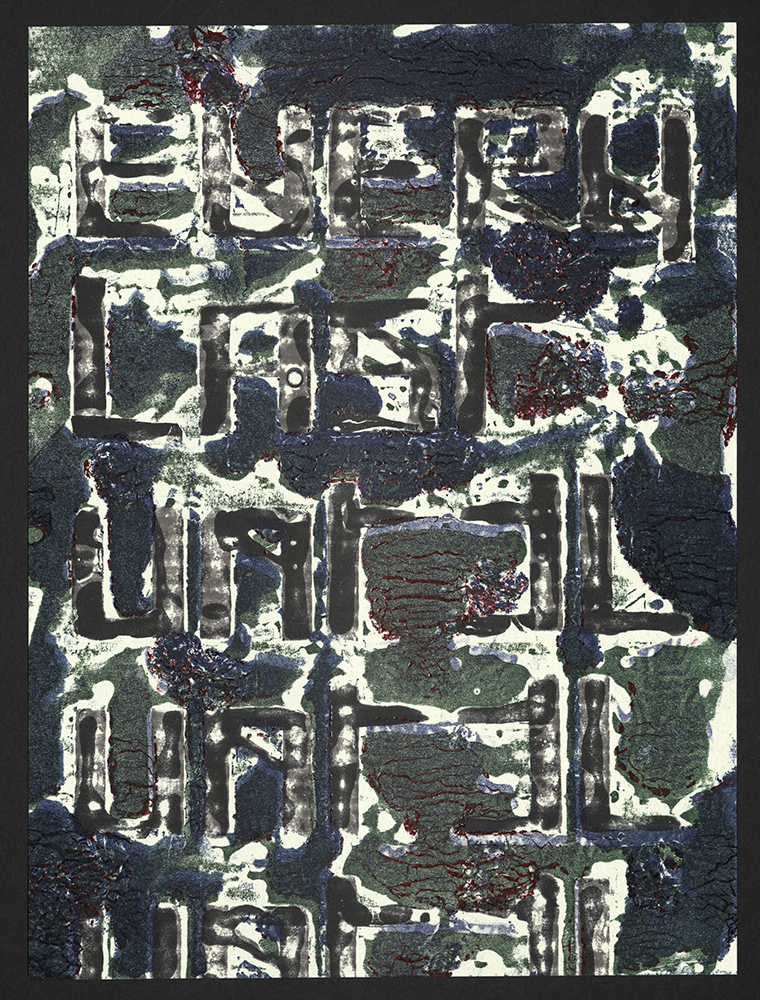
Aaron Cohick | Colorado: The Press at Colorado College and Newslight Press
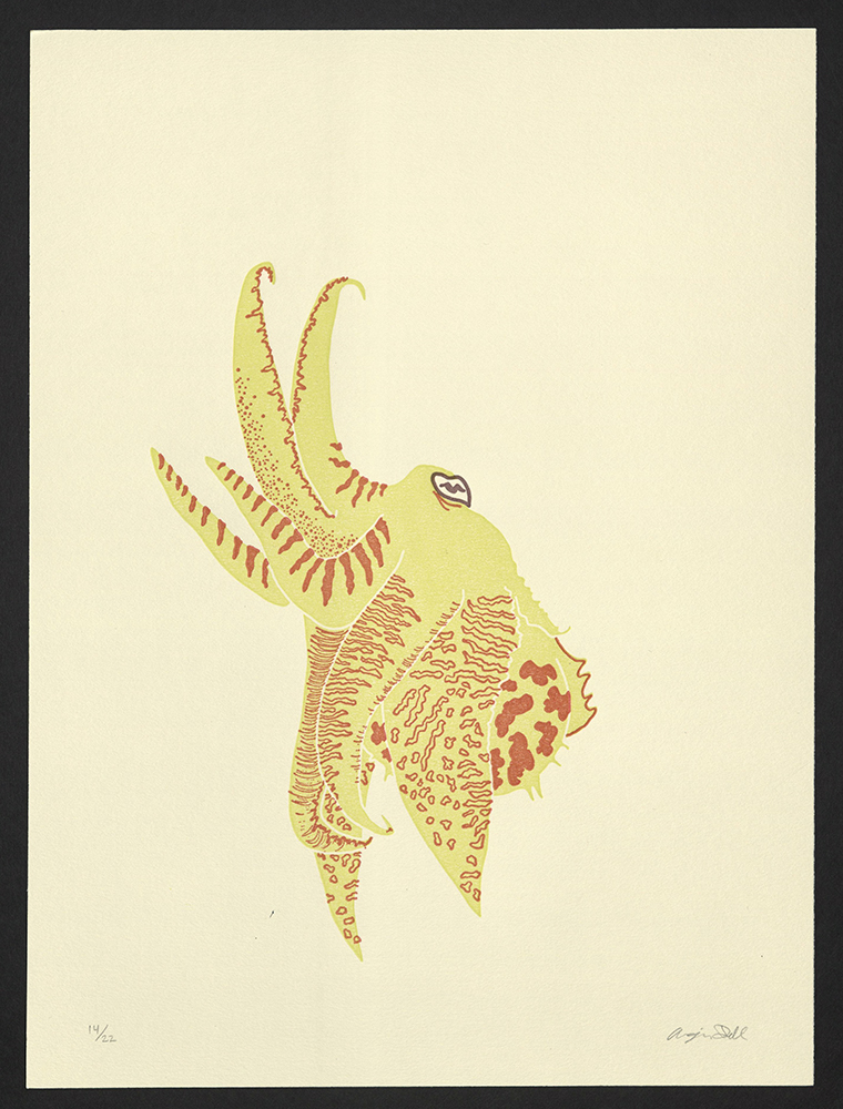
Angie Dell | Arizona: Shut Eye Press
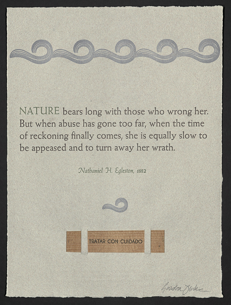
Gordon Fluke | New Mexico: J. D. Grahame Cracker Press
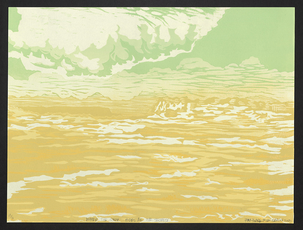
Barbara Ryan Gartin | Arizona: Two Tables Press
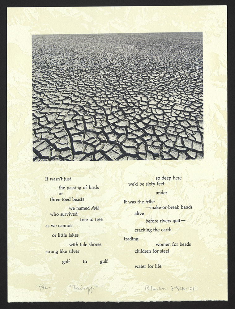
Daniel Mayer / Rebecca Lawton | Arizona / California: Dan Mayer Studios
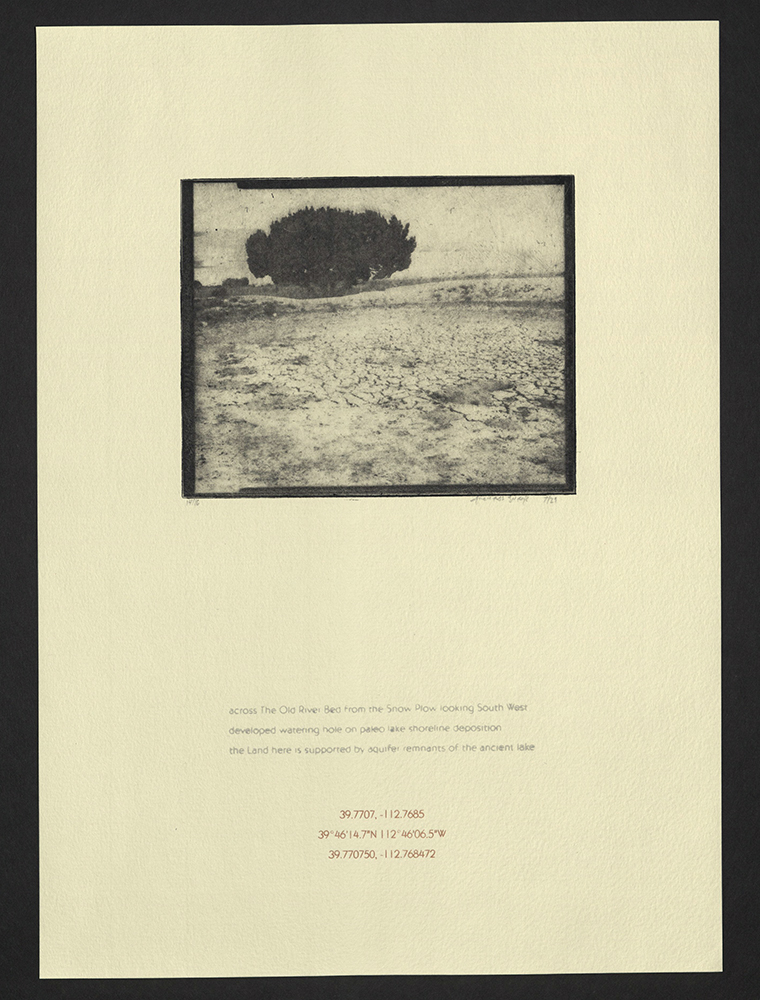
Michael Sharp | Utah
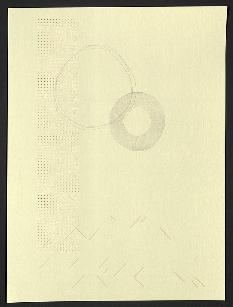
Amy Thompson | Utah: Paper Boat Studios
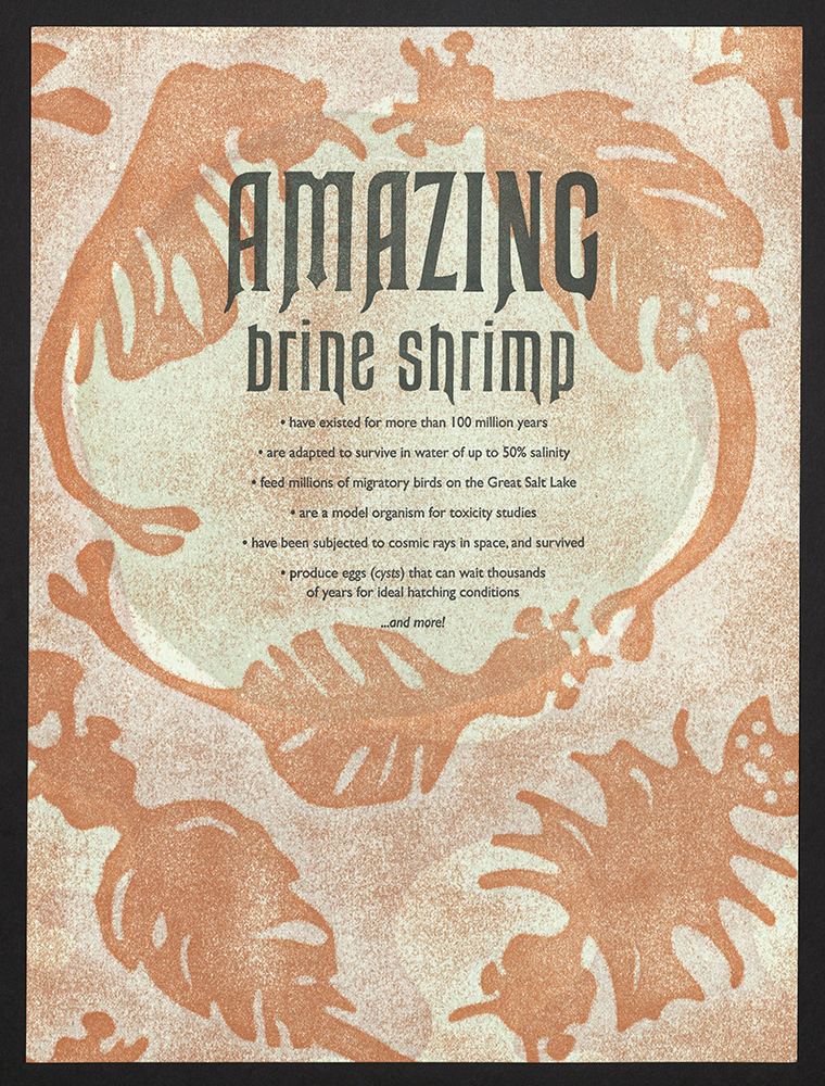
Emily Tipps | Utah: High5 Press
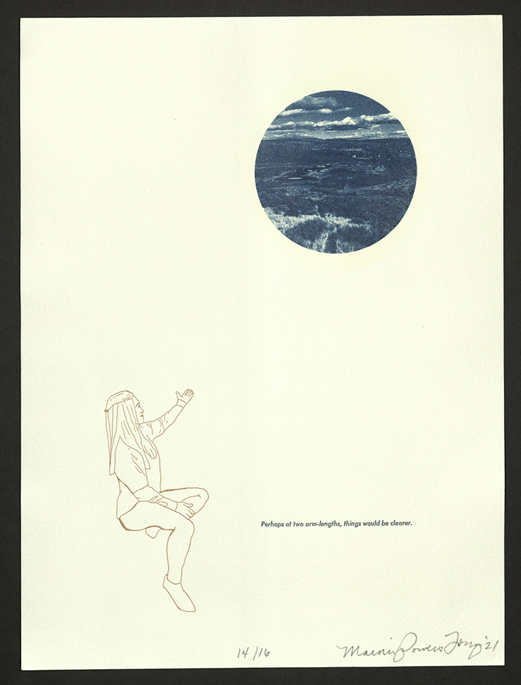
Marnie Powers-Torrey | Utah: Book Arts Program and Red Butte Press
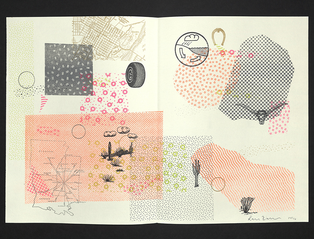
Karen Zimmermann | Arizona: Dry Heat Press
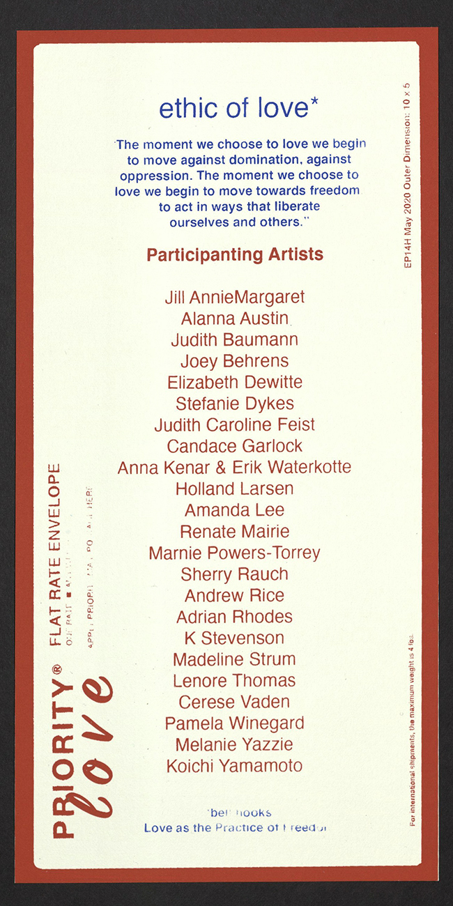
ETHIC OF LOVE
Stefanie Dykes sent a spontaneous call to print-action in early January 2021 for the Ethic of Love Portfolio, inspired by bell hooks’s essay “Love as the Practice of Freedom.” Propelled by the two-month deadline, the powerful essay, and the knowledge that other printers were making and loving in unison, participants produced a broad range of prints. By April, all twenty-five artists had received a full set of prints, each in a 10” x 5” priority mailer with a window that gave the enclosed exhibition the opportunity to travel and spread the love.
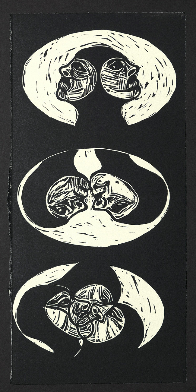
Jill AnnieMargaret
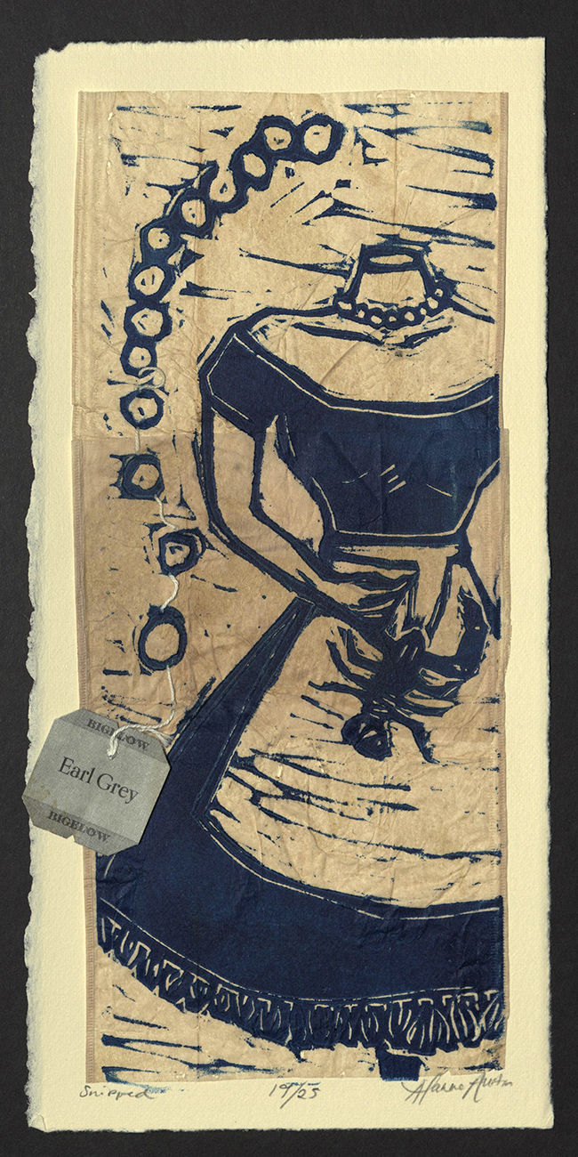
Alanna Austin
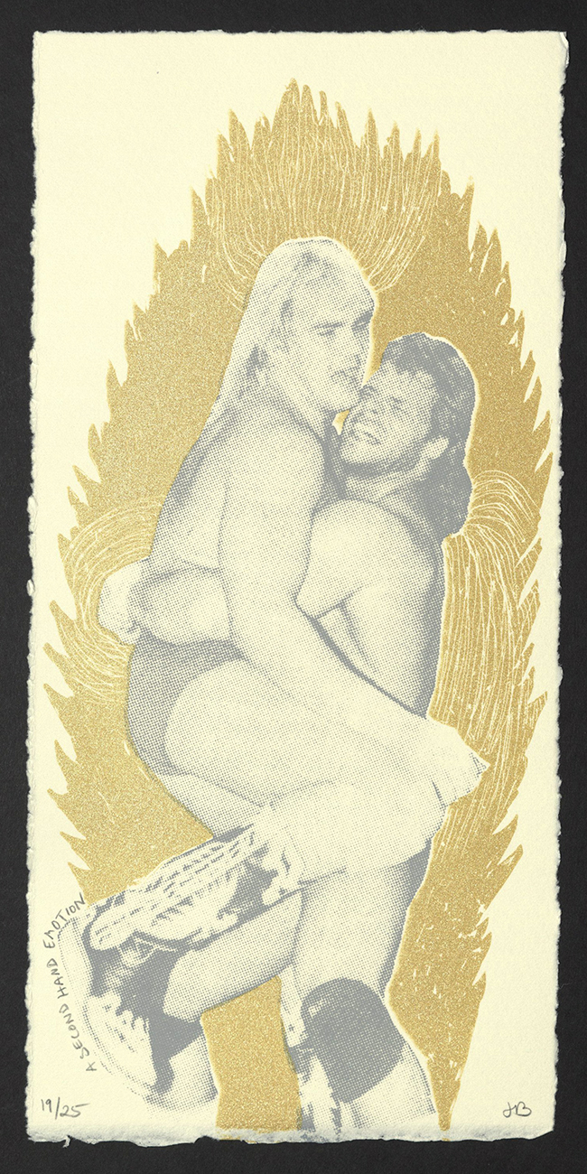
Judith Baumann
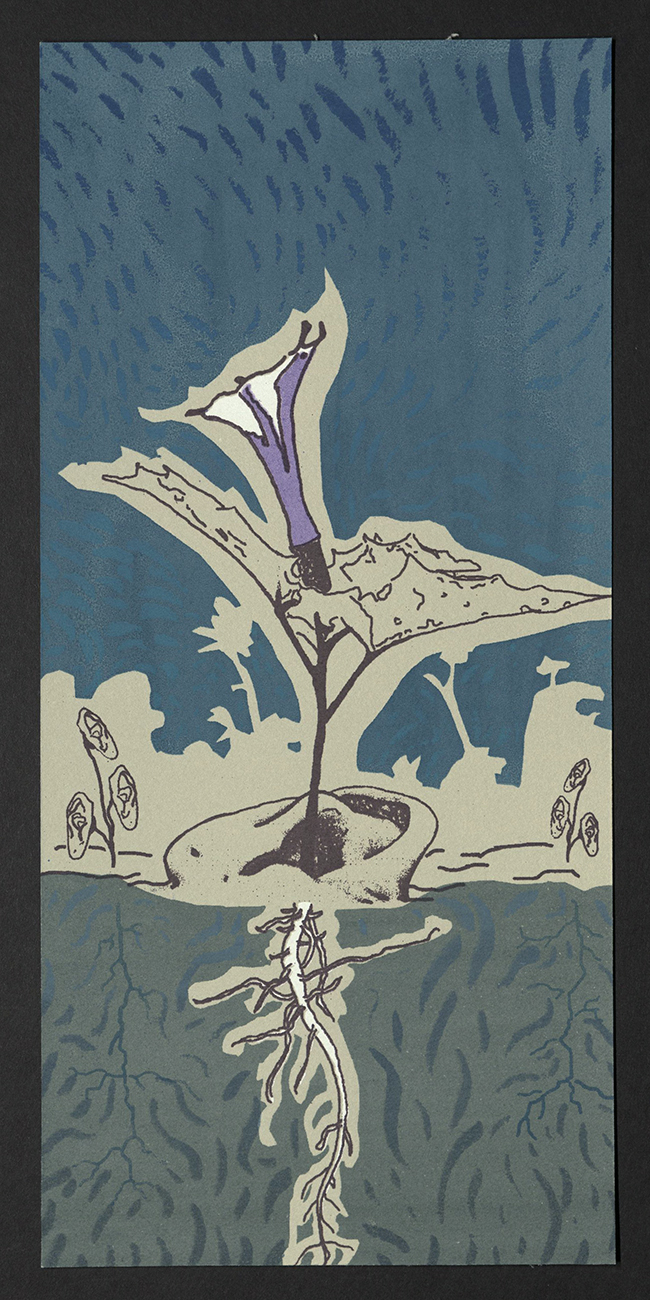
Joey Behrens
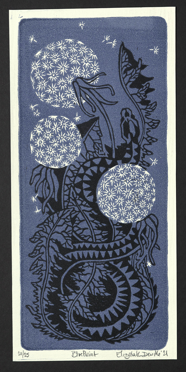
Elizabeth Dewitte
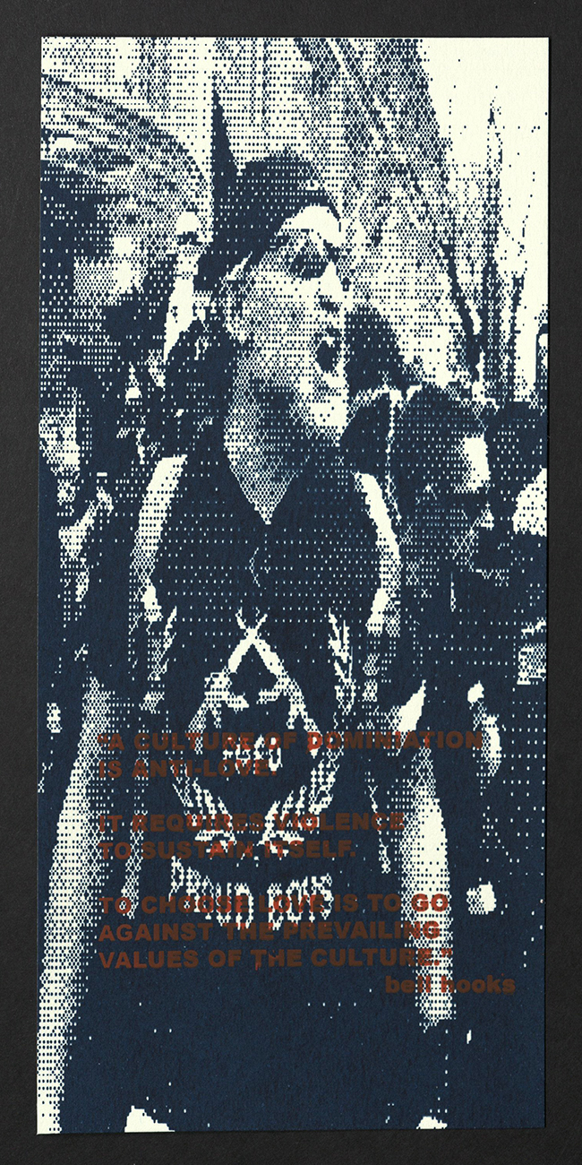
Stefanie Dykes
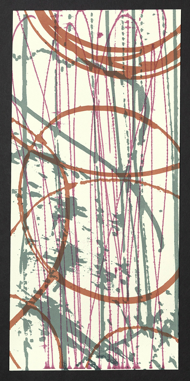
Judith Caroline Feist
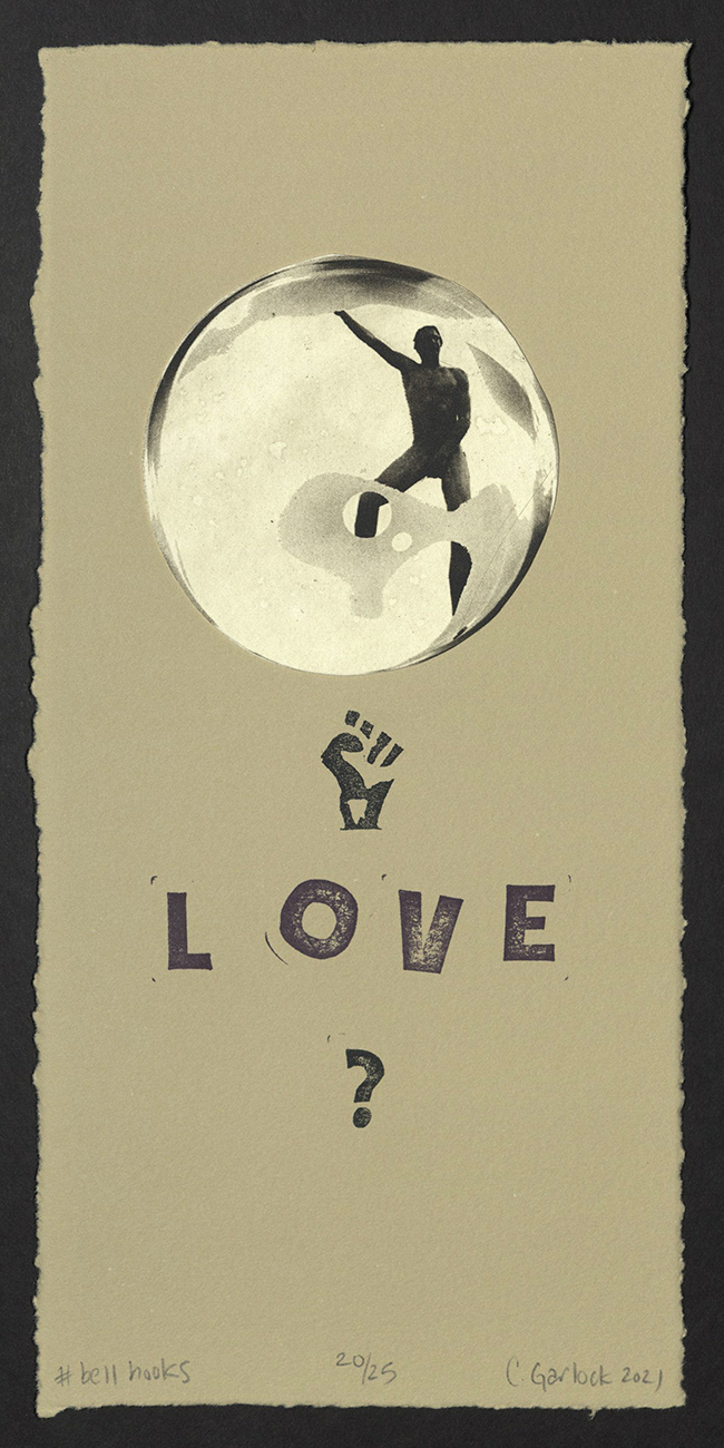
Candace Garlcok
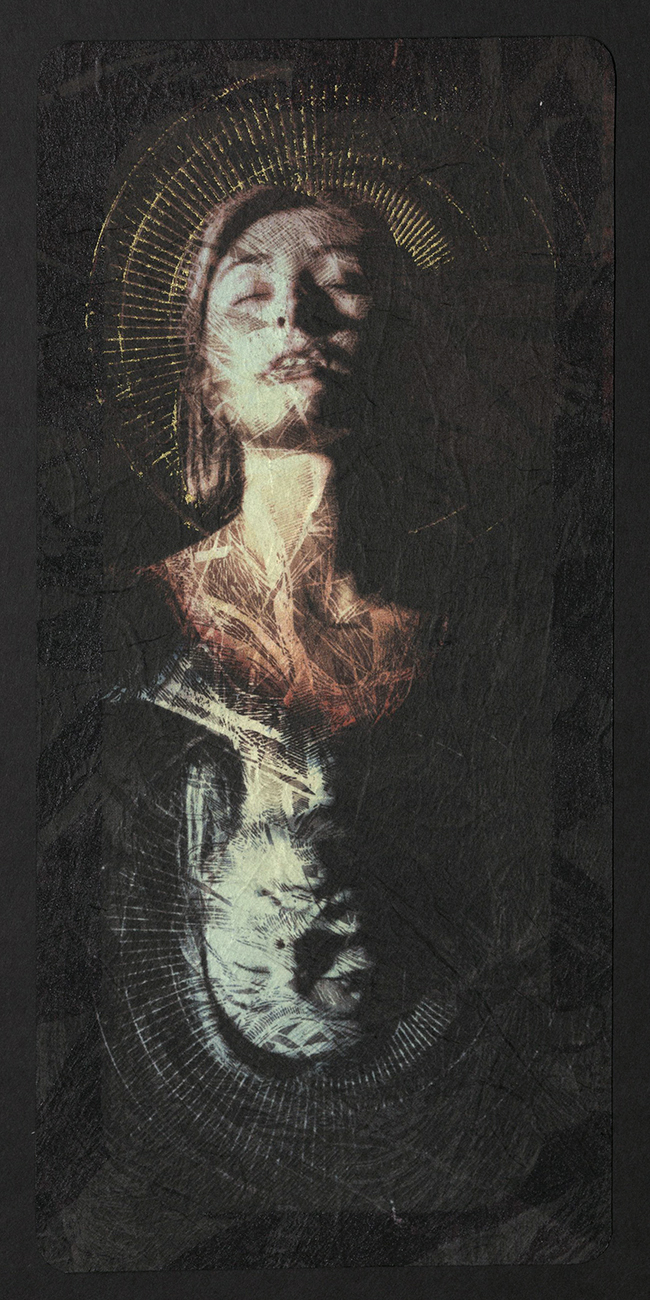
Anna Kenar and Erik Waterkotte
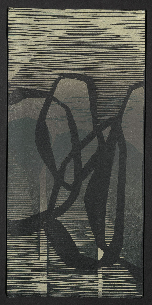
Holland Larsen
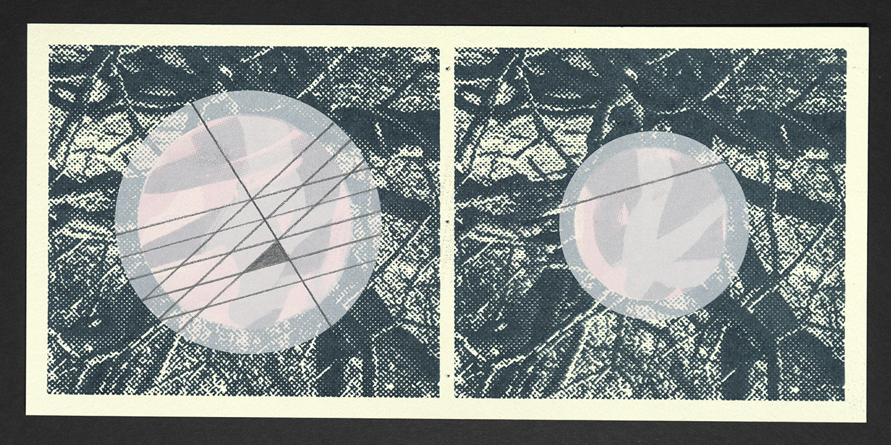
Amanda Lee
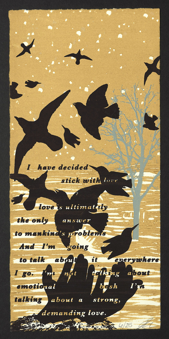
Renate Mairie
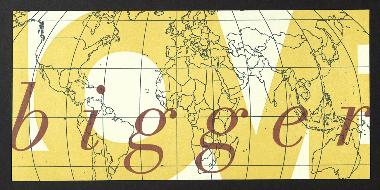
Marnie Powers-Torrey
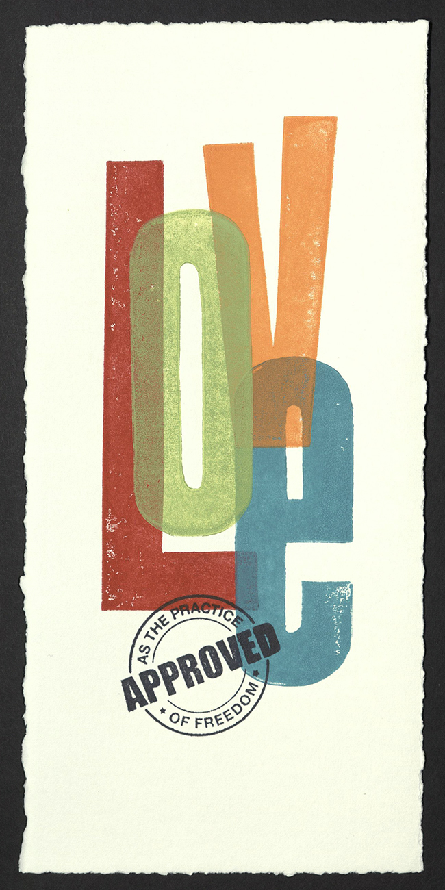
Sherry Rauch
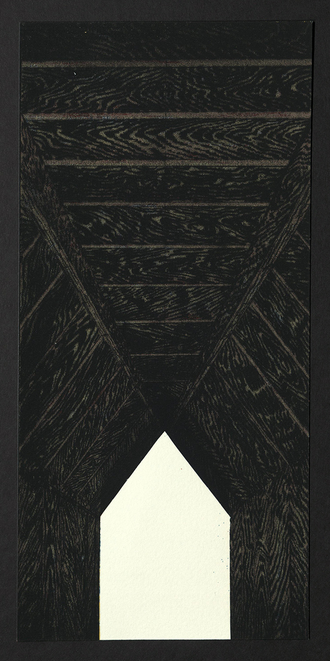
Andrew Rice
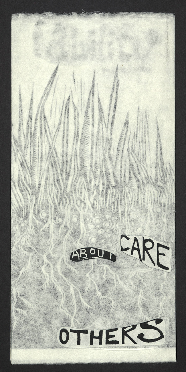
Adrian Rhodes
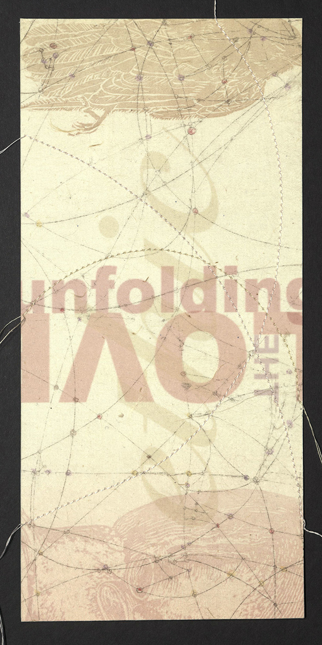
K Stevenson
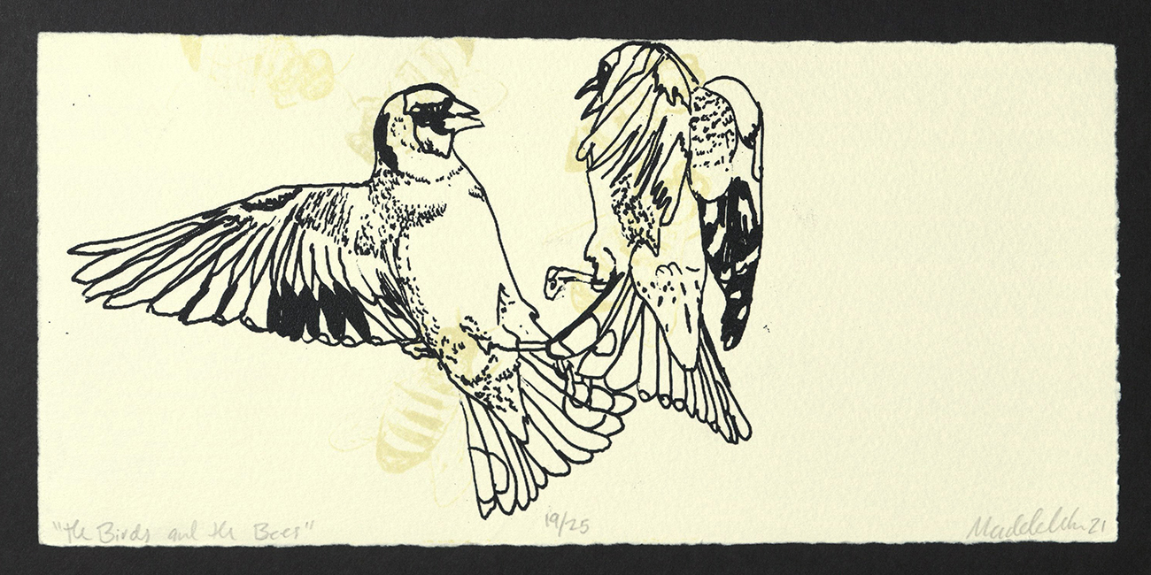
Madeline Strum
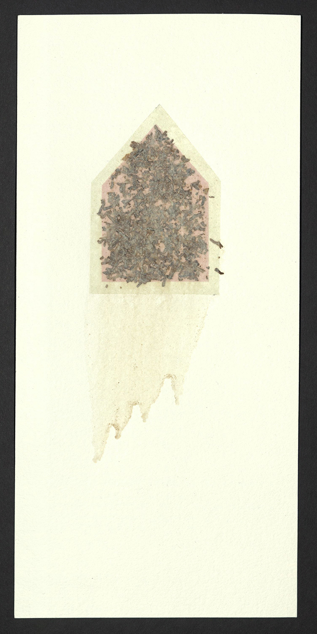
Lenore Thomas
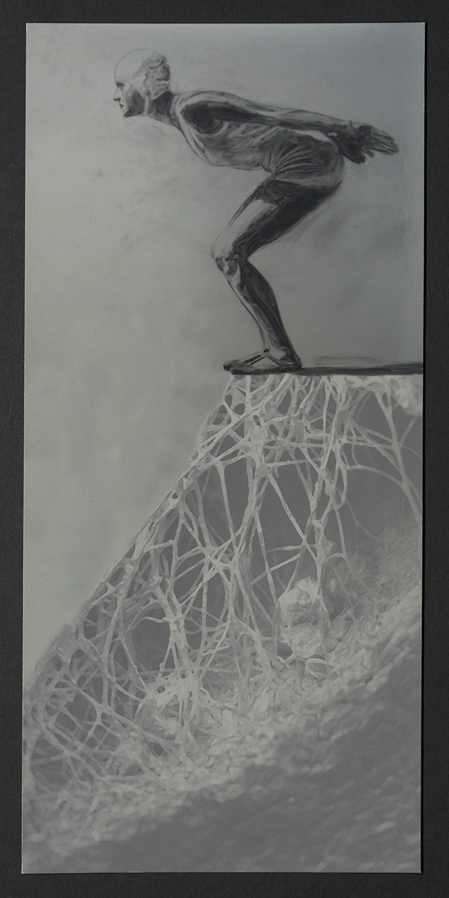
Cerese Vaden
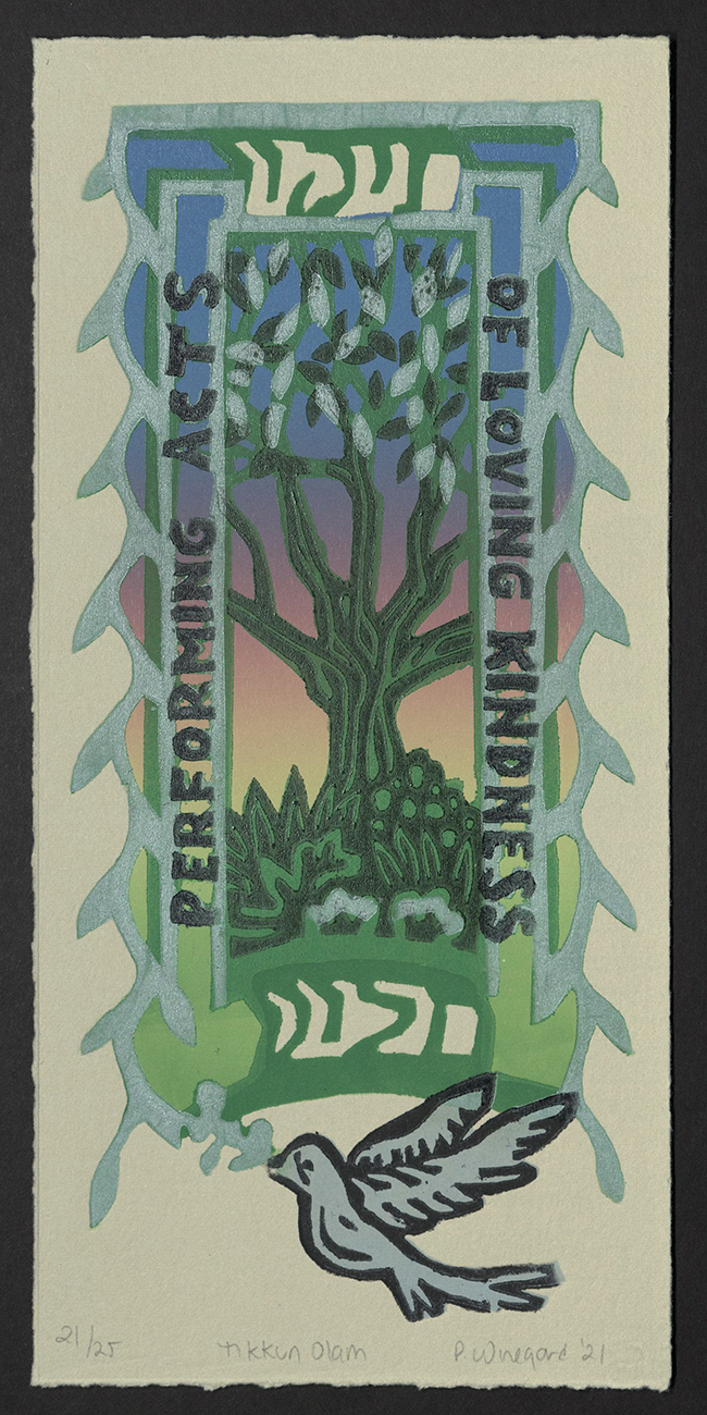
Pamela Winegard
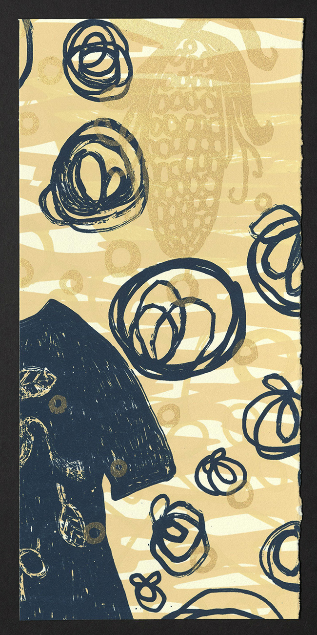
Melanie Yazzie
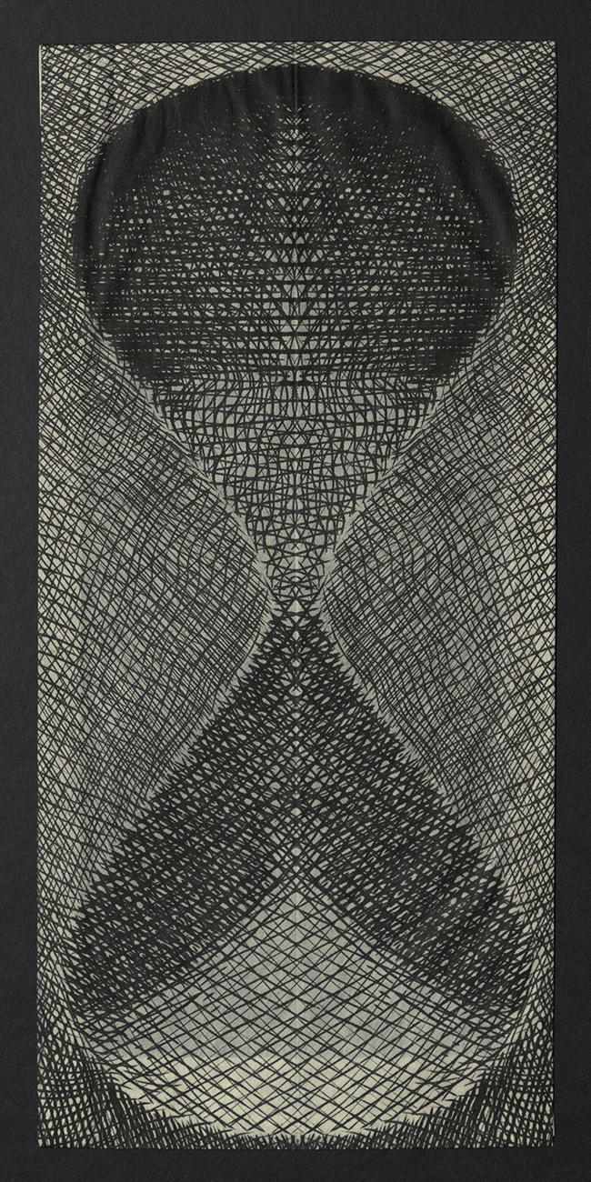
Koichi Yamamoto
HOPE IS AN ACTION
In November 2020, Jessica Snow, Kseniya Thomas, and Jenny Wilkson organized the Hope is an Action Print Exchange. The genius was in encouraging participants to take action by hoping – something accessible to all – with individual and combined effort. The inherent potential of collective problem-solving and the power of connection across geographic as well as political and/or cultural divides was striking in the resulting work. During a period when the world seemed suspended in time, involvement in the project gave structure and meaning to creative output. Hopefully, these messages will inspire action, new ways of thinking, and new ways of being.
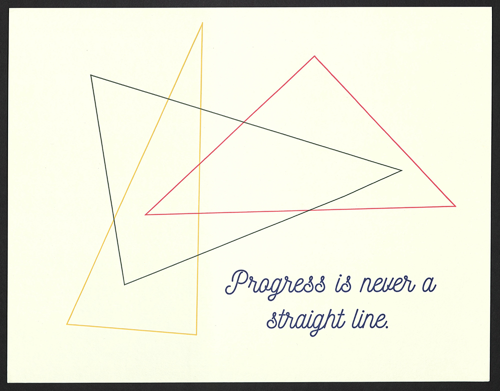
Progress is never a straight line
Adelaide Ann Carter
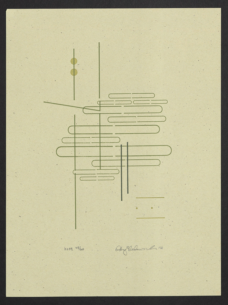
Hope
Amy Redmond
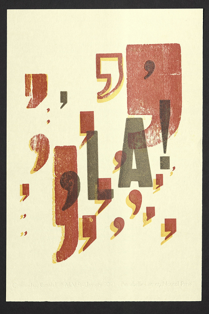
Comma-la... Kamala!
Annabelle Larner | Noted! Press
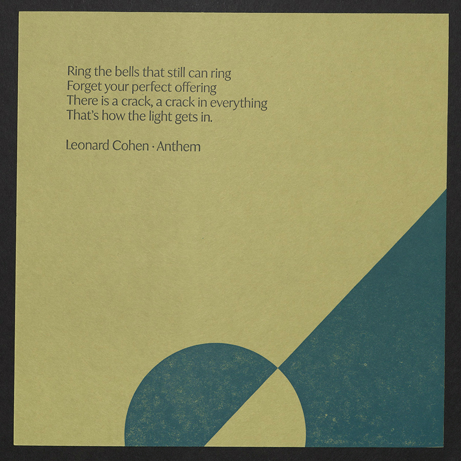
Ring the bells that still can ring...
Ashley Bromstrup | The Steady Press
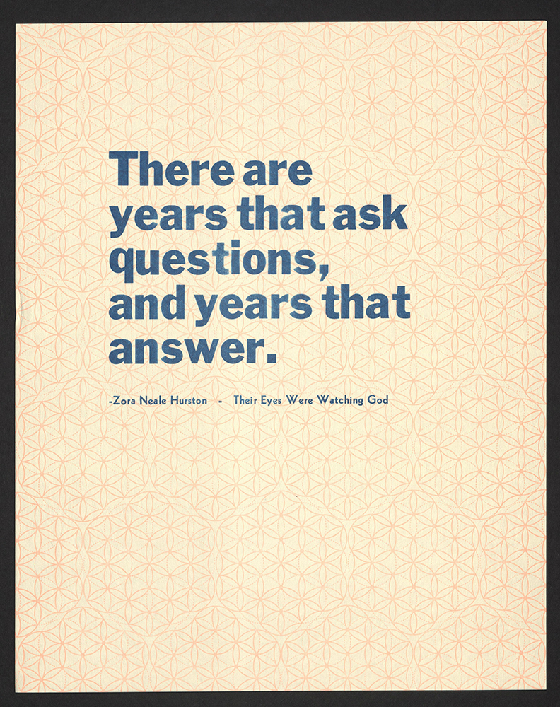
There are years that ask questions...
Blackbird Letterpress
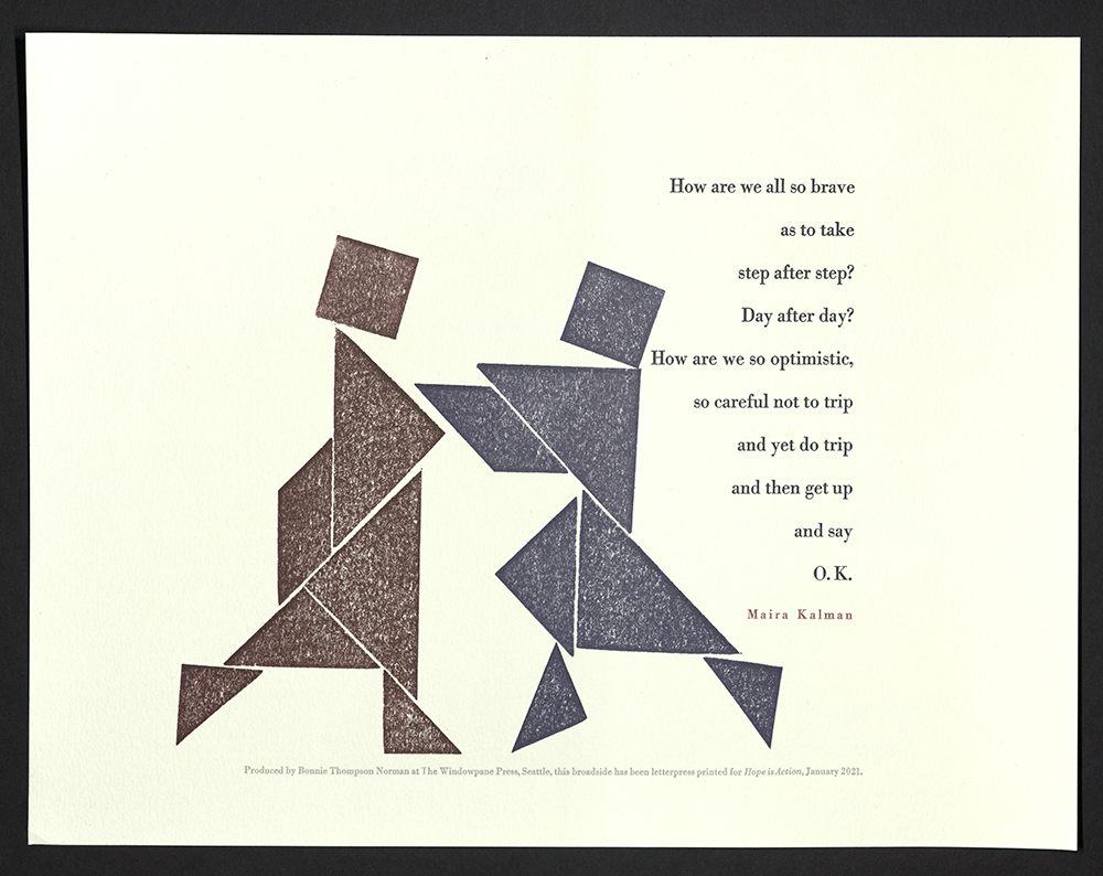
How are we all so brave...
Bonnie Thompson Norman
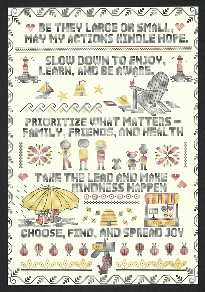
Be they large or small...
Boxcar Press
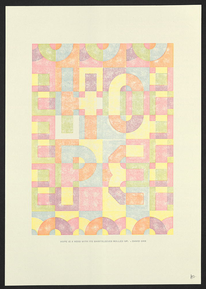
Hope is a verb with its shirtsleeves rolled up
Bright Press
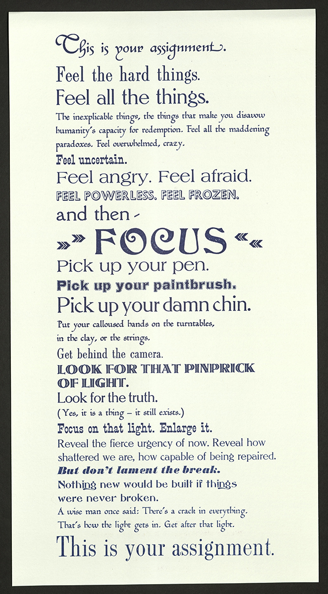
This is your assignment...
Cathleen and Don Cherry
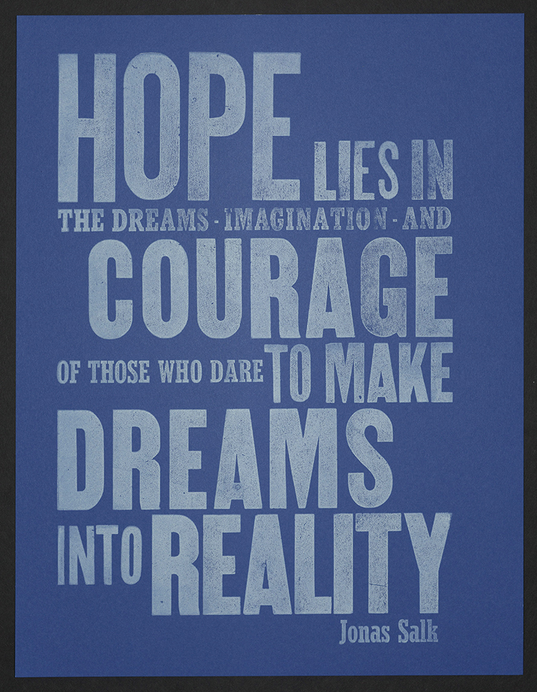
Hope lies in the dreams...
Christina Aumann
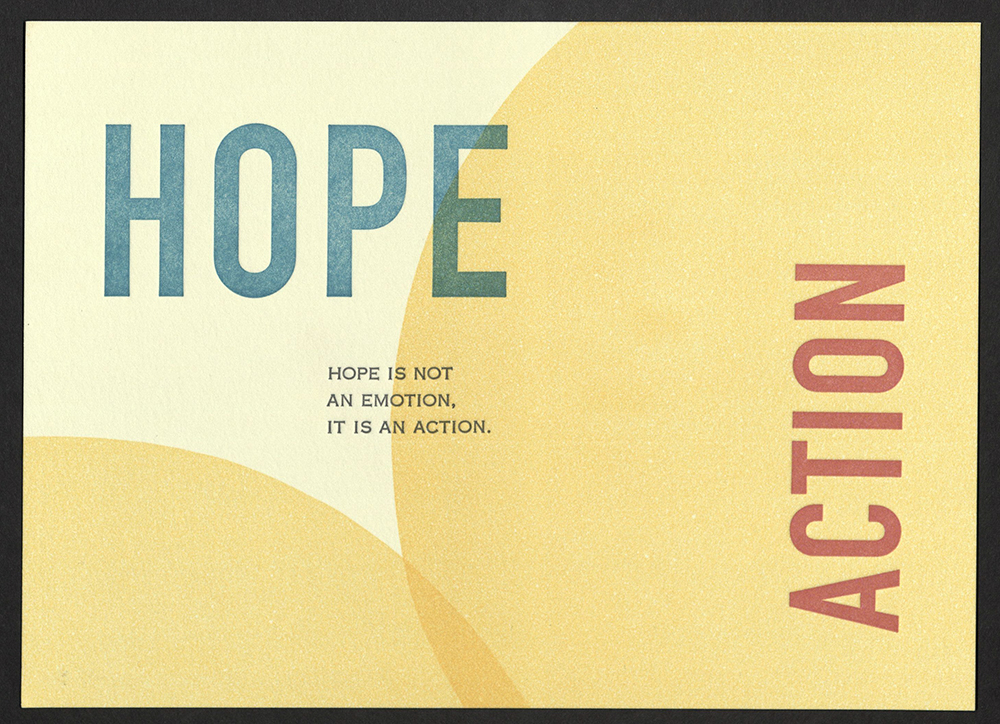
Hope/Action
Circa EightyThree
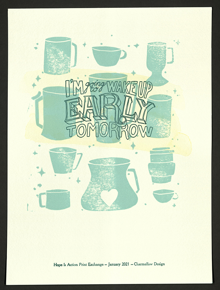
I’m going to wake up early tomorrow
Dani Renwick | Charmellow Design
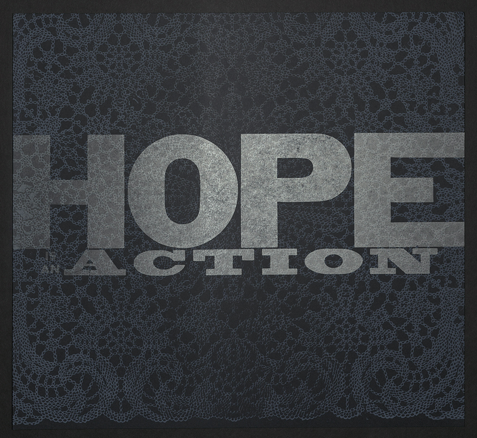
Hope is an Action
Denise El-Hoss
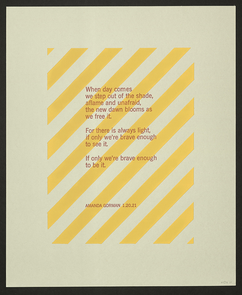
When day comes we step out of the shade...
Elinor Nissley
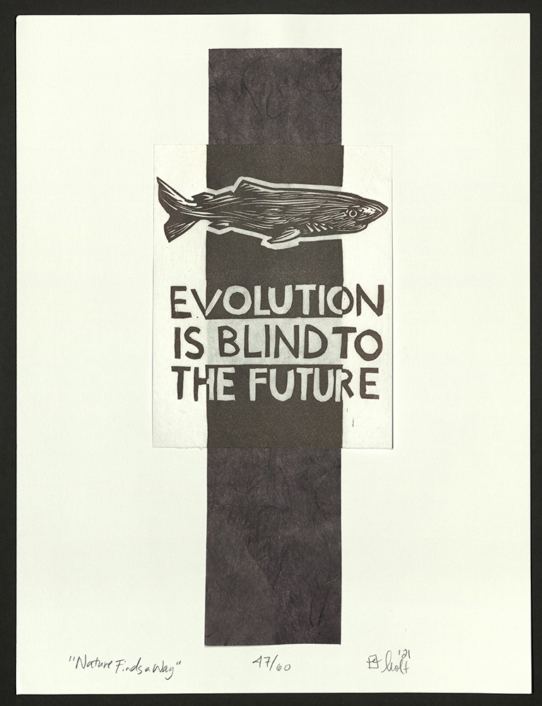
Nature Finds a Way
Erin Holt
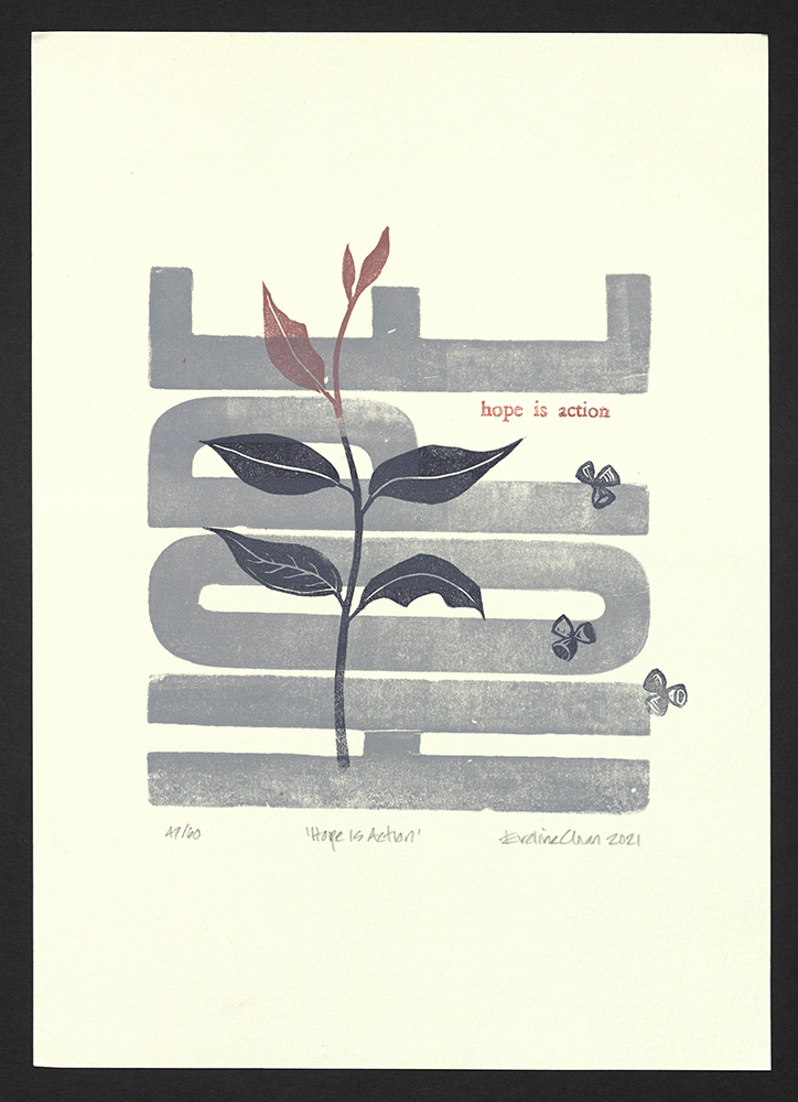
Hope is Action
Eveline Chan
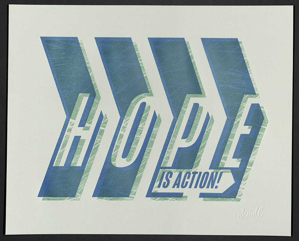
Hope is Action!
Inkwell Originals
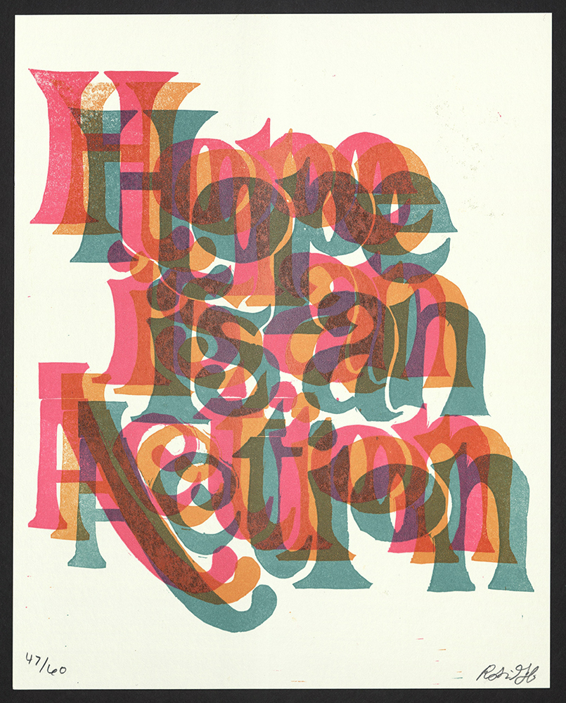
Hope is an Action
Inkworm Press
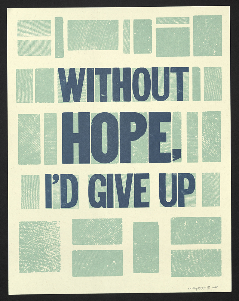
Without hope, I’d give up
Inky Lips Letterpress
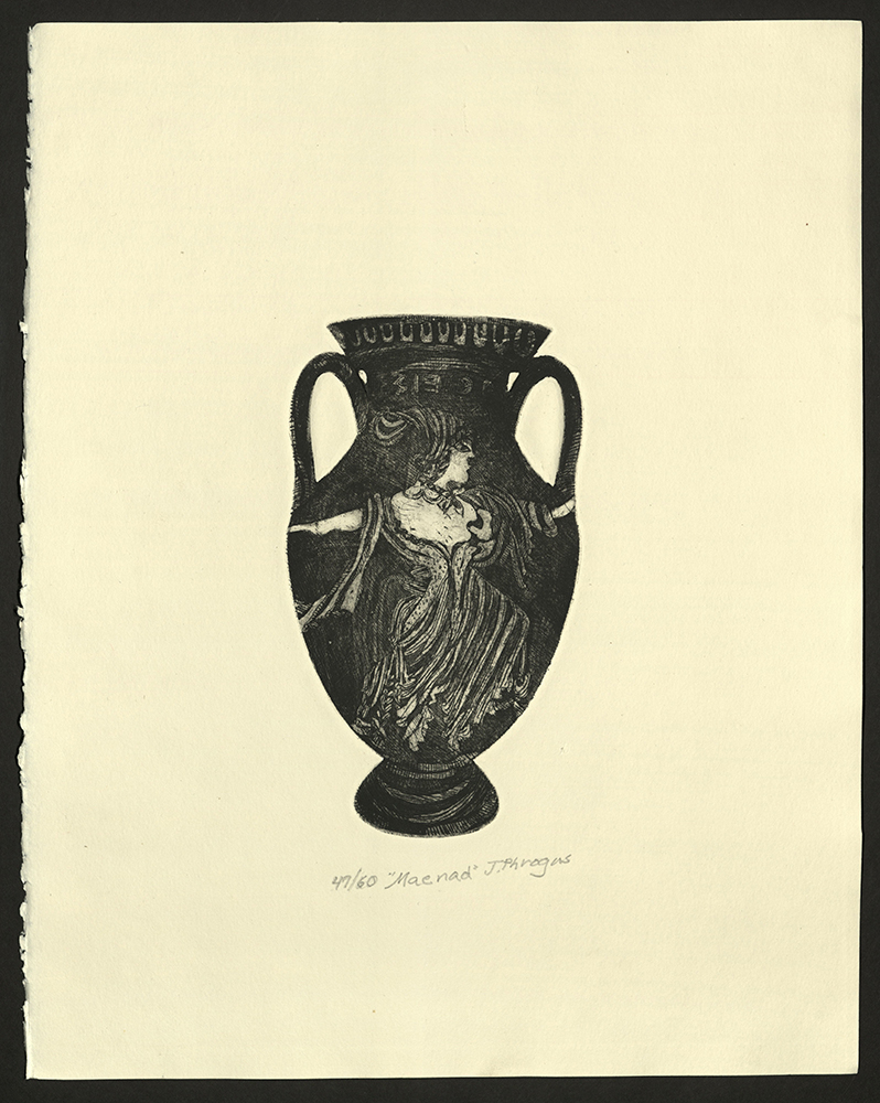
Maenad
J. Phrogus Press
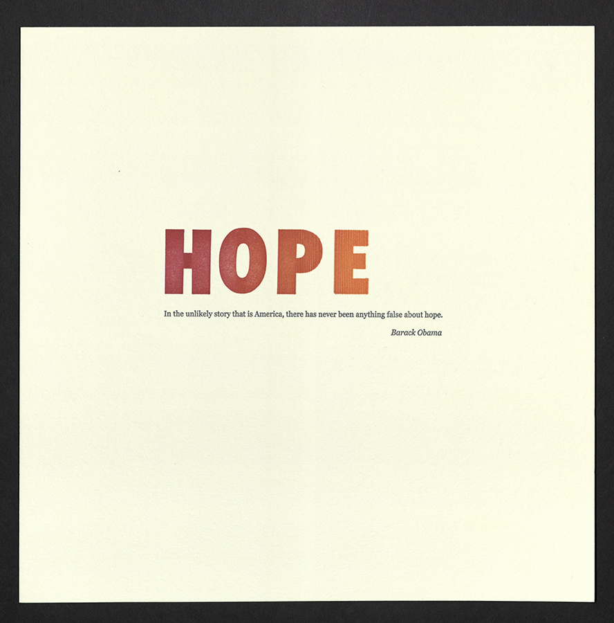
In the unlikely story that is America...
Jane Suchan
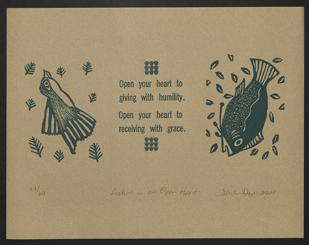
Action is an open heart...
Jessica Depp
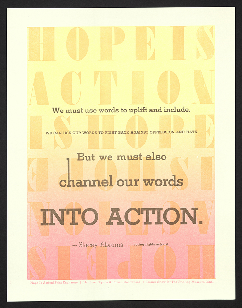
We must use words to uplift and include...
Jessica Snow
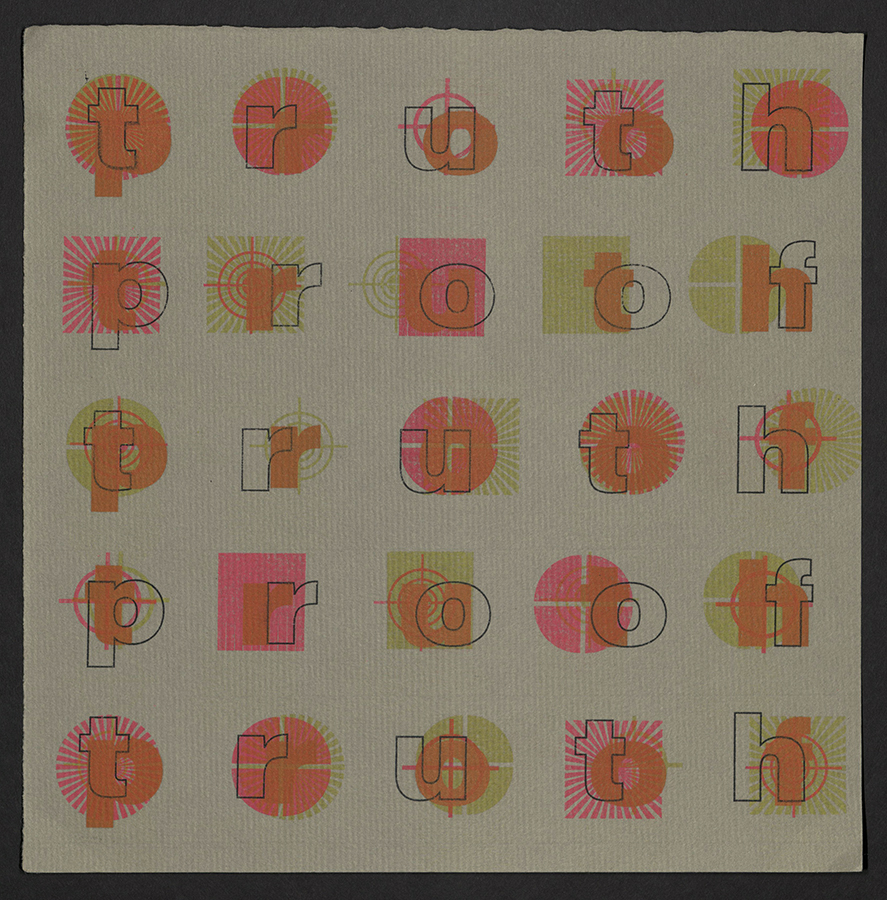
Truth/Proof
Karen Zimmermann
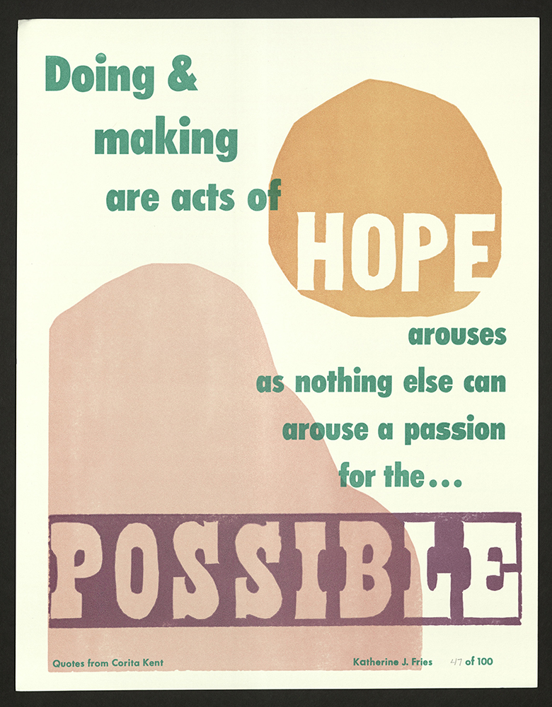
Doing & making are acts of hope...
Katherine Fries
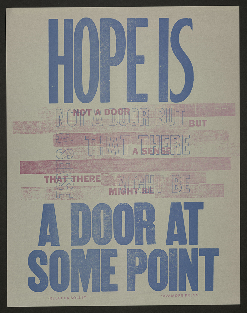
Hope is not a door...
Kavamore Press
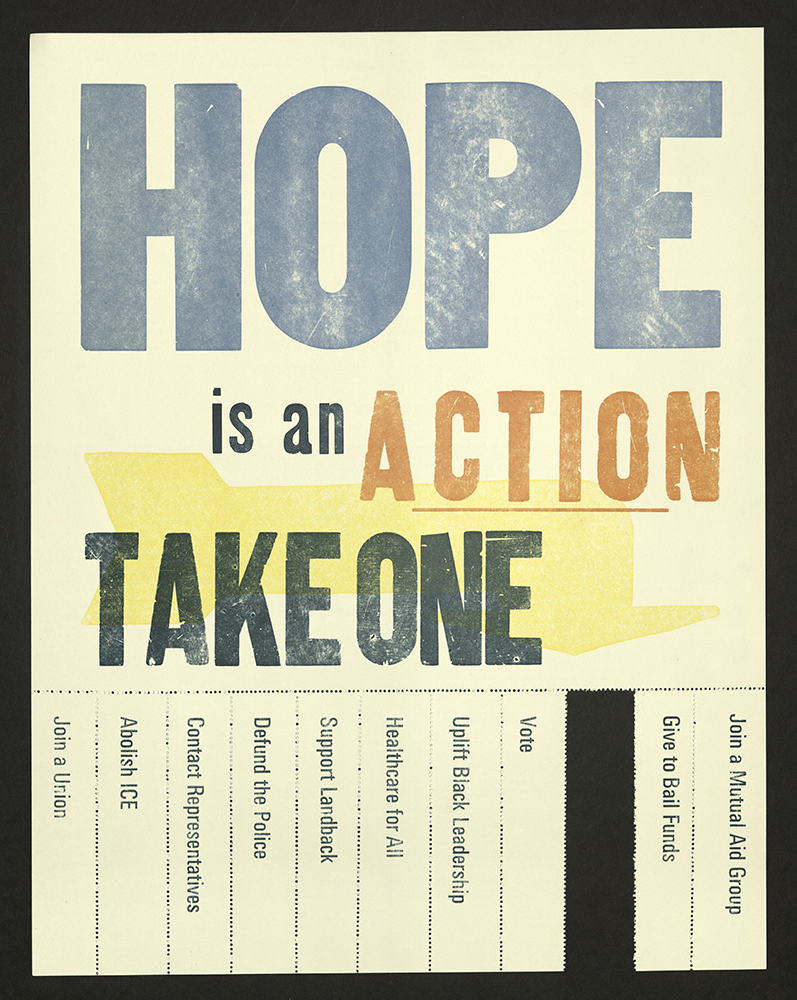
Take One
Kristen Lyle
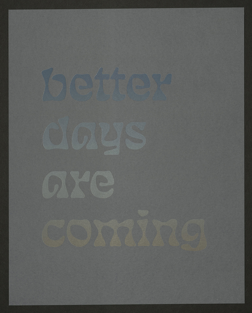
better days are coming
Kseniya Thomas
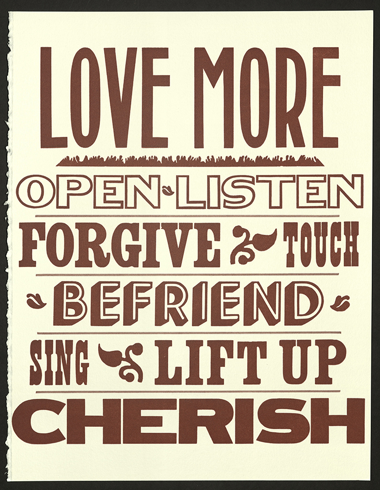
Love makes us courageous
Kyp Bisanga and Jules Faye
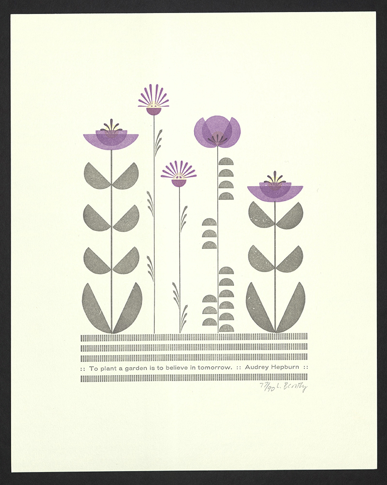
To plant a garden is to believe in tomorrow
Laura Bentley
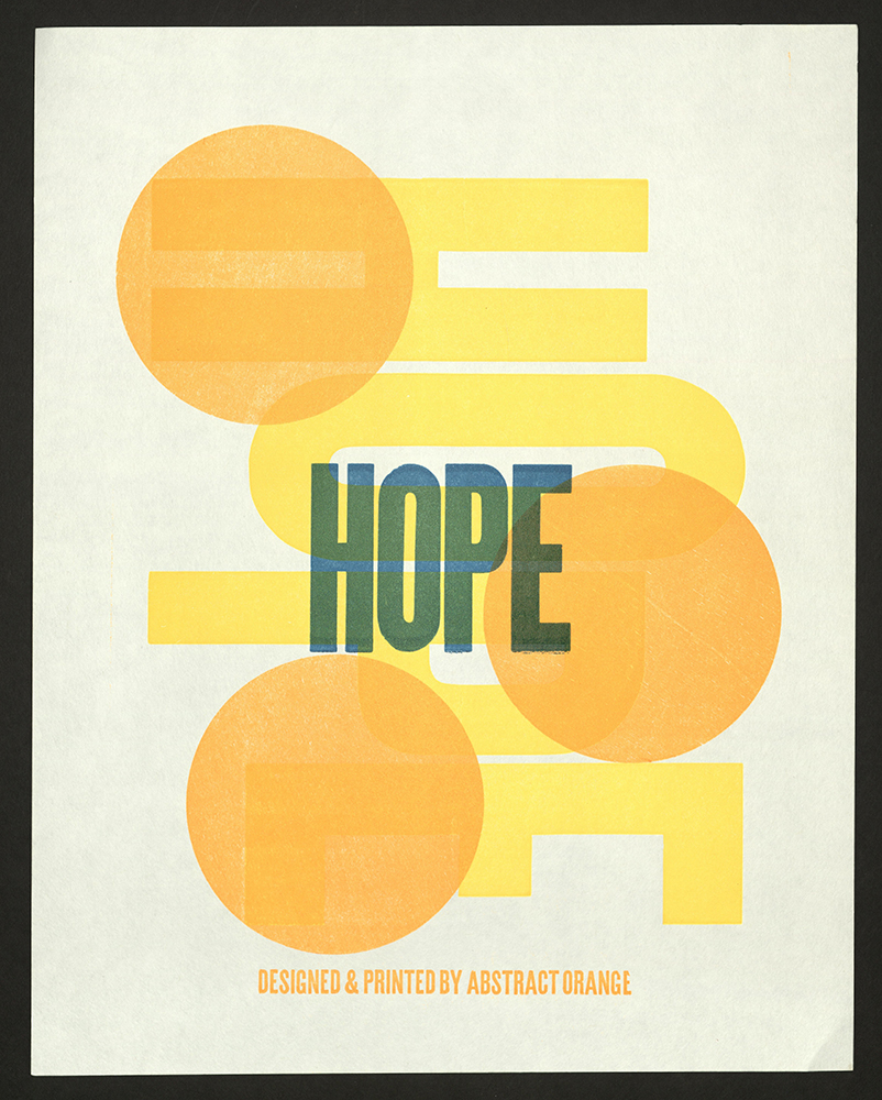
Hope
Lauren Emeritz
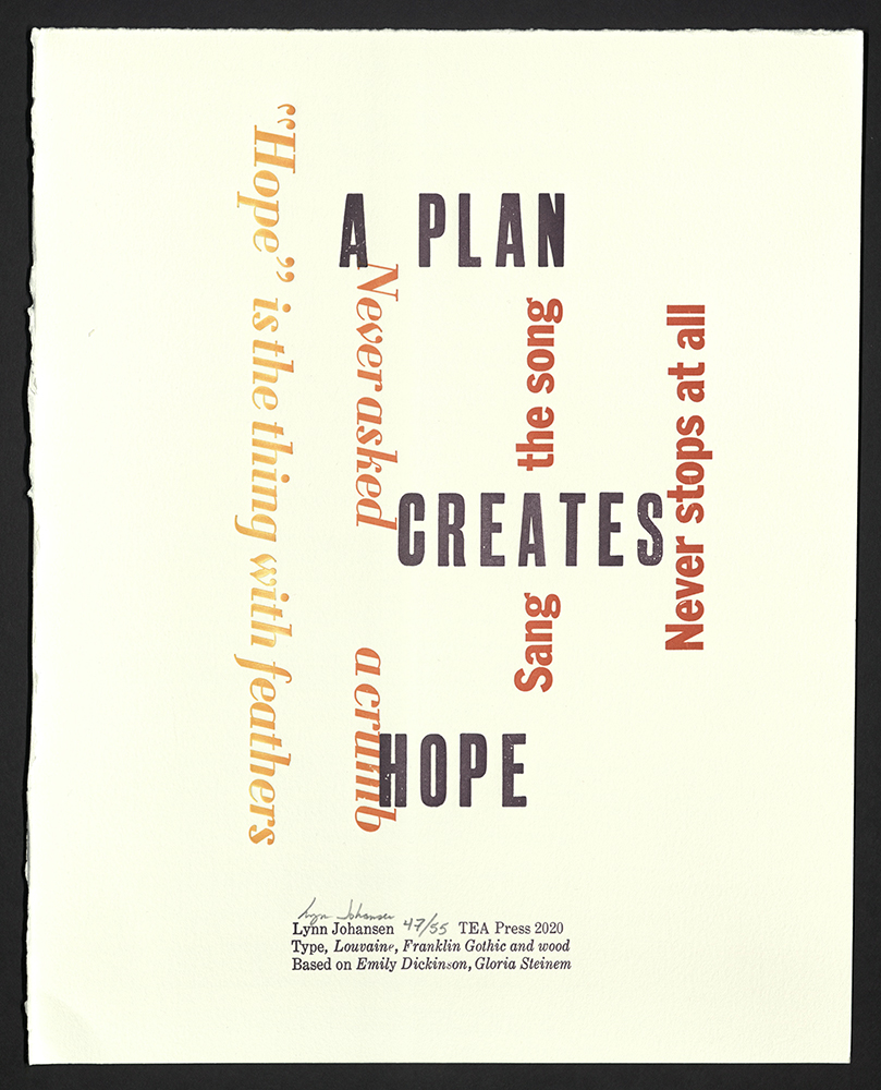
A plan creates hope
Lynn Johansen
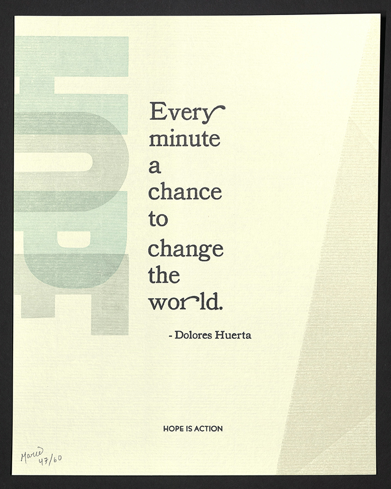
Every minute a chance to change the world
Marie Kuch-Stanovsky

Never doubt...
Marie Oberkirsch
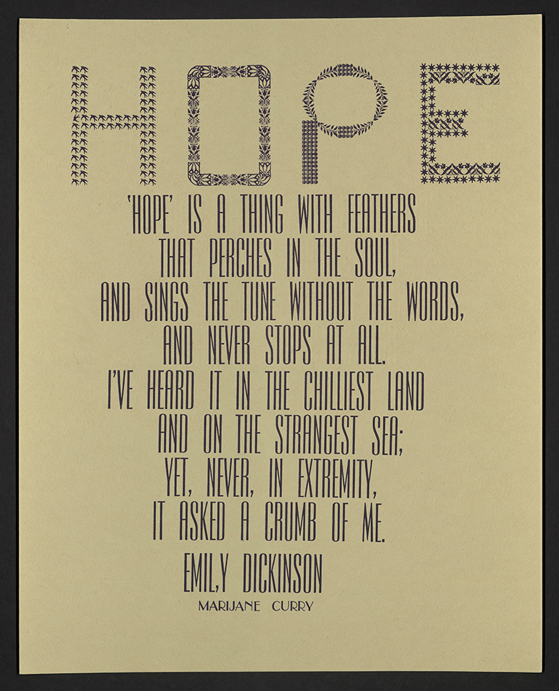
Hope is a thing with feathers...
Marijane Curry
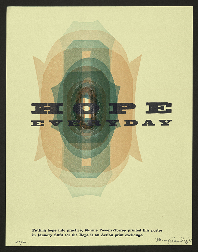
Hope Everyday
Marnie Powers-Torrey
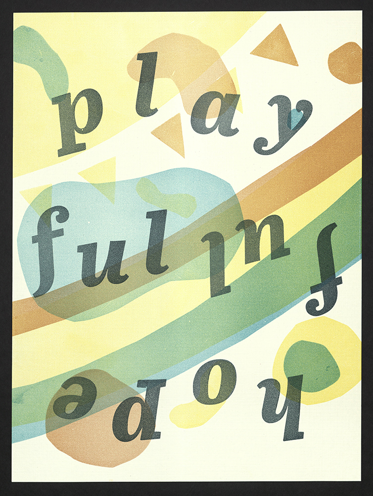
hopeful playful
Megan Asbeck
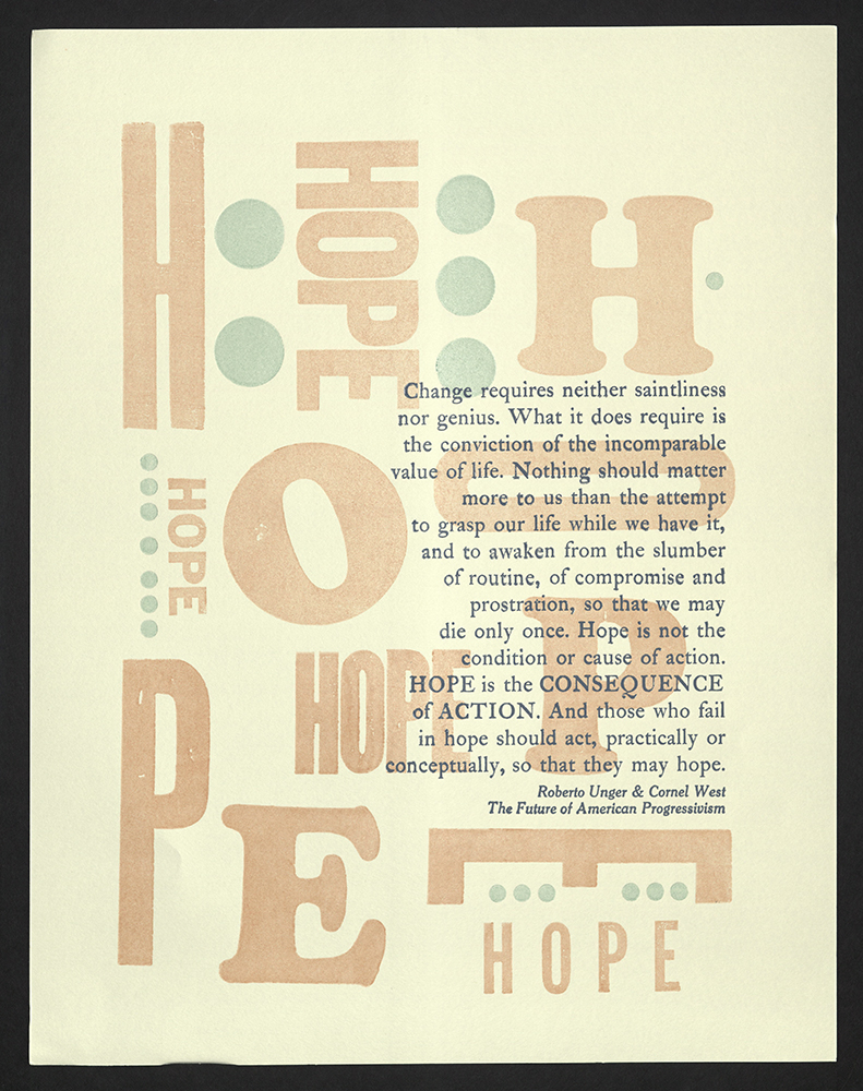
Change requires...
Michelle Choban
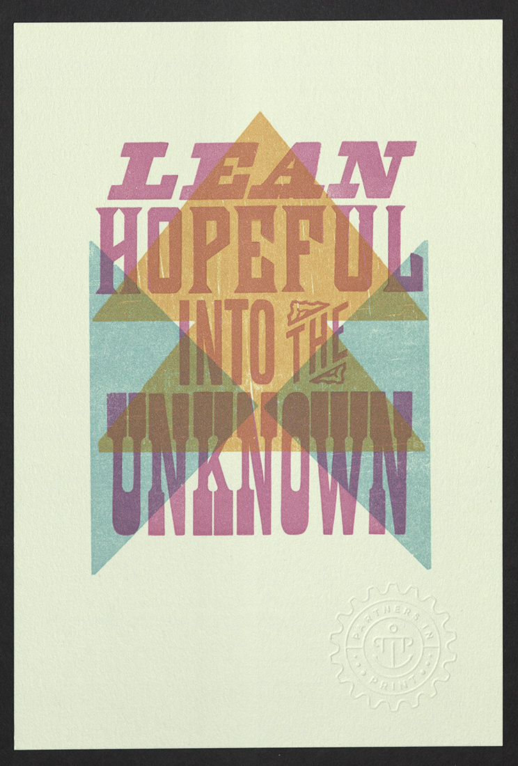
Lean Hopeful Into the Unknown
Partners In Print
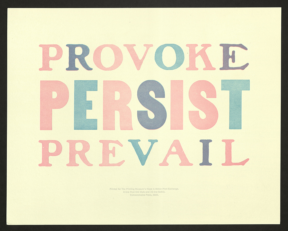
Provoke Persist Prevail
Paul Moxon
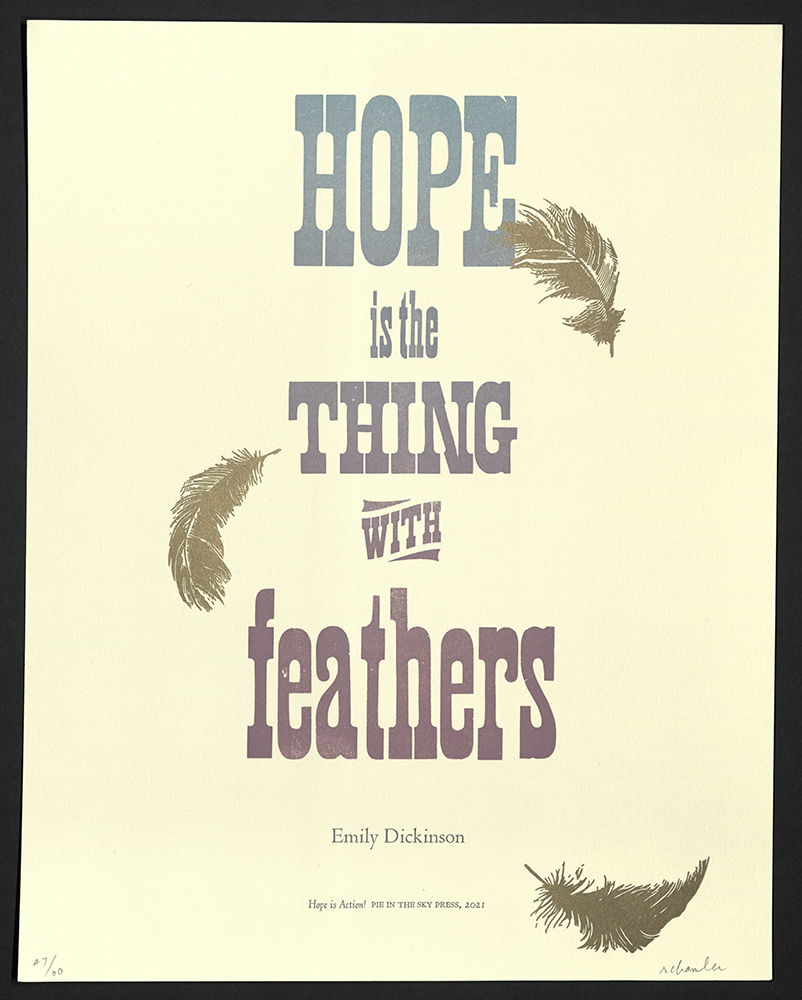
Hope is the thing with feathers
Pie in the Sky Press
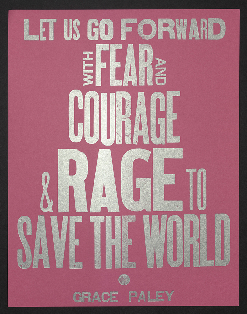
Let us go forward
Pilar Nadal
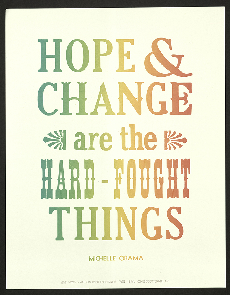
Hope & change are the hard-fought things
Pumpkin Patch Press
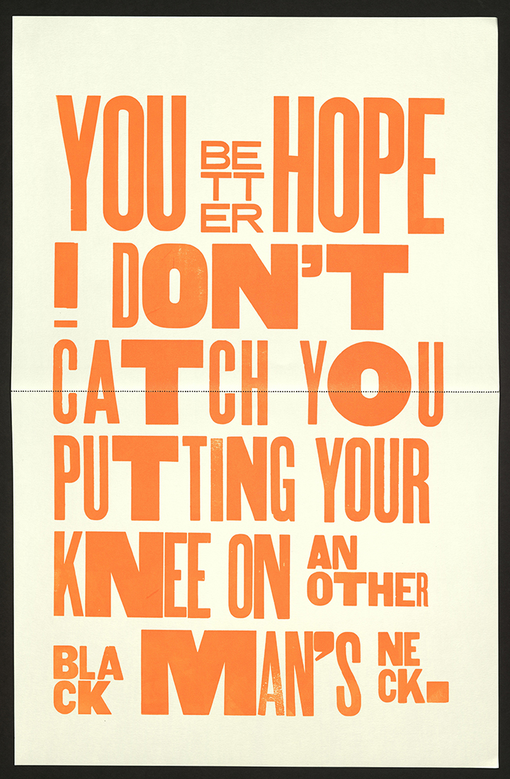
You better hope...
Rick Griffith
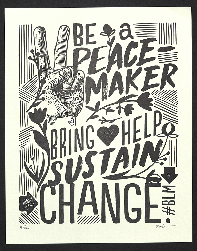
“Be a peace-maker...
Sarah McCoy | The Permanent Collection
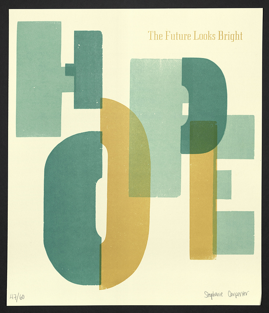
The future looks bright
Stephanie Carpenter
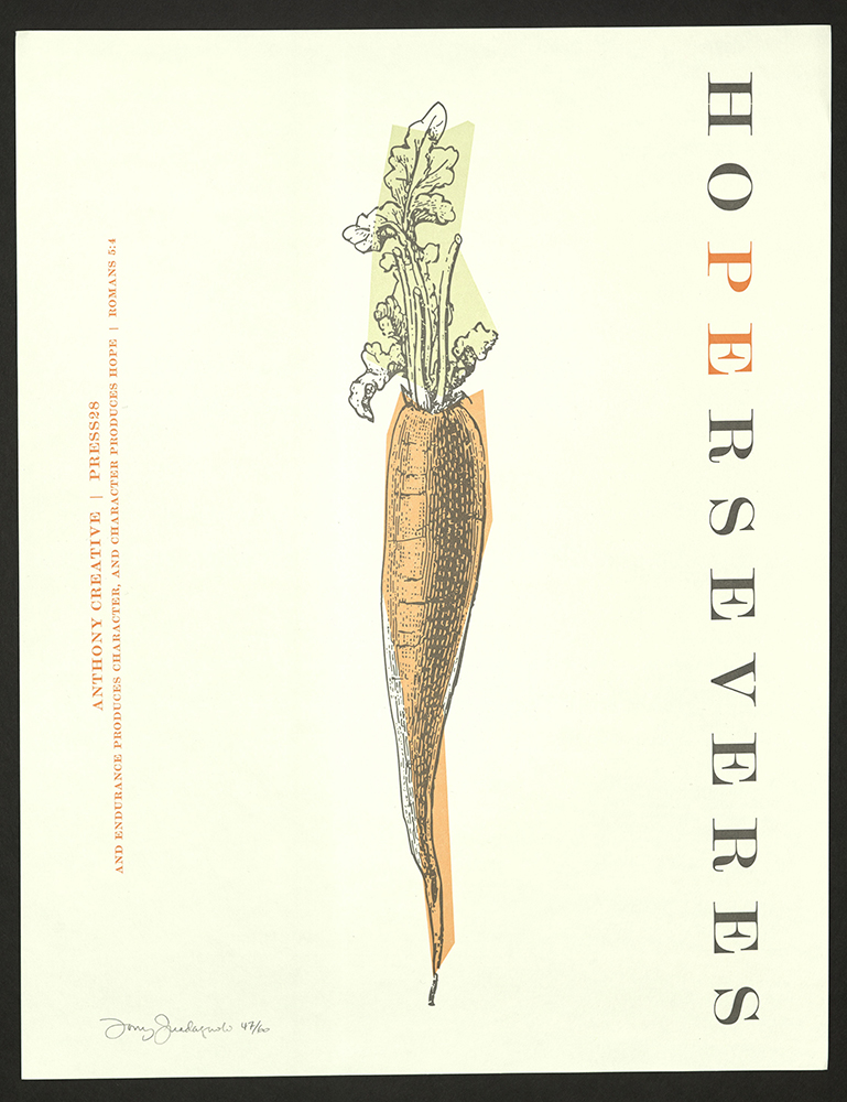
Hope perseveres
Tony Guadagnolo
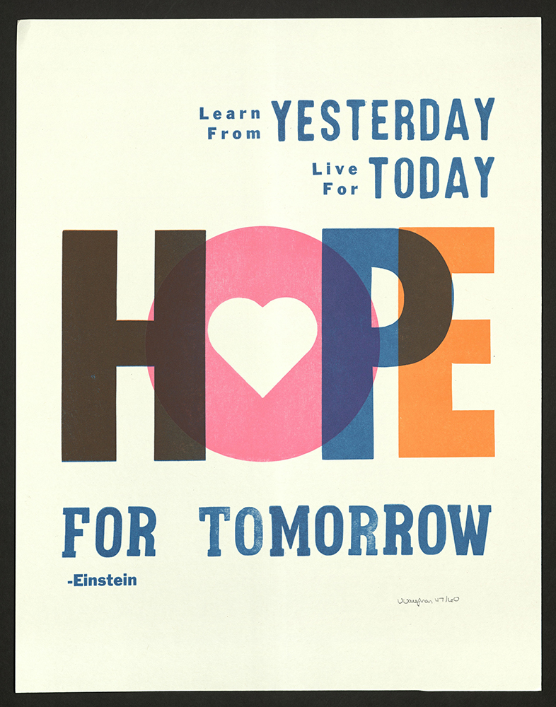
Learn from yesterday
Veronica Vaughan
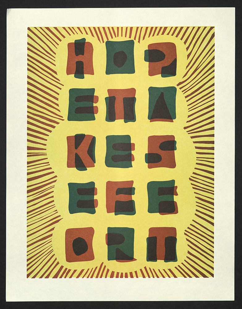
Hope Takes Effort
Virginia Rougon Chavis
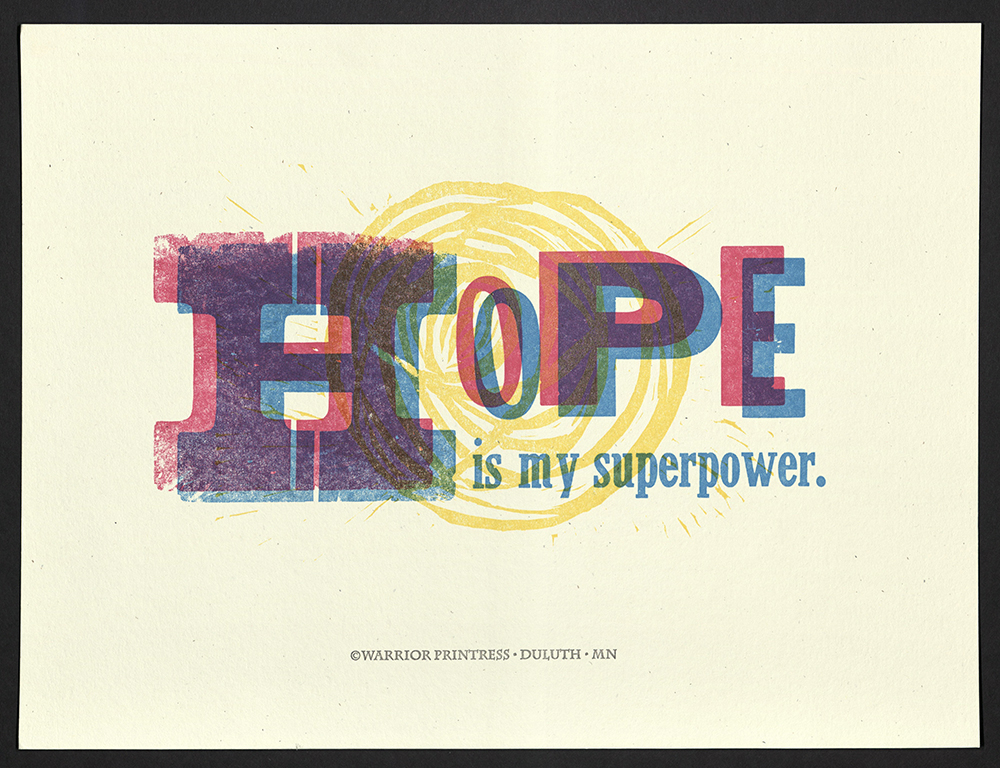
Hope is my superpower
Warrior Printress Letterpress and Design
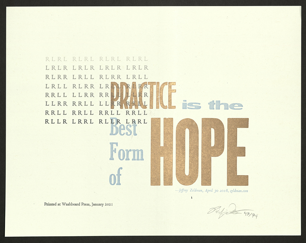
Practice is the best form of Hope
Washboard Press